There’s an old business model that many business strategists live by—the 3 Cs. It’s a reminder to focus on the company, customers and competitors. Many small businesses and websites also use this model. But for designers, the three Cs are a little different.
When creating user interfaces, you should focus on color, contrast, and content. These three elements are the foundation of good design. But each is a little more complex than it might seem from the surface. Here’s how to think about–and incorporate–the three Cs of user interfaces into your design projects.
Color
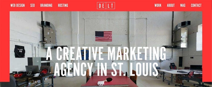
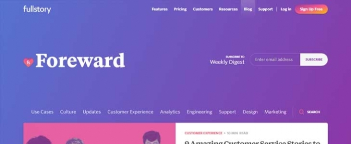
Color is one of the most obvious visual elements to most users. Designers and non-designers alike can talk about color and whether a certain hue or palette appeals to them.
Color can create distinct emotional connections completely on its own, without other effects. You can hand a color swatch or chip to almost anyone and get a reaction about whatever color is visible. It’s also a funny design element in that personal and design preferences tend to shift over time almost universally.
Color can make or break a design for a lot of reasons, but primarily it does so many things and provides so many visual cues to the user simultaneously that you can’t ignore it.
Color impacts:
- Usability and readability
- Brand recognition and awareness
- Where users look and interact
- Organization and user flow
- Overall success of the design
Use color to create:
- Navigation that’s clear and understandable
- Intuitive interactions
- A mood for the project
- Create strong calls to action or usable elements
- Establish a sense of what the design is about, such as reality versus fantasy
This might all seem like a tall order for something as simple as a mix of red, green and blue.
So, where do you start? Arguably the most important variables when it comes to color is creating a palette that’s engaging to users and speaks to what the design is about (such as branding and mood). For example, a website for Coca-Cola that used blue as a dominant color rather than red would be jarring to users.
A solid color palette is rooted in the principles of color theory. You don’t need more than a couple of colors to make it work. Two to three colors and a good library of lighter and darker variations are enough. Mockplus recommends the 6:3:1 rule: pick three colors for a palette, including a dominant color which is use 60 percent of the time, a secondary color that’s used 30 percent of the time and an accent color that can be in the remaining 10 percent of the design. The rule is rooted in the golden ratio, a mainstay of design theory and can be a great starting point.
Here’s one more rule for creating color palettes in user interfaces: start with black and white. If the design is usable without color, it will likely work once the color is added. The black and white outline also gives you a good idea of how to pick colors with enough contrast (the second C) to enhance usability.
Contrast

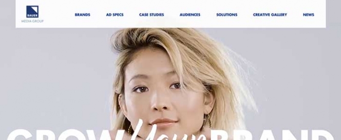
Contrast creates a distinction between elements. It helps create visual hierarchy, scanability and contributes to how easy something is to understand quickly. Elements with strong contrast make it easy for the user to look from one thing to the next, creating a natural visual pattern and user flow.
The reason contrast is so important to user interface design is that it is part of everything you do. How you create contrast varies based on the type of element of visual effect involved.
You can establish contrast with:
- Color
- Size
- Direction
- Space
- Shape
A key element of accessibility guidelines is contrast because it ensures that users can discern one element from another in the design. The A11Y Project, which has a goal of making web accessibility easier, has this recommendation: start with color contrast by using colors from different segments of the color wheel, or contrasting colors. Remember that complementary colors – opposites on the color wheel – provide maximum contrast.
The same concept applies to creating contrast between other elements as well. Pick typefaces from different families or use dramatically different sizes to help users read the words quickly.
Use directional signs, arrows or images with motion to help force the user to look in a certain direction, then flip the directional cue for even more contrast.
The difference between tight and open space creates a lot of contrast. If you want to ensure that your text is easy to see and read, give it a little more space to draw attention to it.
In short, the idea behind contrast is that opposites attract. Elements that are seemingly different can actually work together so that both are easy to see at a glance.
To know if contrast is working in the way you intend, think about a couple of factors when you look at the elements on the screen:
- Readability: Are all the words and images easy to see and read?
- Clarity: Is it easy to distinguish one element from another?
- Accessibility: Does it work for as many people as possible?
- Environment: Can users see and understand the design in the places where it will be used?
Content
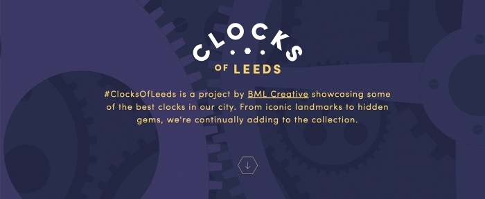

The last of the three Cs is content. The user interface design can only be as good as the information contained therein. Content includes everything from images to text to illustrations and icons to logos and brand marks. Content also includes video and every bit of copy from the full messaging or narrative to blog posts to tiny bits of micro-copy.
All of these elements come together to tell the story of what makes your design and user interface special. Why should users give you their time rather than do something else?
And just having content is not enough. You have to have stellar content. High-resolution content. High-value content. Your content has to be better/bigger/more special than similar content competing for the attention of users.
That can be a tall order, but most designers can create this content by being true to themselves and their brand and messaging. Stick to what you are and what you know. Users will see this authenticity and hopefully value it by spending time with your design.
Conclusion
Now that you are armed with the old three Cs of business — company, customers and competitors – and three Cs of user interface design – color, contrast, and content – you have the tools and knowledge to create s design project that’s out of this world good. (Or at least highly usable.)
By working both strategies into design projects, you are forced to think about how to create something that will benefit the website owner and the user. You are creating not just so that the design is beautiful, but also so it is functional.
Note: All of the examples in this article are from the Design Shack Gallery. Make sure to take a look around; it’s full of great work and inspiration.


