The tiniest bits of text on your website can have the biggest impact. Microcopy includes all of the instructions, labels, navigation, tooltips, error messages and call-to-action language that helps users actually use a design.
Microcopy can aid navigation, and be the final element a user reads before clicking a button. (It’s easy to understand why these words are so important.)
Microcopy is often neglected though, in the website design process. Often “click here” is just slapped on a button and it’s done. But well-thought-out microcopy can make your website better. Great microcopy can even help boost retention and conversion rates among users—and that’s something every website owner can appreciate.
So how do you do it? Here are ten tips for getting started down the road to writing great microcopy.
1. Show, Don’t Tell Users What to Do

Great microcopy helps users do something without really having to think about it. That’s why “click here” is such a popular term.
But you don’t have to use that. Use words that tell users clearly what is going to happen. Microcopy phrases that are commonly used in clickable elements include learn more, read on, buy now, get information, download, submit, etc.
Each of these words is clear and users will likely know exactly what should happen next when they click. (Just make sure that’s the action that actually does happen.)
As for other microcopy, think about ways to use it that benefit the user. Navigation, for example, is a place where microcopy can help your website design. Good navigational words can tell users where to go, help explain what your website is about and provide search and SEO cues for crawlers. (So you better take care in what words you use.)
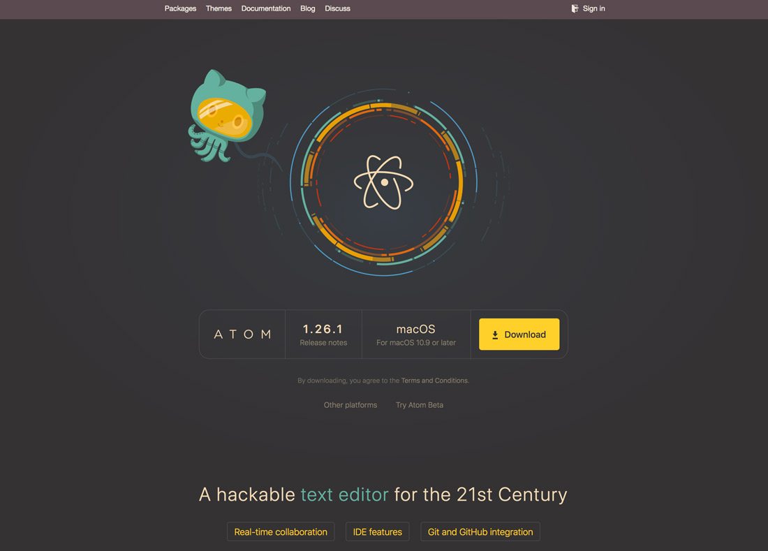
Note how Atom, above, uses a button with the word and icon for “Download.”
2. Keep Microcopy Concise
Microcopy gets its name because these are often the smallest words on the screen in terms of size. But they might also be the shortest phrases as well.
Keep instructions and microcopy short and to the point. Long explanations aren’t necessary for most user interactions, and too much explanation can be overwhelming. If there is a short and easy way to signal an action or use, do it.
3. Important Copy Should Always Be Visible

Don’t use tooltips for vital information.
There are two types of microcopy – elements or instructions you always see, and those that appear as needed. The latter often appear in the form of tooltips, hover boxes that can enhance usability for certain design elements.
But be aware that not all functions should hide inside this hover state. Any important or vital microcopy should always be visible to users, such as what information to include in a form or what will happen when they click a button.
A tooltip-style bit of microcopy is appropriate for additional information, such as explaining what happens if a user needs help. (Such as a small ? icon next to instructions; the icon is a signal that the user can find more information if needed. Hover over the icon, and that microcopy appears. This is an appropriate use of hidden microcopy.)
4. Match the Tone of Your Website
While the language for microcopy should be pretty straightforward, it can (and should) match the tone of the complete website design.
This is a delicate art and only works when users still understand what to do.
5. Avoid Jargon

While you can match tone, stay away from jargon inside microcopy.
Jargon in your copy can get confusing fast and presents challenges for search engine crawlers as well. Avoid it.
6. Use Alt Info for Images
This isn’t writing the exact microcopy, but it matters. When uploading user interface elements that will contain microcopy, make sure to include alt information for image and icon files.
This can help search and aid usability for some users. (This can be particularly important for users with connectivity problems or those who are using speech-browsing features.)
Think of it like this. If you can’t see the button or icon and the alt information tells you that it is a button of a shopping cart and the microcopy is “buy now,” you understand the action that will occur. It’s not hard for you to do this as you build the design, but it can make a huge difference for some users.
7. Provide Appropriate Options

Microcopy usage extends to elements inside a list of dropdowns or bullets as well. When it is appropriate, make sure to include options for users to increase the chances of a conversion.
One of the most common uses of this comes in ecommerce. Note how often there’s a form with a button that asks you to enter payment information, but right below is a line of explanation that you can review the purchase one more time. That’s an extra level of microcopy that gives the user a choice and helps them understand the process more fully.
If you use email marketing software the same choice is also apparent. Most programs include an option to “send now” or “schedule for a later date,” when an option is selected the user gets a confirmation of the choice they made.
8. Place Text In the Right Location
Microcopy locations need to fall in normal reading patterns. Most users read left to right and top to bottom. Try to incorporate these patterns with microcopy placement.
Let’s use an email signup form as an example, there should be a box to enter an email address and the submit button, should be to the immediate right of the signup or directly below it because that’s where a user would look next.
Use placeholder text with high contrast so they are easy to read. If the text is so faint that it’s difficult to read, do you really need it at all? Maybe that placeholder copy should be deleted altogether.
9. Use “Live Text”

Text that is actually an image is a problem on multiple levels.
The image isn’t actually readable by search engines or screen readers (think about accessibility) and can render unreadable in certain responsive environments depending on how the image scales.
All copy, including microcopy, should be live text so that every element is readable and scales to ensure that users can see and understand it with ease.
And while we are tackling the issue of live, readable text. Make sure that all microcopy includes enough contrast so that it is easy to see. It’s such a small thing, but if you pay attention, you’ll be amazed at how many designs use low-contrast labeling.
10. Include Success and Error Messages
Great microcopy isn’t often a one-step process. It’s often a series of messages that relate to one user action.
Depending on what that action is, you should include microcopy that confirms that an action was completed or shows an error message when an interaction fails. This provides valuable feedback to the user and helps them complete tasks on your website.
Conclusion
Crafting great microcopy isn’t that hard when you think about what you want users to do with your design and how you want to do it. Think of microcopy as a super-streamlined instruction manual.
Remember to use common language that’s short and understandable, provide clear instructions and make everything easy to read. Do those things and you’ll be on the path to creating great microcopy.


