Monotone color palettes have always been popular. It’s a classic colour scheme that never really goes out of style. Most recently, we’ve seen plenty of white or dark monotone palettes dominate this style.
But there’s a new take on monotone colors that’s trending: mono gradients. Here’s a look at the trend and how designers are making the most of it.
We’re sharing different examples of mono gradients in action, and sharing tips for how you can use it in your own designs.
What is a Mono Gradient?
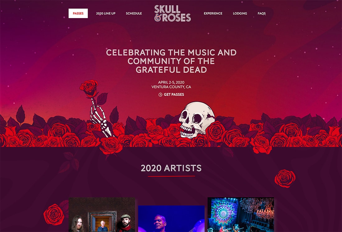
Mono gradients are just an extension of using a monotone color palette.
Two colors that are similar in hue and saturation are used to create a fade that can be used in the design. The mono gradient might be subtle, such as two blues that you almost don’t see the fade, or more distinct, such as the red to purple gradient above.
Mono gradients are an extension of two trends – monotone color palettes and use of gradients. It’s almost a natural evolution of these design trends. And the result can be quite stunning!
Traditional Monotone

A traditional monotone gradient is a fade between similar colors. (Click through the example from Quadangles, above, to see four different mono gradients – red, blue, green, and pink.)
The beauty in this simple gradient is subtlety. Depending on the variation of hues, the gradient can be so soft that you might not notice it at a glance. (And that’s ok.)
This style of mono gradient can work for a lot of things from the background color to button fill.
Multiple Mono Gradients
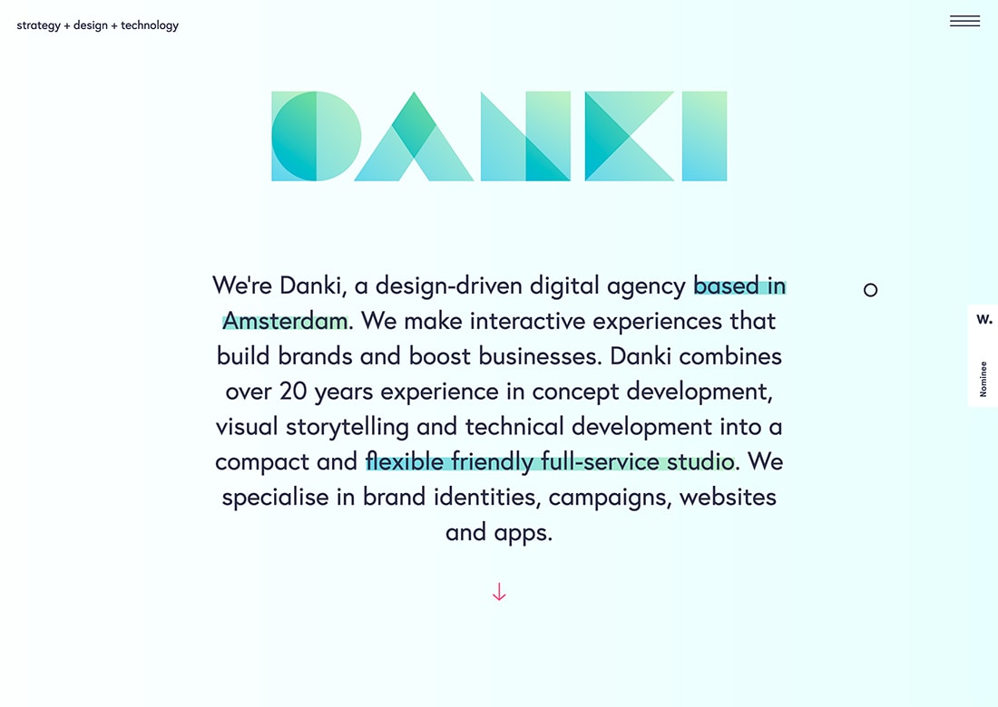
Mono gradients can be interesting enough to combine and layer in a design.
Danki uses a mono gradient in two ways in the example above.
- As a mono gradient accent to highlight key words and phrases in the text
- With an overprint effect to create multiple degrees of color with the mono gradient
Both uses have a beautiful simplicity that’s interesting and does not overwhelm users. (The green color choice is exceptionally nice as well.)
Mono Gradient as an Accent

A mono gradient element can be a complementary accent in a fully monotone color scheme.
EPR Solutions does this with a blue design that includes a mono gradient inside the tablet screen. The mono gradient helps draw the eye with a little extra color – and also motion in this example – to create a flow through the design.
This design uses that same concept with other colors throughout the scroll. (You should definitely go take a look, the different uses of mono gradients – black and violet – are exceptionally well done.)
Mono Gradient Overlay
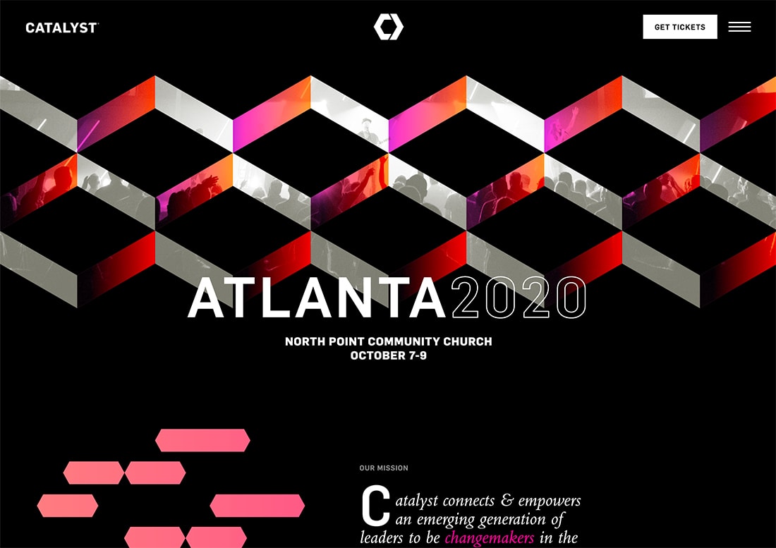
Gradient overlays were a trend of their own at one time. Many of these designs included bright hues with an almost rainbow style to them.
Today’s gradient overlay is more subtle with a mono color scheme – even if the hues are bright, such as the example above.
This style of mono gradient can work as a full image overlay or for smaller parts as you see here. On this scroll, this design uses the gradient overlay for other full photos to create impact.
What’s nice about a mono gradient overlay is that it can add a little more pop to photos that aren’t quite doing the trick for the design; it can create a distinct eye-tracking path with color, and help tie a brand to an event or new design.
And it’s fun. Play with different brand colors uses for a gradient overlay with photos or videos in your design.
Mono Gradient with Animation

This might sound like a lot going on at once – a monotone gradient and animation. But you can make it work.
In the example above, the mono gradient is a pale yellow that fades into the white background. It spins and has a pulsing yellow overlay in the center. While a lot of things are happening here, the color choice saves the design.
Because the yellow is soft and the rest of the design is very simple, it doesn’t overwhelm you at all.
Mono Gradient Background
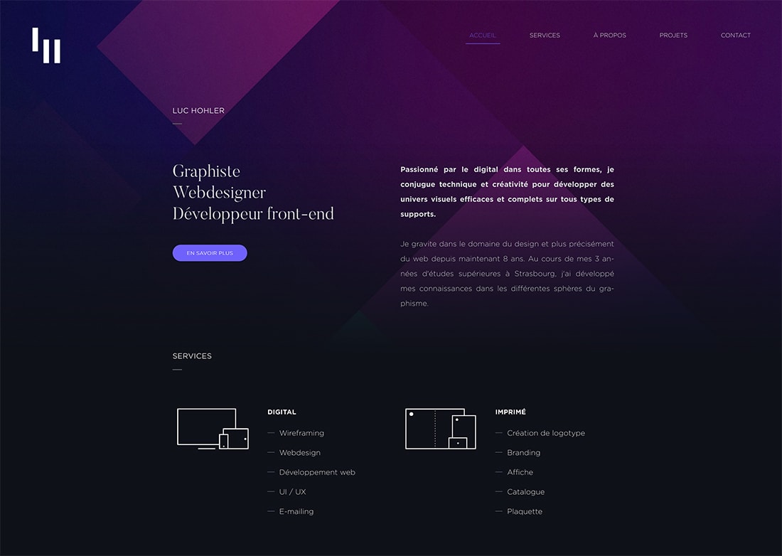
Gradients aren’t the easiest thing to use when it comes to a background color scheme. That’s often due to variations in color that can make foreground elements difficult to read (particularly text).
A mono gradient solves this problem. Using a monotone palette will ensure that the background has a dark or light feel, making contrasting text in the foreground a lot easier to accommodate.
You get the visual interest of a gradient without the challenge of readability.
Luc Hohler does a nice job of this with his portfolio website, above. Monotone gradient blocks create a nice background pattern that has more depth than if he had options for a single mono gradient for the full canvas.
Almost-Mono Gradient
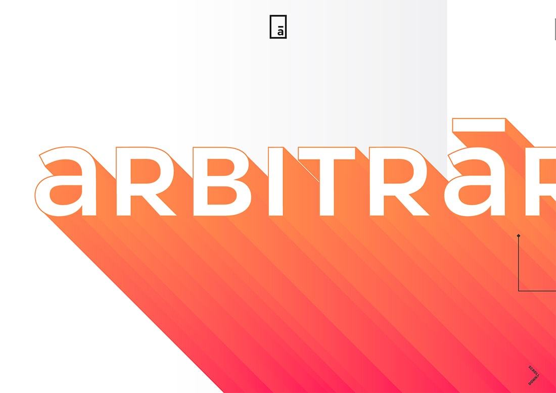
You can’t miss the gradients for Arbitraer.
The orange to red gradient isn’t quite a mono gradient, but it is close. (Keep scrolling and the design offers a few more almost-gradient pairs.)
It’s is a little bolder than some of the purely mono options above, but isn’t in that more rainbow style that we’ve seen either.
What keeps this color scheme in the mono gradient family is the use of colors that are close on the color wheel and have similar saturations. The colors bleed into each other naturally as you would expect for any other mono gradient.
This option can be a little more of a challenge to use because you may have to use colors outside your brand palette or consider how to incorporate other elements with bolder hues. As this design shows, it works nicely with a more minimal design that doesn’t have much color elsewhere. (That can be said of many mono gradient styles.)
Conclusion
Mono gradients are a fun design trend that we are seeing a lot of right now. There are plenty of ways to use them.
Most notably when looking at these designs collectively, is that many of them don’t feature other art elements (images, videos, or illustrations). This technique is strong enough in most cases to stand on its own and can be a good solution if you are contemplating an art-less project.


