Your web form might look good, but does it convert? A high-converting web form is a must if you want to capture user information, build a subscription list, or create a quick checkout experience. It isn’t enough just to have a form that looks inviting. It needs to function well!
Users are getting more and more spoiled to well-designed and functioning forms, leaving little room for those that are clunky, awkward, or just don’t quite work.
So how do you do it? Here are five tips for creating a web form that will help convert users and grow your online presence.
1. Design a One-Column Form
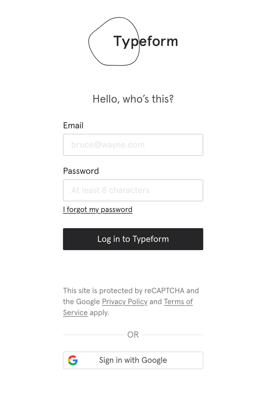
You know that users have short attention spans. Designing a one-column form can help you win the war against distractions.
A study by the CXL Institute found that users could complete a one-column form 15.4 seconds faster than the same form with multiple columns. That’s an eternity when it comes to website interactions, making using a one-column form a no-brainer.
But it makes a lot of sense when you think about the design as well. Multi-column forms get confusing because users don’t always see the logical pattern to tab from one field to the next, it can be easy to skip fields or leave out information, and multi-column formats can be a challenge on smaller (particularly mobile) screens.
All that boils down to one easy design rule for forms: Keep everything in a linear, vertical format.
Below the last element on the form the call-to-action button should be on a line of its own and large and easy to see. (You don’t want to miss that interaction!)
2. Guide Users with Copy and Space
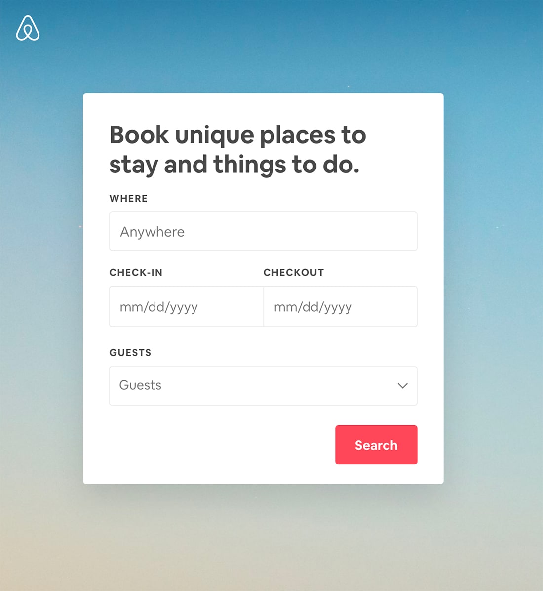
Solid copywriting and spacing can make or break form readability.
In terms of design, focus on four things.
- Make sure every bit of copy is useful, short, and tells users exactly what to do. There’s no need to get cute or over-explain with the copy.
- Include placeholder text to make each field a little less confusing for users.
- Space form elements far enough apart so that each field is clear and easy to fill in. Remember to make the boxes big enough to tap with ease on mobile devices.
- Finally, use a common notation, such as a red asterisk, to note which fields are required. Don’t make users get to the end, only to find out they missed the required fields. That can be frustrating and lead to form abandonment.
3. Don’t Ask for Anything You Don’t Need Now
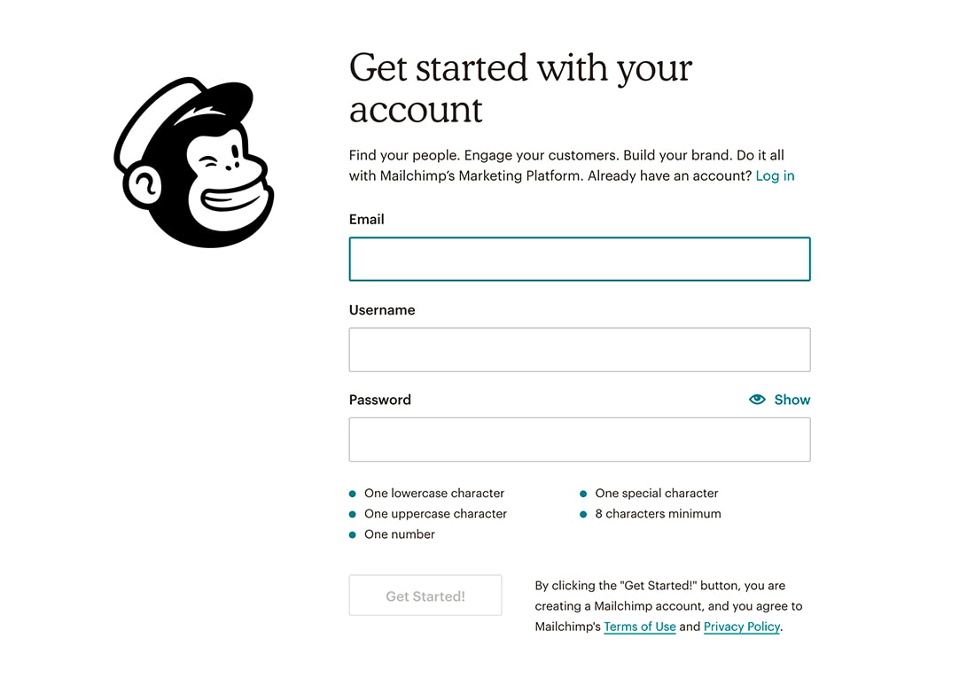
How much information do you need right now? The answer depends on what part of the marketing funnel you are in, but chances are you are asking users for too much information.
If you are looking to generate new subscribers to an email list, do you need more than an email address right now? (You can follow up with additional information later.)
If you are asking users to register for website access, do you need a full personal history? (Start with the basics, don’t ask users for an address if you never plan to ship anything to them.)
If you have a checkout form, do you really need users to select a card type? Or enter billing and shipping addresses? Eliminate fields that aren’t absolutely necessary and enable checkboxes to consolidate fields when possible.
Another option here? Use auto-detect and predictive search where possible.
4. Use Field Validation
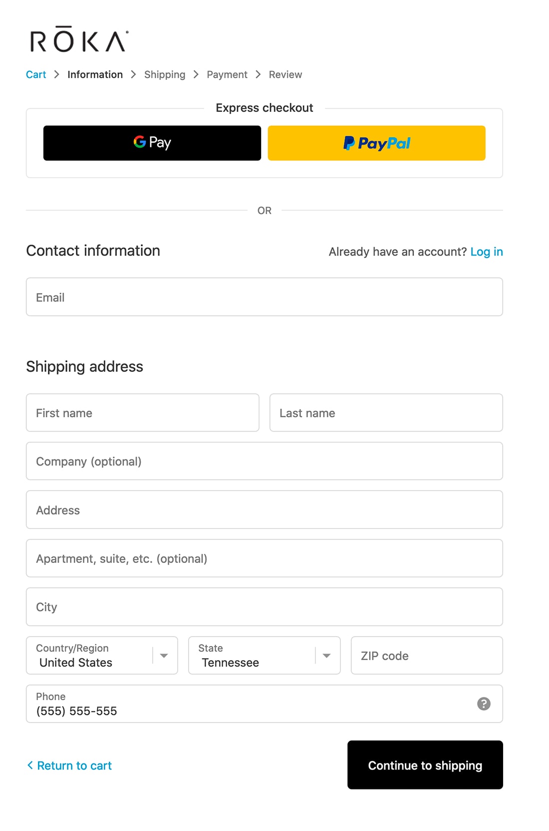
Field validation can help show users an error before they move on to the next field. Validation ensures that the right kind of content is entered in the appropriate field, such as an email address in a field for emails.
The smarter your form validation, the better information and leads your form has the potential to generate.
Allow some wiggle room as well in validation so that you don’t frustrate users.
Think about phone numbers, for example. A standard 10-digit phone number could be entered in different ways:
- (000) 000-0000
- 0000000000
- 000-000-0000
But which one is correct? With a little programming finesse, all of them work equally well. (Use this same concept for dates.)
Validate for common domain email addresses, such as gmail.com, yahoo.com etc. so that if they are misspelled, it will alert the user.
Other form tricks include setting defaults for common user groups, such as a country or state if most of your users come from a specific location.
Finally, use tooltips for validation errors so that users know right away that something is wrong. Don’t make them hit submit only to find a typo or validation error. Do everything you can to make providing information as easy as possible.
5. Have Fun
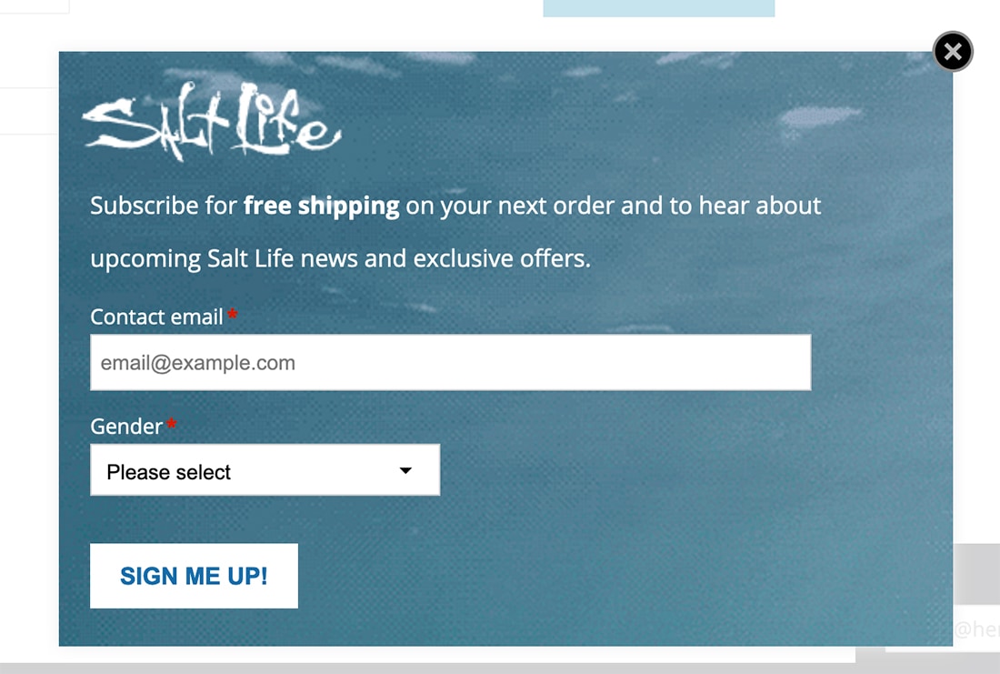
Website forms can actually be fun. (This is not a joke.)
While many forms tend to be simple, a form type that often goes neglected is the survey form. Simple questions with easy answers are the most likely to convert.
I recently sent a survey to event respondents with an A/B test. Some were asked to rank the event on a scale of 1 to 10. Others used an emoji scale from a sad face to happy face. The latter got 50% more responses. It was a lot more fun!
Other ways to make form design fun include using inviting and actionable language in the copy surrounding the form. What are you saying to entice people to consider filling it out?
Design elements can help draw users into the form as well. While many forms might pop-up or slide-in, the design should be disruptive enough that it doesn’t blend into the rest of the background. People need to see it before they will consider interacting with it. The Salt Life pop-up form, above, includes a moving water animation.
For more complex forms, put them on their own page within your website design. Simplicity is key. That also pertains to cognitive load; fewer things on the screen at once are easier to process and digest.
Conclusion
Forms are an essential web tool and can help every phase of the marketing process, from initial contact in the form of an email subscription to making a purchase. As with any other website design tool, the key to prolonged success is keeping an eye on forms to figure out if they are working.
Track analytics, signups, and conversions for forms to ensure that your design is resonating with users. If a form isn’t resulting in the desired action, do some testing with the design and function to make sure it communicated what you are asking for and works properly.
Good luck!


