Better contact form design starts with usability. The goal of a form is obvious: you need information from the user. The form has to be intuitive enough so users know exactly what to do and don’t get sidetracked in the process of completing that action.
The best contact forms are easy to look at and include highly usable elements that users can engage with without thinking about them. (It sounds a little easier than it is sometimes.) But thankfully, we have a selection of tips to help you design better contact forms.
1. Make It One-Column
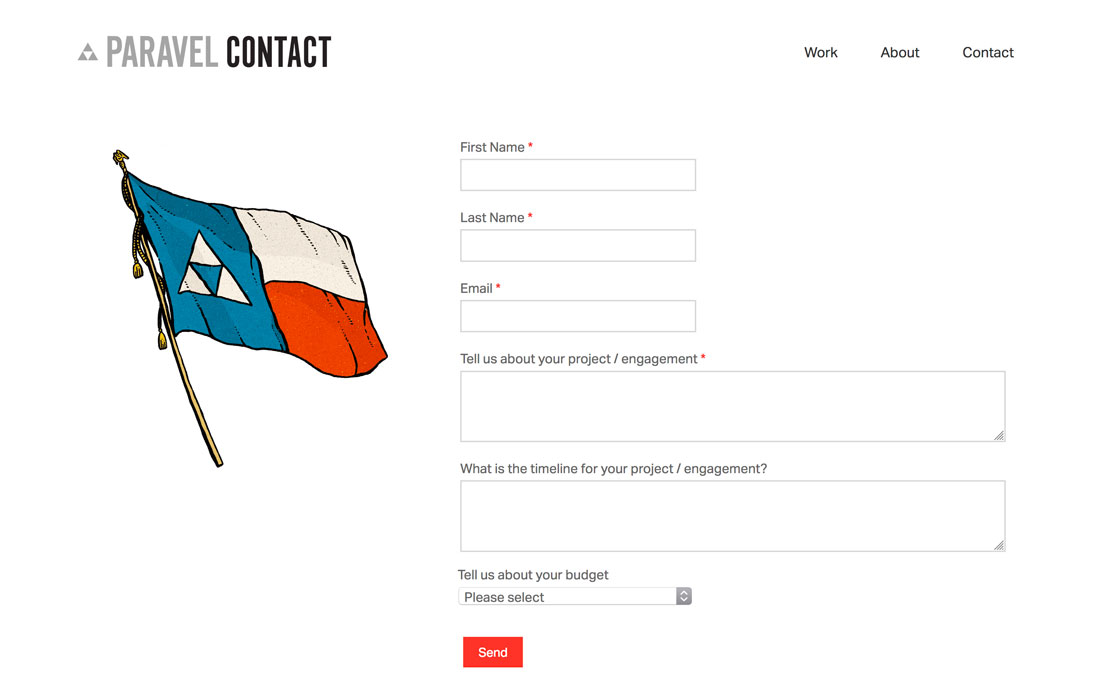
What’s easier? Tabbing through a form vertically or filling in items across and then down the screen? Creating a form with a single vertical column is the easiest solution for many users because they only have to think about one action – moving down the screen through the form.
The can work for fields that are similar, such as short answer for a name, email address, and phone number. It can also work well for elements such as a checkout screen.
This shape also works better with responsive formats so that the form has the same shape on different devices, providing a more consistent user experience. This can be particularly important with e-commerce or checkout forms because you don’t want the experience varying, creating questions about the validity and credibility of the form.
2. Group Content Logically
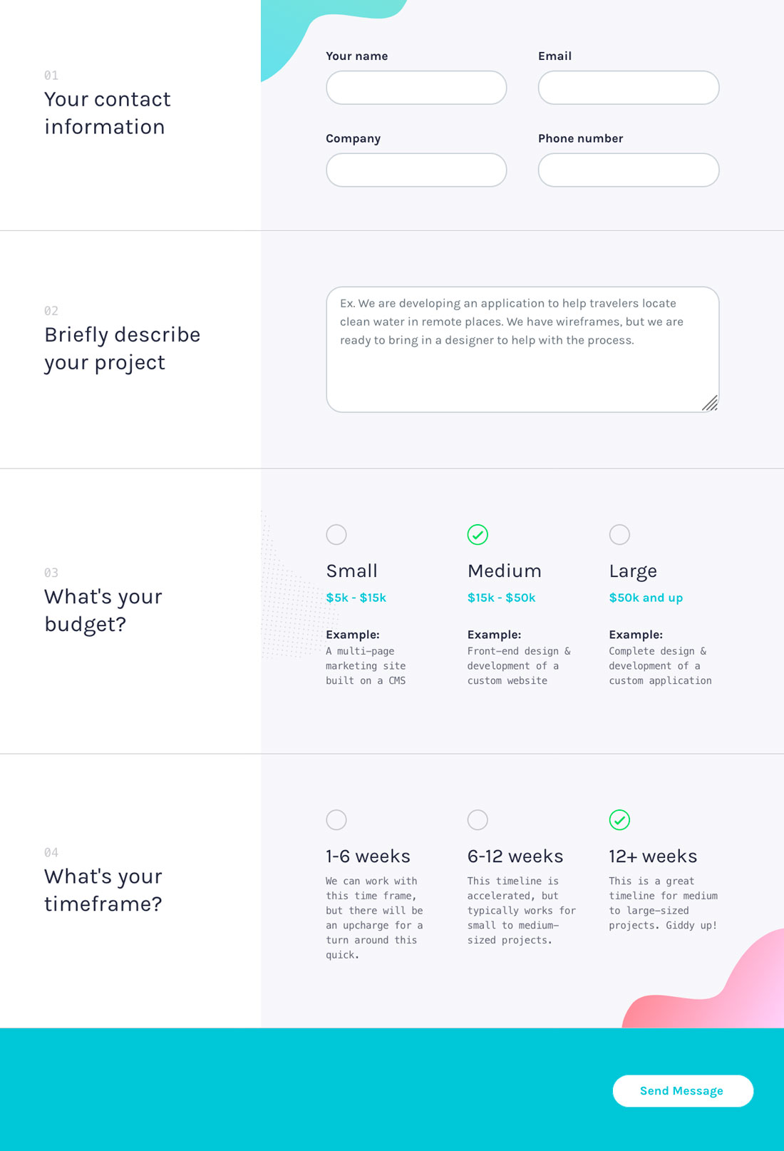
Small, visually grouped blocks of questions or forms fields can make a form easier to understand. Keep similar items together (such as address information or payment fields), and group elements with their labels and any other instructional text. Users should never question what field a label or instruction relates to.
Logical groupings of content create a flow for the form, where users can anticipate what information comes next. This makes the experience easy and enjoyable.
3. Place Labels Above Content
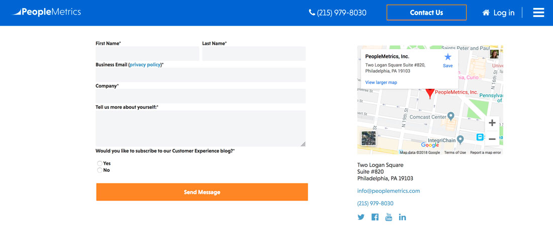
Most form-building tools give you plenty of options for where to place labels or tooltips. Resist the temptation to get overly creative and place labels above the field where information goes. This is the most common—and usable—placement for labels.
Plus, this placement converts easily to other devices. Think about the form on a phone rather than a desktop, for example. If the form comes ahead of the label, you can plan what information to put in the field even before you scroll to it, and that will stick without until the form field is complete. But if the label is below the field, you might get stuck in a pattern of scrolling down and then up again to see instructions and fill out the form.
While this might now seem like a big deal, it can be frustrating to users. And with longer forms, it can result in errors throughout the form. This is a major usability concern in your contact form design.
4. Don’t Ask for Too Much Information
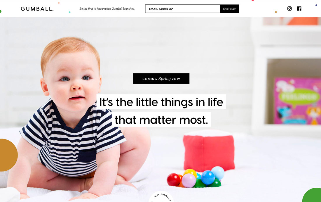
Shorter forms are more likely to be filled out completely than long forms that ask for unnecessary information. (Do you really need to enter what kind of credit card you have on a payment page? The answer is no, the number denotes the type of card, so don’t make users enter this unnecessary information.)
The less engaged and loyal users are, the fewer fields they will accept to complete an action. For new users, it’s OK to ask for an email address. Wait for a confirmation email (once they are a little more invested) or follow-up to expand the information gathered to include a name, ZIP code or birthday.
Short simple forms have higher engagement rates that long, exhaustive contact forms. Design appropriately.
5. Make the Button Obvious
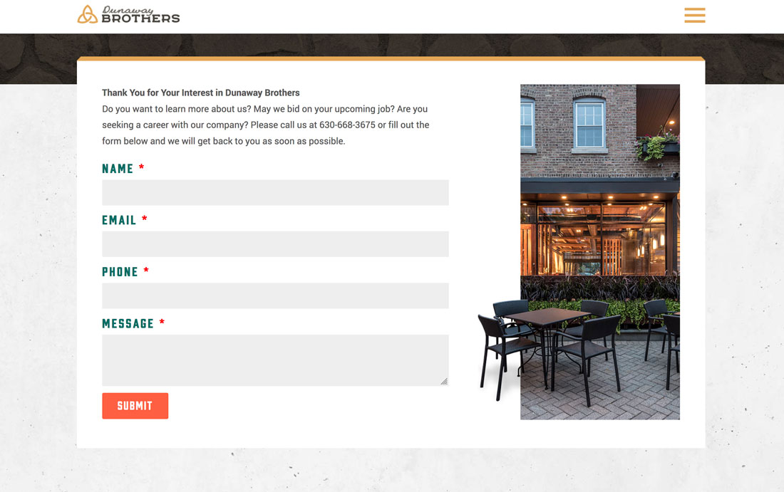
Once the user fills out each field in the form, is the final action obvious? Too often, creating an easy-to-see button is the forgotten step in form design. The button should be clearly visible. Use a color specific to the final button and ensure that the micro-copy within the button tells you exactly what happens (submit, complete payment, etc.).
Bonus Tip: If you use a captcha or another type of human challenge, put it between the last field in the form and submit button. (There’s nothing more annoying than clicking submit only to have the captcha force you to repeat the action… or worse, make you start over.)
Oh, and one more tip that goes without saying… let users know when a form is completed successfully! A simple “thank you” dialog is often enough.
6. Use Appropriate Field Types
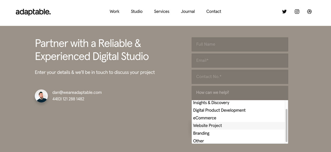
A good form designer knows that one field type does not fit all information. Match the field type to the data being collected to make it easier for users to fill forms out properly. You wouldn’t use a drop-down menu for a phone number, would you?
While this is one of those tips that seems totally obvious, it happens wrong too much of the time.
Think about this field on a contact form: the best way to contact me is by email or phone. Using a button choice makes it clear that the user should select one. Using a drop-down is too complex of an action for an either/or choice. And you definitely don’t need this as a short answer field.
Not only will using the right type of field make forms easier for users, it’ll also streamline your data collection and analysis.
7. Validate Data Where Possible
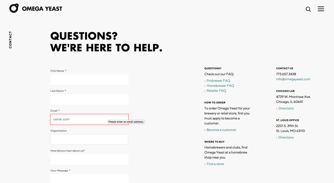
Don’t you just love it when a form tells you about errors as you go rather than at the end? Not only can you see and correct the error, but it saves time and headaches in the process.
Using validation on contact forms is a must. From confirming that an email address follows the proper format, to validating the number of digits for a ZIP code or phone number, these small things can make a big difference.
And if you aren’t doing it, you’re in the minority. A study from the Baymard Institute shows that 60 percent of forms use inline validation. So it’s not just a usability tool, it’s rapidly becoming a commonly accepted user pattern (and expectation).
Conclusion
The two most popular types of forms in website design projects are probably email signups and contact forms. Start by ensuring that these forms are set up properly and tweak the design to make them more usable. (If you notice significantly more engagement, it’s probably working.)
The same concepts can be applied to forms throughout the design as well as surveys, checkout pages, and other data collection. These concepts scale up to meet any kind of website element where the user needs to enter information to complete a process.


