Three-dimensional shapes and geometry add depth and visual interest to the digital space. Maybe that’s why this is a trending website design technique.
While 3D elements in web design aren’t new, using geometry and geometric shapes to create this effect is beginning to explode. It can be a fun and interesting way to make elements seem to jump off the screen for website visitors.
Here’s a look at the trend with some examples to get you thinking about how this design trend (and these techniques) might work in your projects.
What Is 3D Geometry?

It seems like we are constantly trying to make the 2D canvas of a website more real. Three-dimensional effects are one way to do that, and doing it with geometry is a little less complicated than jumping into augments- or virtual-reality.
This trend involves using layers, shadows, depth, and color with geometric shapes to create a 3D effect for elements in the design.
Uses for 3D geometry might include highlighting a key bit of information (such as the example above), providing a visual cue that an element can be clicked or tapped, drawing the eye to a certain part of the screen, creating a more effective visual, or to create perceived motion on the screen.
Regardless of how you do it, you should use 3D geometry in a way that feels natural and realistic. The effect shouldn’t feel overly complicated or forced. It should feel like a natural part of the design that might even be invisible to some users, meaning they don’t think about the 3D nature of the elements at all, but they know how to use and interact with the design.
Shapes and Shadows
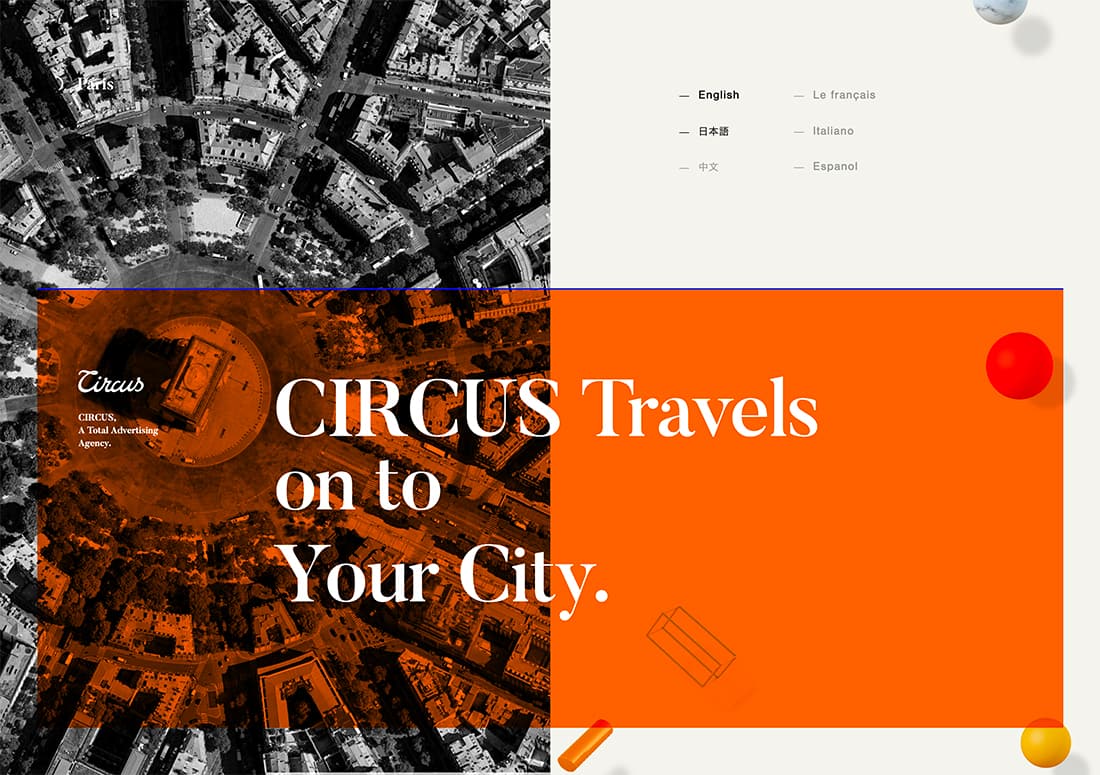
The basic concept of using 3D geometry goes back to grade school. You might remember drawing a simple shape and then adding lines to make it “come alive.” (You can see that basic rectangle sketch in the design above.)
That’s the root of this design trend.
In the design above, shape accents in the form of line elements and full-color shapes – think spheres, cubes, and cones – have shading, shadows, and depth that make them seem more real.
Here, 3D elements serve as accents to keep your eyes moving through the design.
Shading and Animation
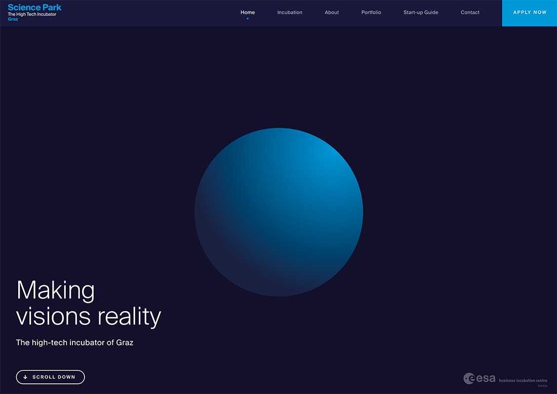
The right combination of coloring and animation can turn a simple shape into a three-dimensional element.
This combination of techniques adds depth to what could otherwise be a flat element. That depth simulates a tactile object that seems like you can grab off the screen.
This concept is described in good detail in the Material Design documentation and might be one reason why this type of element has been growing in popularity. There it is less about 3D and more about interaction, but the idea is the same. https://material.io/design/interaction/gestures.html#principles
It’s all about realistic experiences in the digital space.
3D Illustration
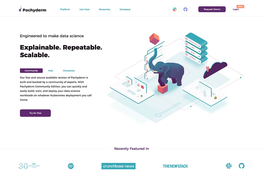
Illustrations can take on a feel of realism with 3D elements as well.
Three-dimensional illustrated scenes (often from “scene generators”) seem to be almost everywhere. These illustrations often use geometric shapes to create additional depth, such as the example above. Note stacks of rectangles and cubes around the elephant illustration.
3D illustrations may or may not include animated elements to further emphasize depth in the design.
Layers
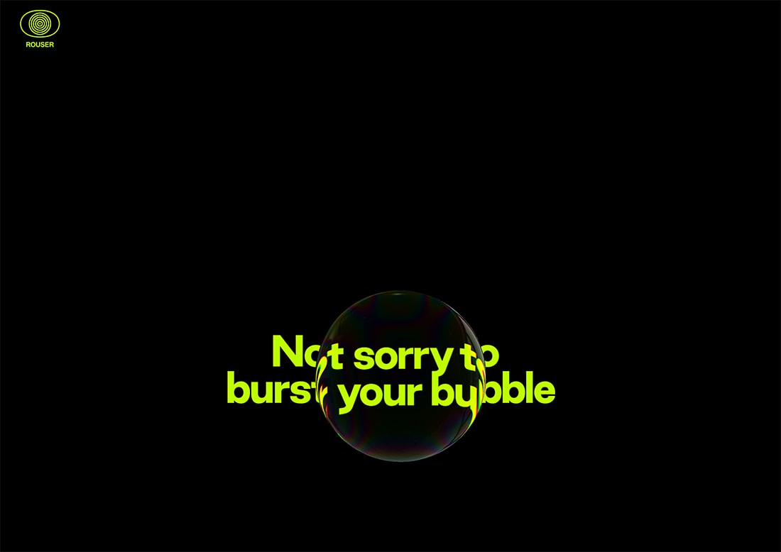
Shape layers can add an element of depth and dimension to projects.
The example above from Rouser, includes a background layer with text and a foreground bubble shape layer. When the top layer crosses the background, it impacts the look of text in a way that mimics what would happen if you had a bubble in real life.
The effect here is almost mesmerizing and establishes a realistic feel, interesting animation, and simple design that encourages users to engage with it. (Scrolling forces the bubble to move over elements faster.)
Shapes and Imagined Planes
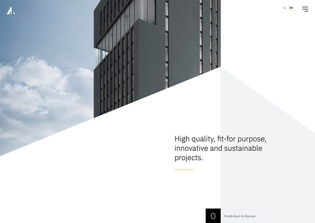
Use shapes that intersect with imagined planes to create a 3D effect on screens. (This is another one of those exercises from grade school. Remember drawing the mountains and roads into the horizon?)
The example, above from Vossemeren, is a great look at how geometry intersects on a plane. Look at how the white and gray triangles come together to imply even more upward motion. Look at it from another angle and the gray triangle might sink or protrude from the design, depending on your perspective.
This combination of color, shapes, and planes creates different variations of 3D that continue to emerge and shift on the scroll.
Make it Obvious
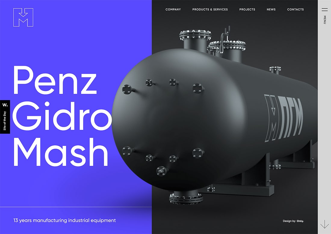
Sometimes a 3D shape is so obvious that you can’t help but see it. Using color and contrast, the round element jumps out of the dark background onto the blue layer in the design example above.
Note the different color techniques happening here to make this come together. There’s lighting on the image that creates degrees of color variation. There are different shadows to mimic that light. There’s the contrast between sharp-edged rectangles in the split-screen design and the round element of the image.
All of these things combine to simulate a real-life element.
Perceived Motion
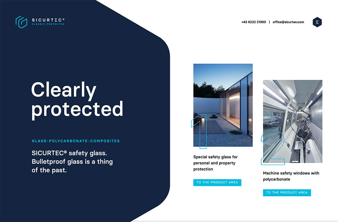
We always talk about creating motion or using hierarchy to help users move across the design.
Geometric shapes can do that in a way that feels natural and realistic without being silly.
In the example above from Sicurtec, the large shape on the left is the obvious focal point, but the eye quickly moves to the right following the shapes on the screen. Placement of the elements then has an almost folding effect so that you are drawn into the center of the screen.
Geometric shapes create a perceived motion that keeps the design visually interesting.
Almost Reality
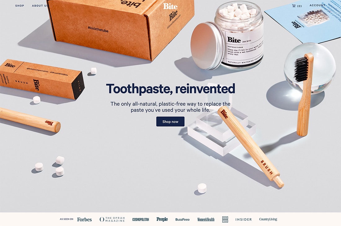
At first glance, the design for Bite looks like a picture. But take a closer look.
It’s a well-planned image that’s packed with geometric shapes and shadows so that the placement of elements look like they would on your counter or table.
Boxed objects are in geometric-shaped packaging. “Glass” cubes and sphere are the props that hold up items so that shadows look realistic.
The simple scene looks real and a bit contrived at the same time, and definitely creates a scene with objects that feel like you could reach out and touch.
Lines and Gradients
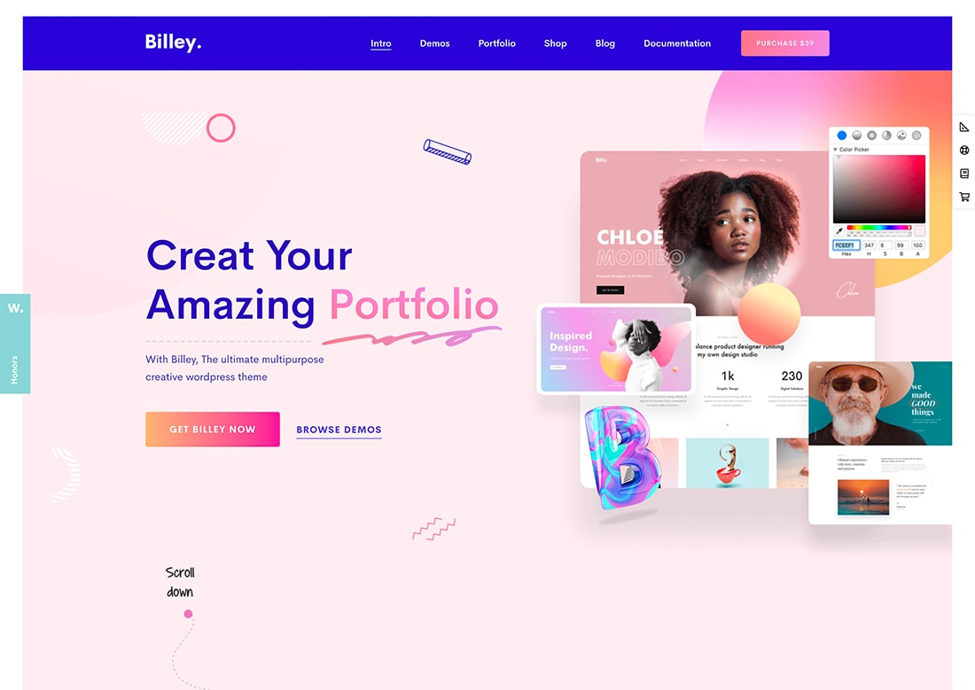
Use a combination of design trends to create a 3D aesthetic. Use geometric shapes, lines, and gradients to create depth and dimension.
Yes, this sounds like a lot at first, but in practice it can work well.
Billey does just this with geometric elements, including line shapes, and gradient coloring to pull it all together. The design also incorporates shadows and hover animations to make it come to life.
Conclusion
The best part of using 3D geometry is that it works with any other brand of design elements you plan to use in projects. Unlike some other website design trends, you don’t have to rethink color or typography choices. You don’t have to reshoot photos or videos, although you might redraw some illustrations.
Moreover, you can use layering and depth to create simple 3D effects that establish a more realistic and tactile approach to your current aesthetic. This is a design trend that almost anyone can incorporate into a project.


