The concept of Fluid Typography was tossed around a couple of years ago. The main idea is that if you know what size your font is at two different viewport sizes, then you can have the font scaling smoothly between the two sizes. We had a jQuery solution for this in FitText (meant of headings, of course) until the calc() function was shipped giving us a pure CSS solution.
p { font-size: calc(16px + (24 - 16)*(100vw - 400px)/(800 - 400));
}
See the Pen Fluid Typography by Martino Stenta (@martinostenta) on CodePen.
The important numbers here are 24px (the larger font up to 800px viewports) and 16px (the smaller font size down to 400px viewports). I wouldn’t use the terms “minimum” or “maximum” to describe font sizes and viewports in this context because it is a little misleading. In fact, you still need to provide a default font size for viewports smaller than 400px and bigger than 800px — otherwise, the font will keep getting smaller (or bigger) with the same scale of the equation. Or, if you are fancy, you could define another scale for bigger screen sizes.
See the Pen Fluid Typography with reset size by Martino Stenta (@martinostenta) on CodePen.
It works really well and you should definitely check the math behind this.
Padding and line height?
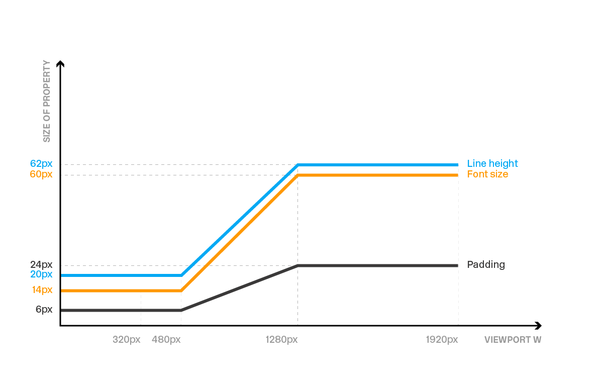
I liked the concept of Fluid Typography so much that I asked myself if it could work with other properties. And it does! You can’t use a percentage, but as long as you stick with px, em or rem units, then it’s OK. I’m a pixel guy, so all my experiments have used those, but there is this neat generatorthat helps you with conversions if you need it.
So, back to padding and line-height. Using the same calc() logic, we can achieve a fully fluid *layout* with fixed values for defined screen sizes.

See the Pen Pure CSS Variable Padding, Font Size and Line Height by Martino Stenta (@martinostenta) on CodePen.
I implemented this idea on this website, but kept it to font-size and line-height. And, yes, it gets easier to look past all that math and put to use the more you work with it.
See the Pen Working Example of calc() on font-size and line-hieght by Martino Stenta (@martinostenta) on CodePen.
A digression about “Hero” components
If you’re like me, then you might take issue with what we all have come to know as the hero component. It’s ubiquitous to the extent that it’s become a staple in design systems (like Bootstrap) and you may have even seen it satirized on sites like this.

My main gripe concerns the best way to make them responsive. If it’s not a *full screen* hero (i.e. takes over the entire viewport at any size), then I usually ask the designer how the page should behave. There’s often a proportion of the hero page that works fine, so that allows me to use padding-bottom in % with absolute positioning of the inner content. That tactic works most of the time,
This is fun and it works fine especially on the desktop version of a website. You end up with a neat hero section, the proportion is good and the content is centered.
See the Pen Standard hero section with ‘padding-bottom’ by Martino Stenta (@martinostenta) on CodePen.
But what happens when you start shrinking the viewport? The hero remains readable up to a point, you really need to change the proportion.
Assuming we are working with a desktop-first responsive approach, we could start with a horizontal rectangle that scales down to the point where we’re left with a vertical rectangle on small screens.

This is a PITA because you could end up with many lines of CSS to have a nice and readable hero section at various breakpoints.
There has to be a better way, right? What if the hero could increase its height while the page width gets narrower?
Back to fluidity!
So, I turned back to the calc() function that worked in those other situations, like making the browser handle the math and scale things accordingly as the viewport changes.
Here’s the CSS from the Fluid Typography example we started with:
p { width: 100%; max-width: 1200px; margin: 0 auto; font-family: 'Open Sans', sans-serif; font-size: calc(24px + (18 - 24)*(100vw - 400px)/(1200 - 400)); line-height: 1.5; padding: 10px;
}
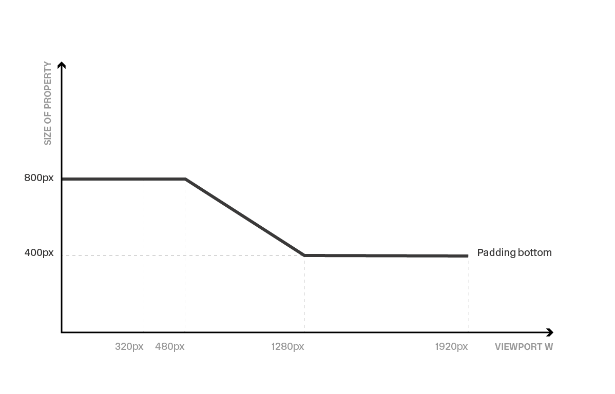
Here’s what we want: a hero component that gets bigger while you shrink the page. I used pixel units for the fluid part and percentages everywhere else.

Here’s a screencast of how the solution I landed on:
This is pretty useful when you want to give more vertical space to the text. Shrinking the viewport width from large to small will end up having more lines for the same text, since the font size can’t be too small.
See the Pen Hero section with calc() by Martino Stenta (@martinostenta) on CodePen.
Pretty nice, right? Yet another way calc() proved it could solve a scenario for me.
Yes, there are some caveats
Browser support is very good, tallying almost 93% of the users (at the time of writing), with the main exception being Opera mini.
This browser support data is from Caniuse, which has more detail. A number indicates that browser supports the feature at that version and up.
Desktop
| Chrome | Opera | Firefox | IE | Edge | Safari |
|---|---|---|---|---|---|
| 19* | 15 | 4* | 10 | 12 | 6* |
Mobile / Tablet
| iOS Safari | Opera Mobile | Opera Mini | Android | Android Chrome | Android Firefox |
|---|---|---|---|---|---|
| 6.0-6.1* | 46 | No | 67 | 69 | 62 |
Also, remember that this calc() technique supports only px, em, and rem units. But the examples we covered here are pretty easy to convert units for things like padding-bottom percentages to pixels since the hero is typically 100% in width.
Oh! And remember to reset your values before and after the breakpoints in the calc() function. Otherwise you’ll end up with either very big or very small values for the target properties.
What say you?
This is probably just one way we can handle the situation and it was primarily driven by my interest in the calc() function. So, that begs the question: how have you handled scaling hero component height? Have you put calc() to use for it? Do you prefer wrangling breakpoints at various widths? Is there something else you use? Light up the comments!
The post Fun Tip: Use calc() to Change the Height of a Hero Component appeared first on CSS-Tricks.


