Ultra Violet. It sounds like the name of a pop band. Pantone’s Color of the Year for 2018 is inspired by music and art and individuality.
The color is reminiscent of Prince’s famous purple and it is part of a growing trend in design to use bolder, brighter colors in more projects. Here’s a look at Pantone’s color of the year and how you can use it in your projects.
About Ultra Violet

The color of the year is Pantone Ultra Violet 18-3838. Ultra Violet is a deep purple, evoking a feeling of royalty and creativity. (Something designers will surely like.)
Here’s what Leatrice Eiseman, executive director of the Pantone Color Institute, has to say about the color selection: “We are living in a time that requires inventiveness and imagination. It is this kind of creative inspiration that is indigenous to Pantone 18-3838 Ultra Violet, a blue-based purple that takes our awareness and potential to a higher level. From exploring new technologies and the greater galaxy, to artistic expression and spiritual reflection, intuitive Ultra Violet lights the way to what is yet to come.”
While that sounds like a tall order for a color, it shows the complexity of purple, in general. The color isn’t one that’s commonly the basis for design projects because of these complexities. But with a color of the year designation and more projects trending toward brighter color palettes, Ultra Violet is likely to pop up in projects everywhere.
The selection of Ultra Violet follows 2017’s Greenery (Pantone 15-0343) and a pair of colors in 2016 – Rose Quartz 13-1520 and Serenity 15-3919.
Color Swatches
- Pantone: 18-3838 or 2096 C
- RGB: 101 R, 78 G, 163 B
- CMYK: 76 C, 75 M, 0 Y, 0 K
- HEX: 654EA3
Pantone made Adobe files available for download using Ultra Violet.
Color Meanings
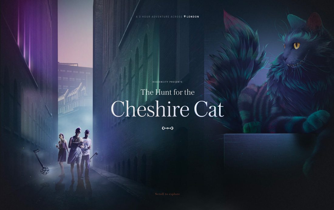
Purple has meaningful color associations. The color isn’t all that common in nature – or design color palettes. The color is thought to be meaningful, royal and majestic.
From the world of science, purple is the most powerful visible wavelength in the electromagnetic spectrum.
Color meanings include:
- Light purples, floral and romantic
- Dark purples (such as Ultra Violet), decadent and mysterious
- In some cultures, purple is the color of mourning
- Younger people see purple as happy and light
- Older people often associate purple with negative undertones
The tough thing about this color when it comes to design projects is that people often feel strongly about purples. They either love or hate the color. There aren’t a lot of people who will be indifferent about it, making it important to think about your audience before diving into a purple color scheme.
Here’s how Pantone describes it: “Enigmatic purples have also long been symbolic of counterculture, unconventionality, and artistic brilliance. … Nuanced and full of emotion, the depth of Pantone 18-3838 Ultra Violet symbolizes experimentation and non-conformity, spurring individuals to imagine their unique mark on the world, and push boundaries through creative outlets.”
How to Use Ultra Violet in Print and Web Design
Purple is not a color you just slap in a print of web design project and hope it sticks. Use of the color should be planned and intentional. The good thing is that there are a lot of ways to do it well.
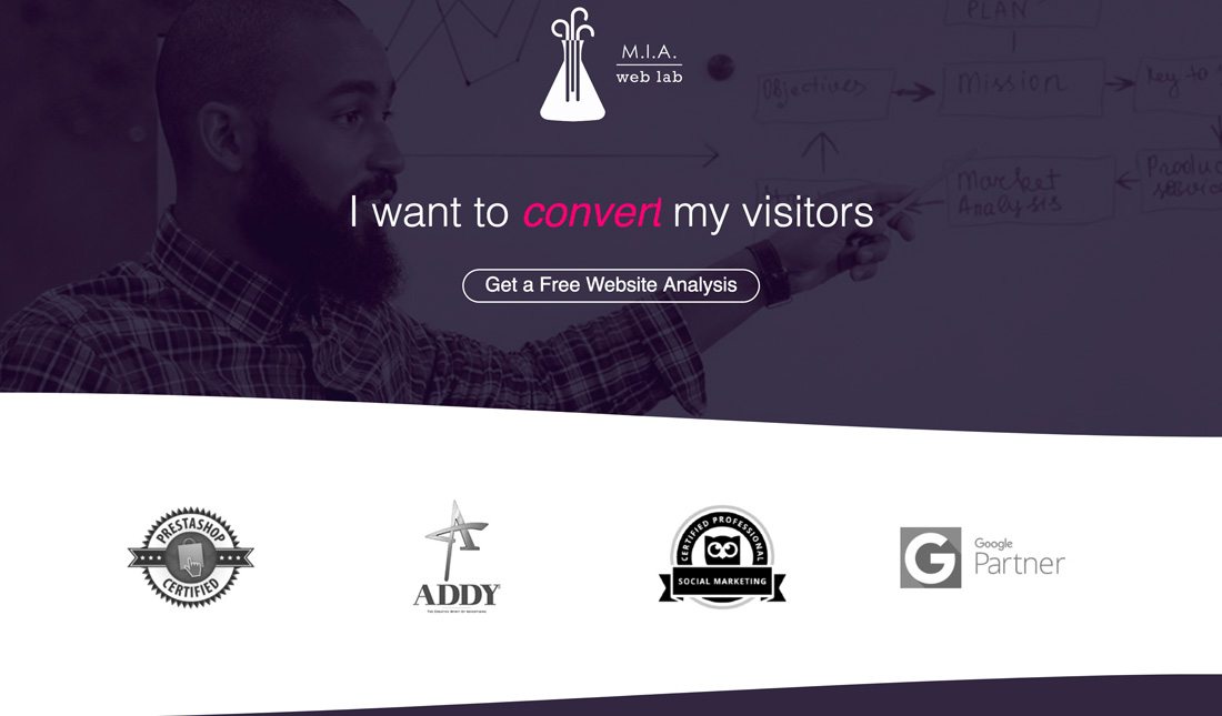
M.I.A. Web Lab uses a purple overlay and border to create visual interest. The grayish tone to the purple helps set the animated text out so that users see messaging right away.
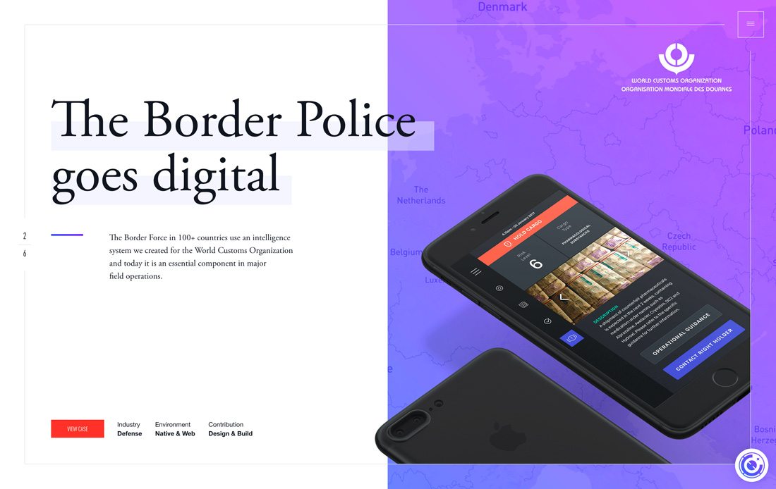
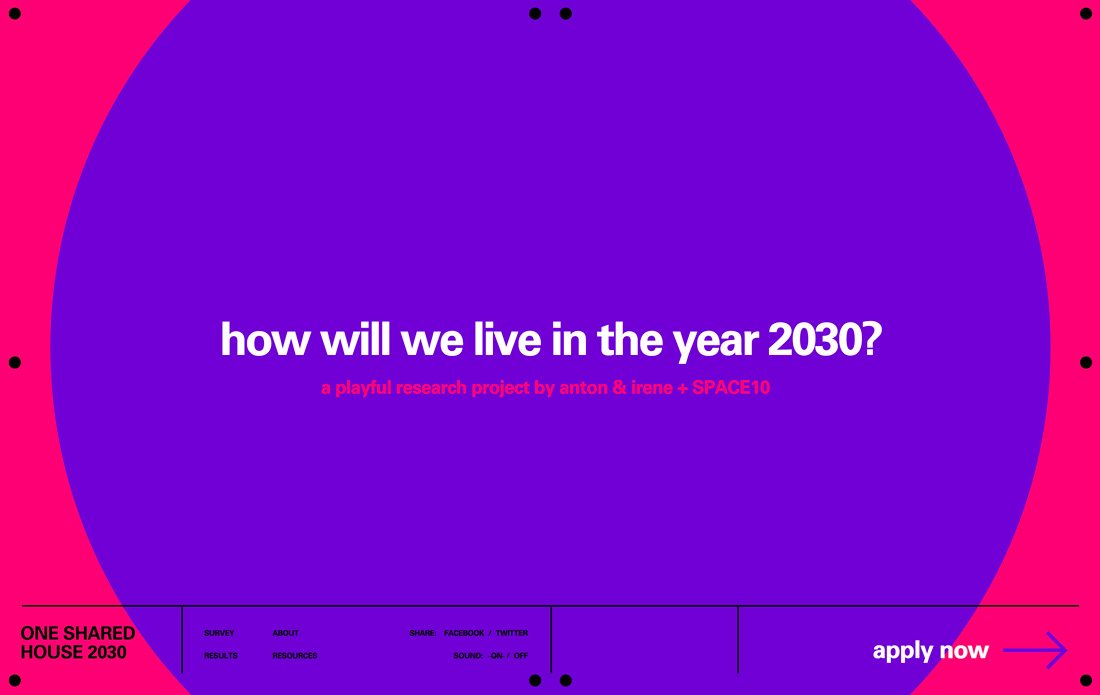
Use purple as part of a fun or trendy gradient design. By fading purple into another color, you can soften some of the emotional connections people might have with the color.
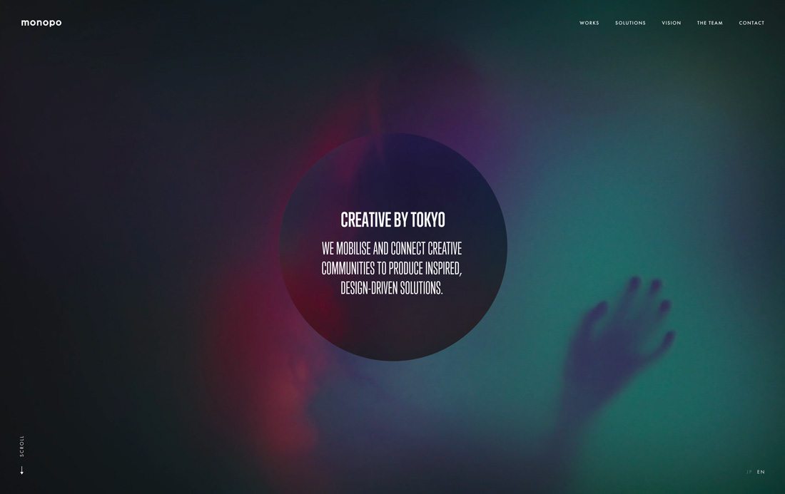
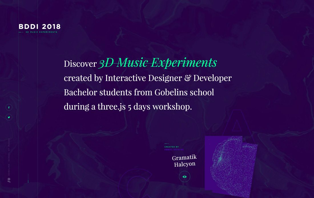
Take full advantage of the mysterious associations with the color to create something interesting and different. The color is associated with creativity and Creative by Tokyo takes full advantage of that concept with purple-hued video B-roll in the background.
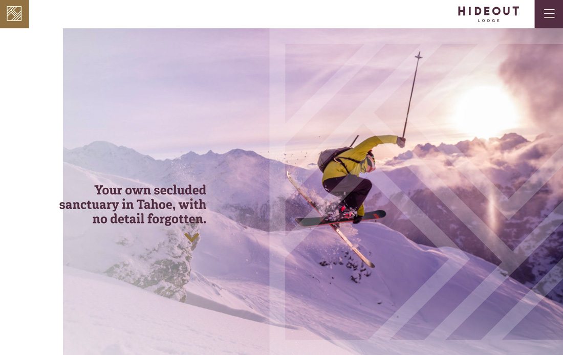
While purple isn’t really a “natural” color, shades of it do appear in some images and environments. Take advantages of purple in images and video to use the color without completely changing your design’s color scheme.
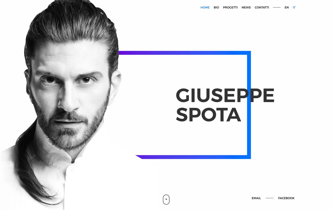
Purple can be a great accent color and makes a solid impression on a simple background. Guiseppe Spota uses a purple to blue gradient to draw users into the design effectively. The color is interesting enough that it can be a draw on its own.
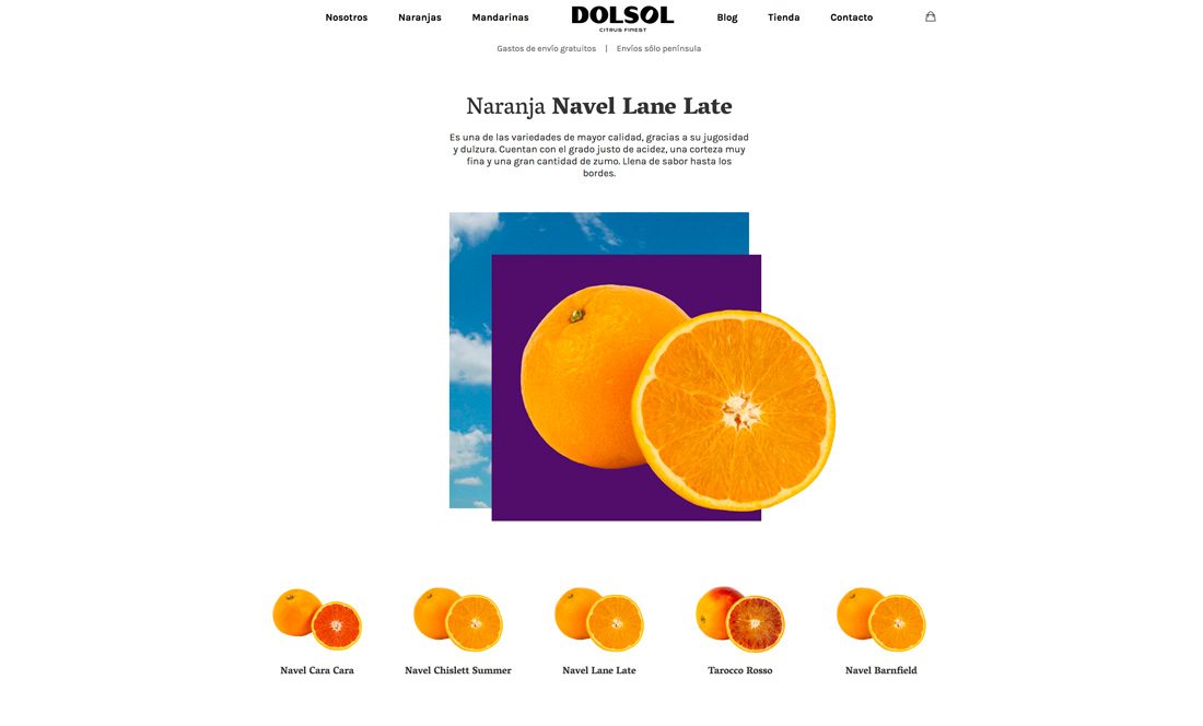
Purple works well to create an element of contrast because it isn’t often a part of the color scheme in other ways. Purple can help oranges and greens come alive thanks to plenty of contrast.
Inspiration from the Design Shack Gallery
Don’t get locked in to a deep purple, just because it is the color of the year. Use this as a springboard to try different variations of the color and adjust the trend to work for you. Here’s a little inspiration from the Design Shack Gallery. https://designshack.net/gallery/
Ema Toader
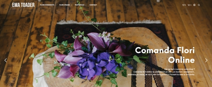
Tanaiska
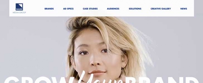
Bauer Advertising
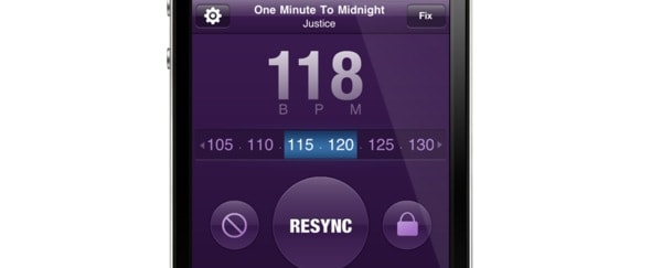
Synchstep
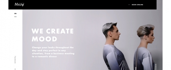
Maija
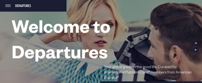
Departures International
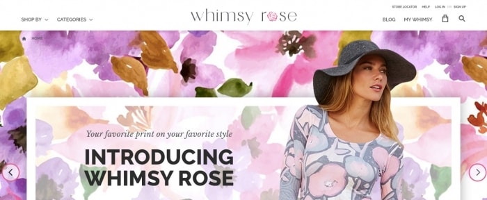
Whimsy Rose
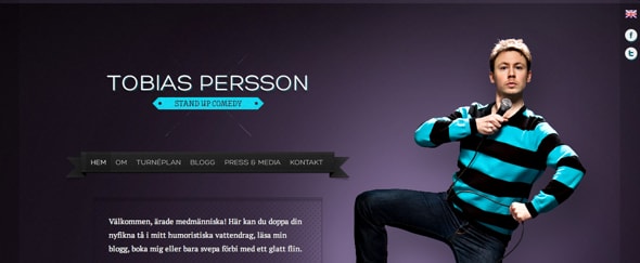
Tobias Persson
Conclusion
So, I’m pretty excited about this color of the year selection. Purple – particularly deep purple – has been my favorite color for a long time. But it is hard to sneak it into design projects. My hope is that Pantone’s selection will help more people open up to the idea of using purple in design projects.
How do you feel about this color of the year choice? Will you try to use Ultra Violet in your projects? I’d love to see them. Tweet links to us and tag me and Design Shack.


