When was the last time you updated your design portfolio? (If you’re like me, it’s probably been a while.) Maintaining a fresh portfolio is a good way to show off your skills to potential clients and can be helpful when looking back on work for annual contest entries.
If you’ve fallen behind with your portfolio design, or just need a new portfolio in general, this is a great opportunity to create something using trendy techniques and visuals.
A modern portfolio using design trends can make a great impression. Not only can a good portfolio design show off your work and what you do, but the portfolio itself is also a representation of your skills—so design wisely! Here’s a look at some of our favorite portfolio design trends for 2018.
Plenty of Space
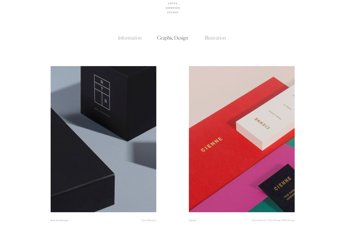
Something that’s been popping up in more designs across the board is making its way into portfolio design as well – plenty of space between elements and objects.
This trend seems to have roots in ensuring that items are appropriately separated on mobile devices and have plenty of tap space, but the additional space can look great on desktop screens as well. (Granted, I’ve always been a fan of white space.)
Lotta Nieminen’s portfolio is a perfect example of this design in action. The super deep header takes up more than a third of the screen while the vertical and horizontal space between portfolio images is super wide. Each element stands on its own and the exaggerated spacing gives each project room to stand on its own, which can be particularly nice for a portfolio design with the potential for so many different types of images.
Large Typography
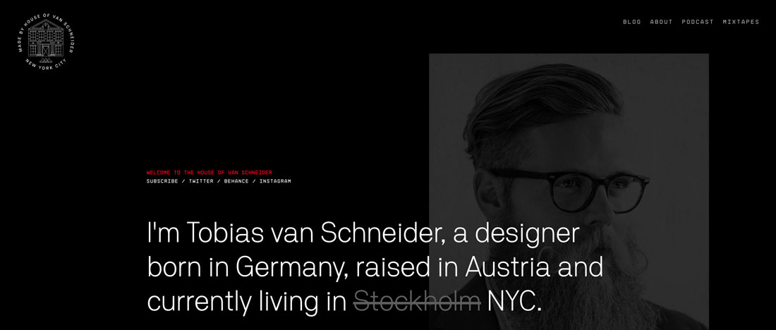
Strong typography and language can be the perfect introduction to your work (and portfolio). Most people probably know of Tobias van Schneider from his ventures as a designer or podcaster, but would you expect his portfolio home page to be mostly text?
Typography and text are some of the most frequently overlooked design elements when planning a project or portfolio. Most of us are so concerned with the visuals or animation.
This example shows why so many designers are opting for portfolios that feature strong typography. It sets the right tone – you know what he does and what the site is about – before getting into the deeper visuals. (This option also highlights his strength for designs that feature a lot of text.)
Full-Screen Animated Navigation
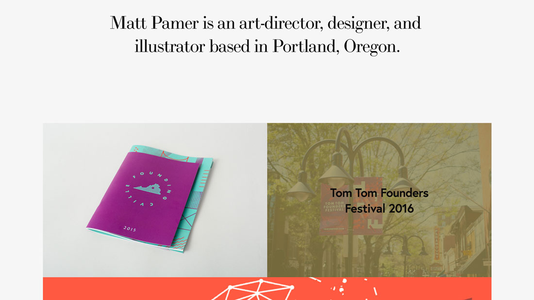
For a while, many designers were opting for one-page portfolios. That has shifted back to multi-page projects with a twist – lack of traditional navigation.
The homepage serves as navigation to individual projects and pages with animated effects in these projects to create a more immersive and wholly interactive experience for users.
It establishes a nice UX that might make a client want to see a similar technique and is a good way to put emphasis on your ability to create in the digital space, even if all the items in your portfolio don’t reflect that.
Minimalism-Inspired Design
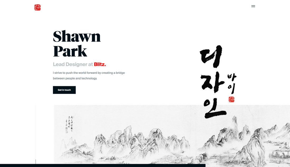
The best thing about a minimalism-inspired portfolio is that it gives the design plenty of room to shine. The design of the actual portfolio becomes relatively invisible so that all the focus is on the elements that you want people to see.
Designer Shawn Park recently wrote about how he redesigns his portfolio every year for UX Collective – I highly recommend that you go read that article here – and the current design (above) shows an evolution of design trends in itself.
Park includes iterations of his portfolio design in the post, beginning in 2013, and you can see how design trends impacted his portfolio. You can also see how this fresh minimal style makes it easier to see his work today than in previous incarnations.
Color Overlays
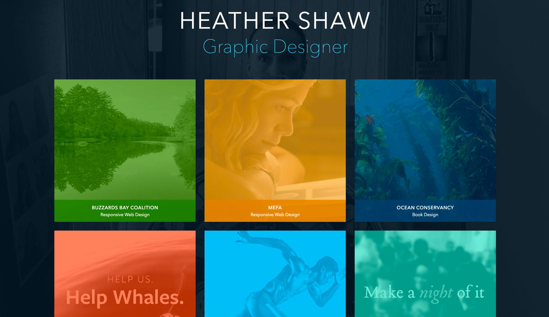
One of the most challenging things about creating a portfolio is the homepage. How do you preview work or project sections in a way that will entice users to actually click through?
The answer might be to partially obscure the work. Using interesting color overlays on preview image links can be a visually engaging way to encourage clicks to individual projects. It’ll keep your homepage cleaner with a consistent look and style for different sections of the website, ensure that one page isn’t too heavy and slow to load, and provides an opportunity to highlight something about a project before the click.
Heather Shaw’s portfolio, above, works because each project is so different, but the color overlays give the homepage a connected feel. The user also knows what kind of project they are about to view thanks to labels with client names and project type right there. This is a highly navigable and easy to understand format that appeals visually.
Modular Grids
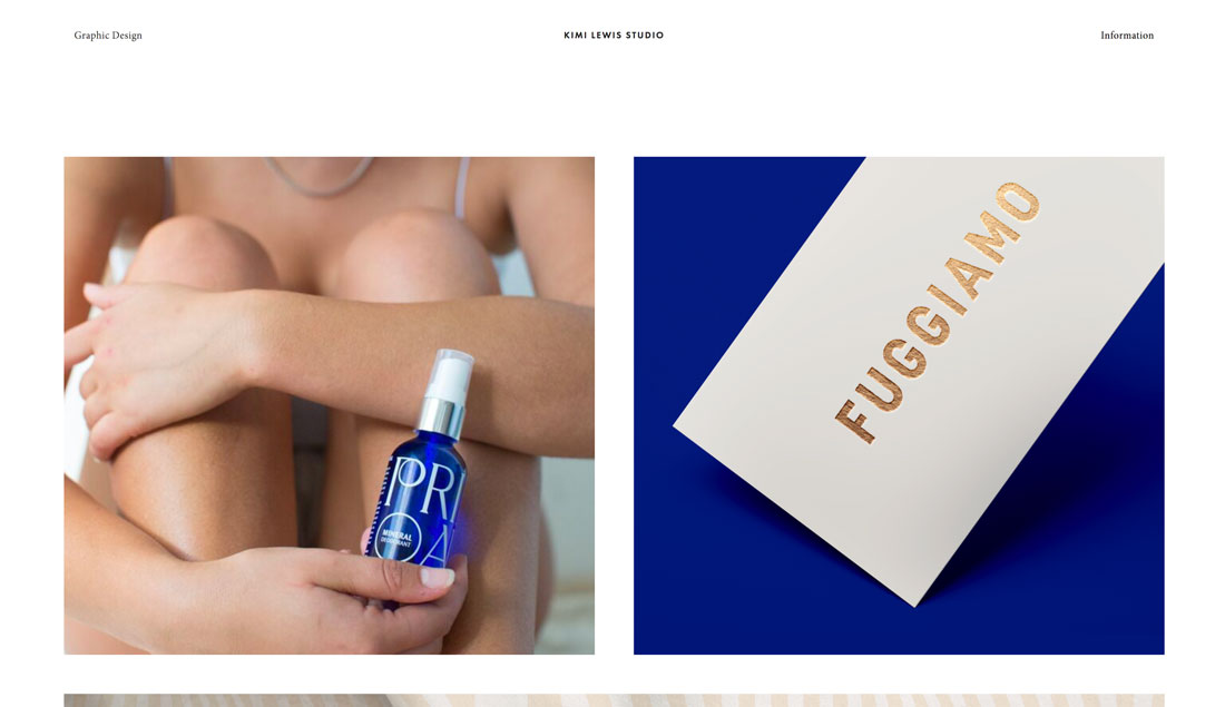
One portfolio design trend that never seems to fade is the use of modular grids to show off projects. This is a great – and functional – option because you can “float” images of different projects on a single canvas.
Kimi Lewis does something a little bit different with her portfolio, above. Rather than lots of small blocks to show portfolio projects, this design goes big. It mixes and matches squarer and long horizontal images in an oversized grid.
Users get a good feel for each project right from the start. Add the oversized grid images to some exaggerated spacing between elements and this portfolio might be one of the easiest to digest that I’ve seen in a while. There’s also a nifty hover animation on each image with the client name and project type to provide extra information before you click through.
Streamlined Project Showcase
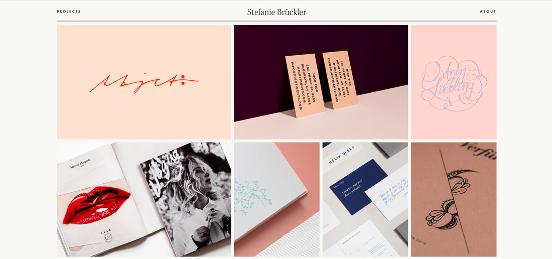
And then there’s the opposite end of the spectrum – portfolios that have a more streamlined look and feel. There can be a benefit to only showing a handful of projects.
It ensures that users only see what you want them to focus on and not get distracted.
Stefanie Bruckler also uses a module grid format but with fewer items in a more contained space. Plus, it’s all below the main scroll which features a minimal business card style design.
It has a look that’s polished and classy, setting a distinct tone for the work of this designer.
Conclusion
Still not quite ready to redesign your portfolio? While it is a creative project, this is also an investment in your business, whether you work for a company or as a freelancer.
So much business and referral business starts online where potential clients are looking for you before you even know they exist. A modern, trendy portfolio with your best projects can make a strong first impression.


