I came clean about my long-running and ongoing battle with chronic depression last year in a blog post on my personal site. But don’t worry, things no worse than they were then and this post is about something else. This post is about designing empathetic user experiences.
Several other sites have been posting on this topic, whether it’s how UX can improve mental health or how it can be used to prevent suicide.
It’s the latter I’d like to focus on here. In fact, Lucas Chae did such a fantastic job on that post that you should stop reading this right now and head over there. Seriously, if you only have time to read one post today, that’s the one.
Lucas goes to great lengths to show how UX can prevent suicide using Google search as a case study. I don’t disagree with any of his ideas. I love them. But anything has room for improvement or at least refinement, and I have a few ideas I’d like to toss in the ring. Again, not because the ideas are bad or screaming to be fixed, but because I have a personal connection to this topic and am interested in seeing great ideas like this move forward.
Let’s briefly rehash the context
I really hope you took up my suggestion to pop over to Lucas’s post, but if you didn’t the main gist of it goes:
- Roughly 500,000 people submit suicide-related searches on Google every month.
- Google returns some helpful information pinned to the top of the results, but it feels like a requirement more than a helpful interaction.
- Lucas mocked up a proposed experience that replaces the existing pinned result with UI that feels more conversational and relatable.
There’s a lot more nuance to it, but that’s roughly what we’re looking at. My four suggestions are merely standing on the shoulders of what’s proposed there.
Gut check
At this point, you might be asking how much responsibility Google has in preventing suicide and whether it really needs to invest more into this than it already does. I like the way Lucas phrases it in his proposal:
“We are only a search engine, and cannot give you answers to your hardest questions. But we can help you get there.”
That is a good line to draw. And, yes, Google is technically already doing that to some extent, but this is an opportunity to provide recommendations that are as relevant as the search results that are Google’s bread and butter.
It’s also worth couching this entire diatribe with a note that there are zero expectations and absolutely no responsibility for Google to do anything proposed in this post. This is merely demonstrating the impact that UX design can have on a real-world problem using Google as the vehicle to drive these points home. We really could have done this with Bing, Yahoo, DuckDuckGo or any similar product.
Suggestion 1: Reach the user earlier
Lucas’s work zeroes in on what Google delivers after the search query has been made. Thinking about this as a user flow, we’re looking at something like this:
| Step | Description | Expected Outcome | Emotions |
|---|---|---|---|
| 1 | User is contemplating suicide, reaches for phone, computer | Able to start up a device and fire up a browser to navigate to Google | Hopeless Sad Lonely |
| 2 | Enters “How to kill myself” into the search field | Possibly some related search suggestions, but ultimately a means to submit the search. | Probably not much different than the previous step, but maybe some pensiveness over what search term will produce the best results. |
| 3 | Submits search | A page refresh with relevant links | Anxious Scared |
The majority of Lucas’s work is driven by Step 3 (and beyond). I think we can narrow the gap of time between contemplation and search submission by zooming in on Step 2.
Have you ever typed a partial query into Google? The auto-suggestions are often extremely useful (at least to me) but they can be pretty hilarious as well. Take, for example:

I’m not sure why that was the first thing that came to mind as an example but, hey, it’s still nuts that those are actual examples of user submissions and have made the list of predicted suggestions. I mean, of course, Russell Crowe is alive… right?
(Does some more searching.)
Right!
Funny (or not funny) enough, Google does not provide those suggestions for suicide-related searches. Or, more accurately, it weeds out suicide-related results and provides others until it simple can’t suggest anything:
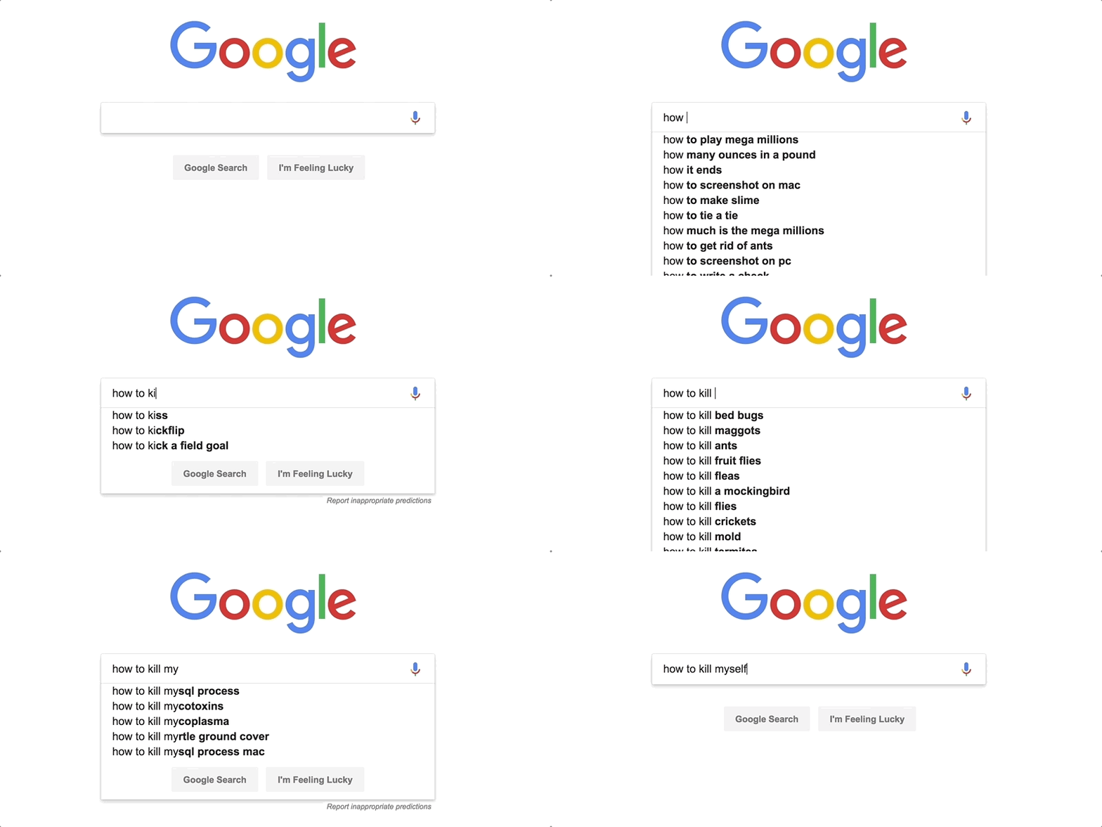
I understand why Google would want to exclude suicidal terms from their suggestions. Why plant ideas in people’s heads if that is not what the user is actually looking for? Seems like something to avoid.
But what if it’s an opportunity rather than an obstacle? If we have a chance to interact with someone even a few seconds earlier in the process, then it’s possible we’re talking about saving some lives.
I would suggest embracing the prediction engine and even beefing it up to take sensitive searches head on. For example, what if we took Lucas’s initial idea of interacting with the user right from here instead of waiting for a submitted search and its results?
Suggestion 2: Amp up the personalization
Let’s all agree that Google knows way too much about people in general. I know, I know. Some people love it and see it as a potential force for good while others are wary of the impact a digital footprint can have IRL. I read The Circle, too.
Either way, Google likely knows a thing or two about the user, even if they are not logged in. But, assuming that the user is logged and has at least a partial profile (both of which I think are safe assumptions given Google’s ubiquitous nature, prevalent reliance on it for oAuth, and that the user turned to it instead, say, Bing), then we can make a personal appeal to that user instead of generalized content.
For example, we can make use of avatars, names, locations, search history, etc. And, yes, the likelihood of Google having all of this among many, many (MANY!) other bits of data are extremely good — nay, great!
If we are going to utilize the predictive search feature, then we can put Google’s treasure trove of user data into play to grab the user’s attention and extend an invitation to engage before the search has even happened. That said, while I’m suggesting that we “amp” up the personalization, let’s agree that any attempt to be too smart can also lead to poor user experiences and, at worst, even more personal pain.
So, while we have a treasure trove of data, keeping the scope to a personalized greeting or introduction will suffice.
Suggestion 3: Leverage Google’s technical arsenal
The biggest criticism of Google’s existing experience is that it feels like a requirement. I wholeheartedly agree with Lucas here. Just look.
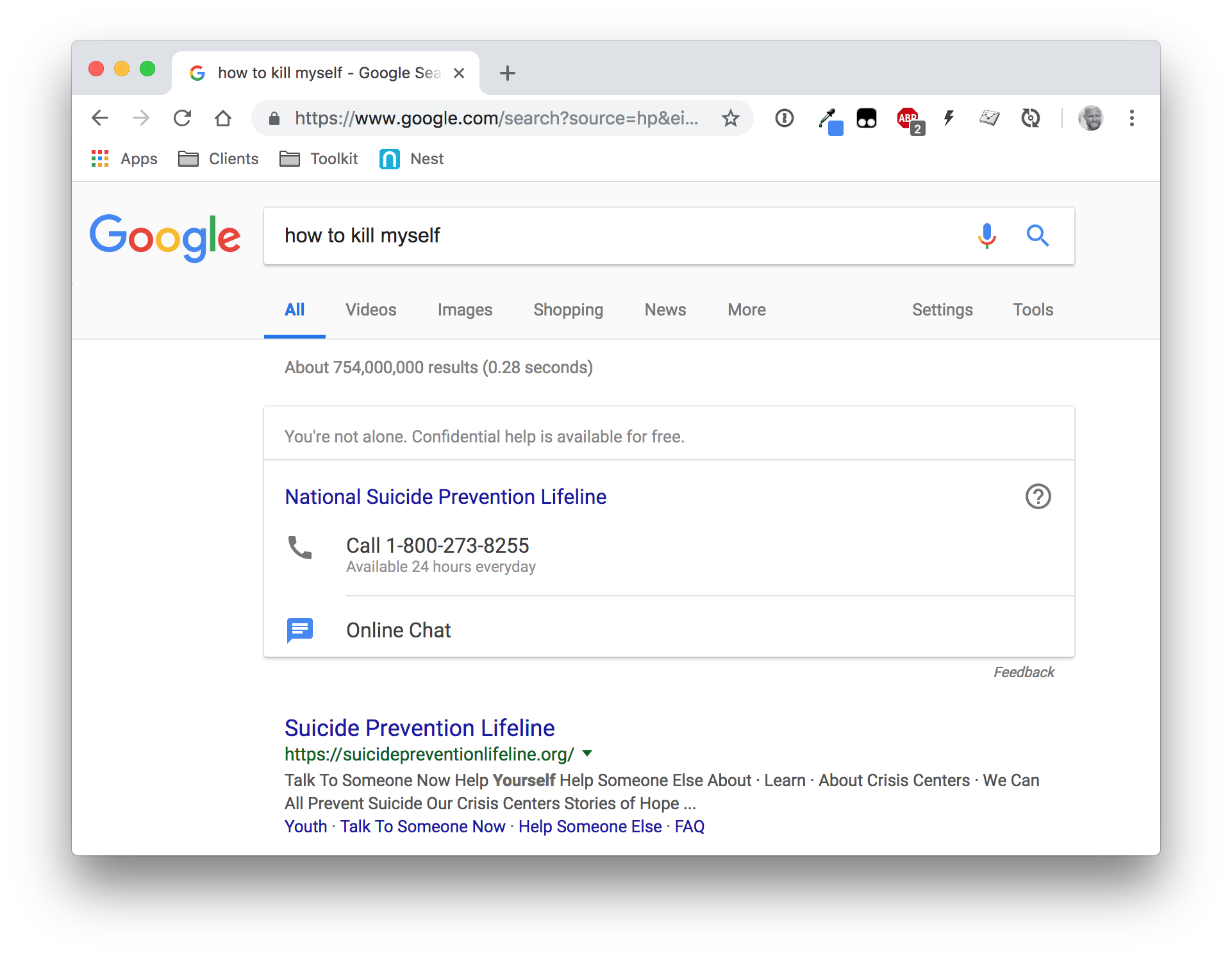
What that uninviting and impersonal approach has going for it is that it provides the user with two clear paths to get help: phone and online chat. Google has developed products that make calls and power video chats, so there’s no reason why we can’t take these already great innovations and put them to use in this new context.
The proposed design from Lucas maintains a call link in the UI, but it seems buried beneath the core interaction and totally removes online chat. If Google has the technical means to apply one-on-one interactions that narrow geographical distances between help and help, and has influence to partner with suicide prevention groups and mental health professionals, then by all means! Those are things I would absolutely work into the UI.
Suggestion 4: Go further to maintain the Google brand
Lucas makes a stellar point that any improvement to the UX should be mindful of Google’s own brand and positioning:
This is a redesign, not a new service that I am launching. One principle I value the most when redesigning an existing interface is respecting the original design principles. Design is never just about making it look pretty. Design is a manifestation of a company’s philosophy and core-values based on years of research and testing.
Amen!
Lucas absolutely nails the grid system, color palette, iconography and baseline card component that come straight from the Material Design guidelines. Still, I think there is room to be even more faithful to Google’s design DNA.
There is a specific point Lucas deviates from the card component guidelines — once the user has made a selection in UI that allows them to categorize feelings.
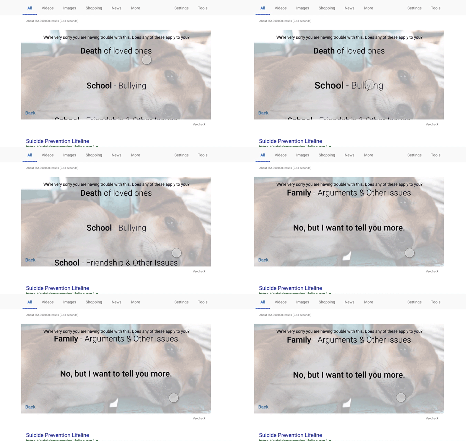
The animation and general interaction is slick. However, it does feel off-brand… at least to me. We’ll get to my mockups in a bit, but I wanted to make sure any new UI took the card component as far as it could go, always using established Google components. For example, I took the UI Lucas created for feeling categories and “dumbed” it down to literal card patterns as they’re described in the docs.
OK, onto the mockups…
Looking past my lack of design chops, here’s where I landed with everything we’ve covered so far.
Predictive search interface
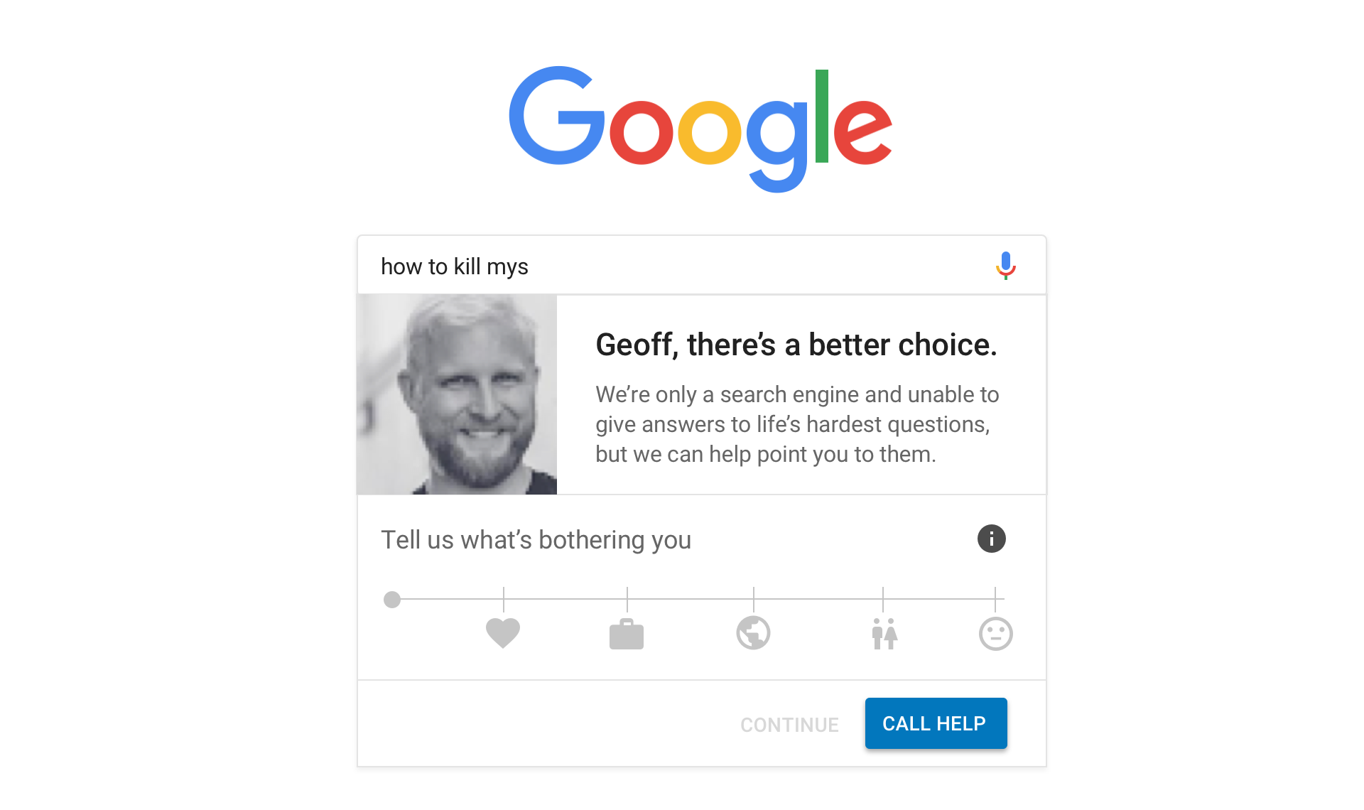
The user has landed on google.com and is in the process of typing, “how to kill myself.” Rather than disabling predictive suggestions like the current functionality does, we tackle the tough query head on and engage the user, making a personalized plea and making an offer to point the user to positive answers.
Notice that the “Continue” text link is in a disabled state. That’s to add a little friction in the flow to encourage the user to engage with the slider. Of course, we’re also creating a clear path to “Call Help” if the user does indeed need to talk with someone and bail on this UI.
Interacting with the user
What’s the slider? Well, it’s more or less an interpretation of the UI Lucas created that allows the user to provide more detail for the pain they’re suffering:
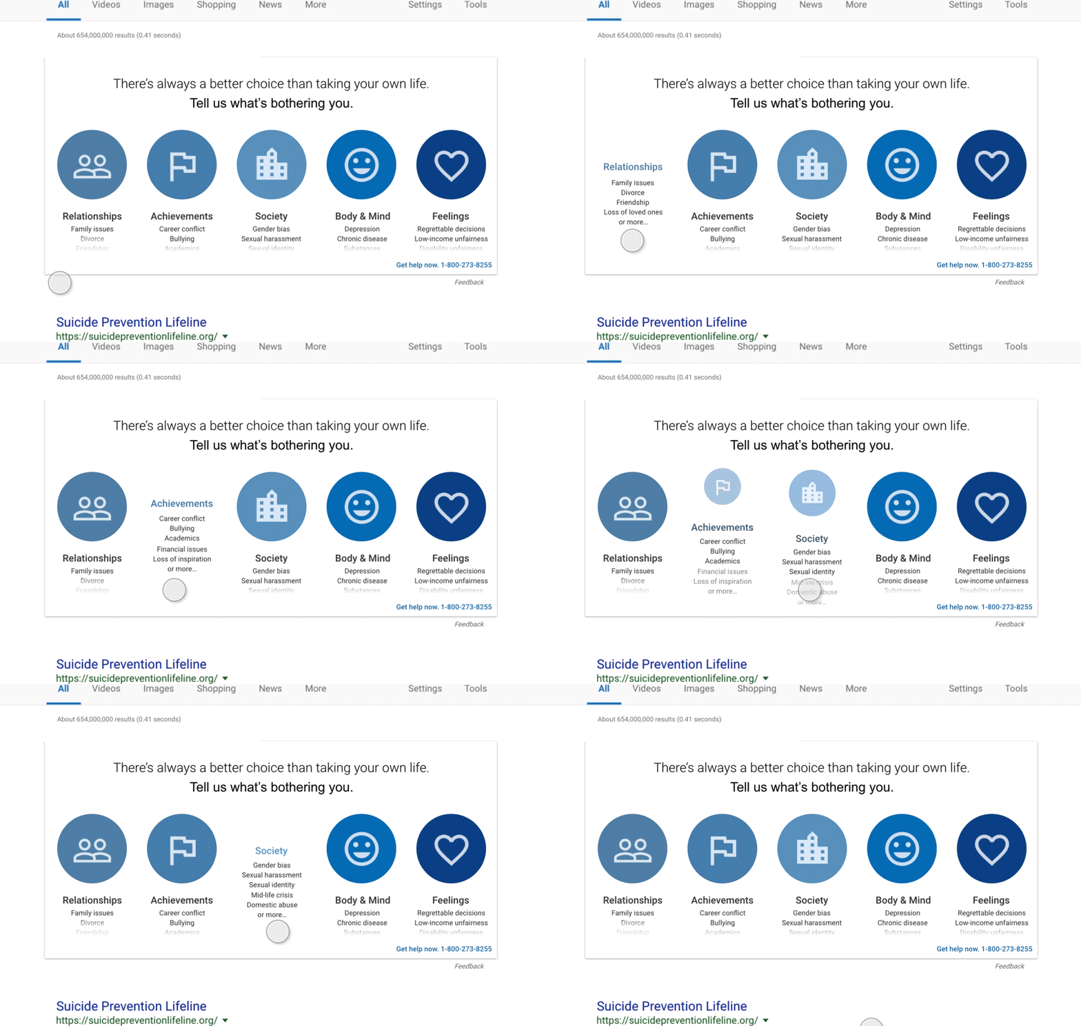
I find that my proposed pattern is more in line with Google’s Material Design guidelines, specifically with sliders.
The slider is a nice way for users to make a selection across a wide variety of options in a small space. In this case, we’re allowing the user to slide between the same categories Lucas defined in his research and introducing sub-categories from there as text links.
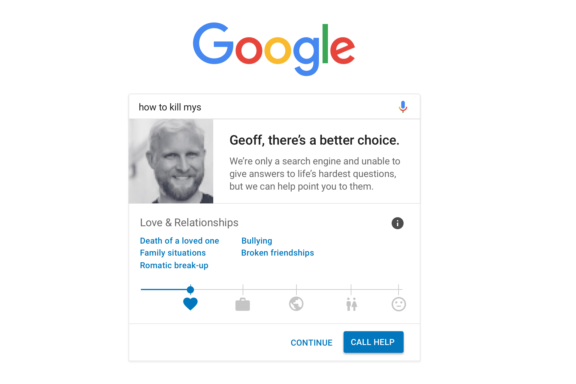
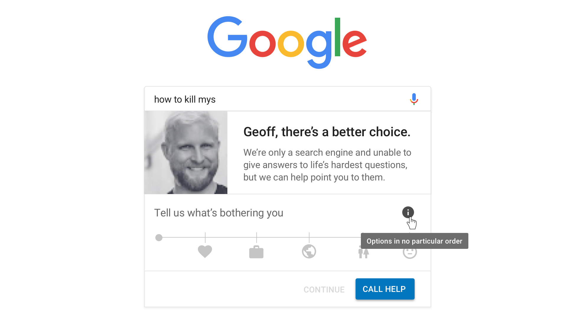
One thing we want to make sure of is that the intent of the options in the slider are not misinterpreted. For example, is “Love & Relationships” first because it’s the most important? It’d be a shame if that’s the way it came across. One idea (among others, I’m sure) is to float a little information icon in there that displays a tooltip on hover explaining that the options are in no particular order.
I think the outcome here, again, is a nice way to get the same level of detail that Lucas mocked up into a smaller space while gaining valuable feedback from the user that helps us learn the context of their feelings.
The first step to help
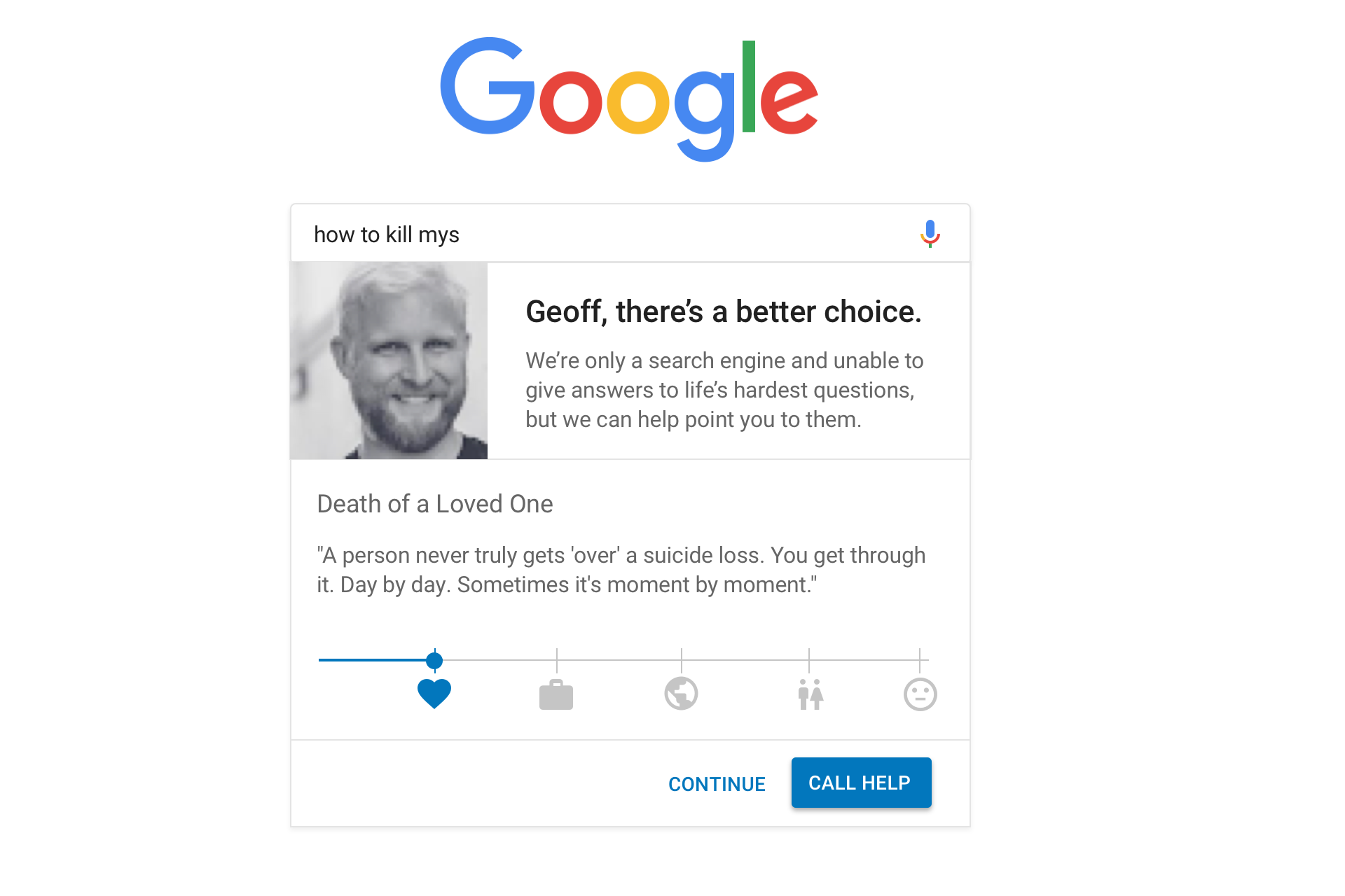
Once the user has made a selection in the slider and clicked on a sub-category, we can provide the same encouraging, inspiring content Lucas proposed, perhaps pulled from real articles on the subject.
Note that we technically changed the state of the “Continue” text link from disabled to active in the last screen. We can use the context the user has provided so far to allow them to proceed with a much safer and productive search query based on the category/sub-category that is selected.
Additional guidance
Will the UX so far prevent a suicide? Maybe. I hope! But there’s a chance it won’t.
But, hey, we now have better context for the user’s feelings and can provide a relevant path to suggest answers. So, if the user has chosen the category “Love & Relationships” and selected the “Death of a loved one” sub-category, then we can send the user to search results for that subject rather than “How to kill myself” — which would inevitably lead to a more destructive set of search results than something on love and relationships.
Google already does a pretty darn good job of this…
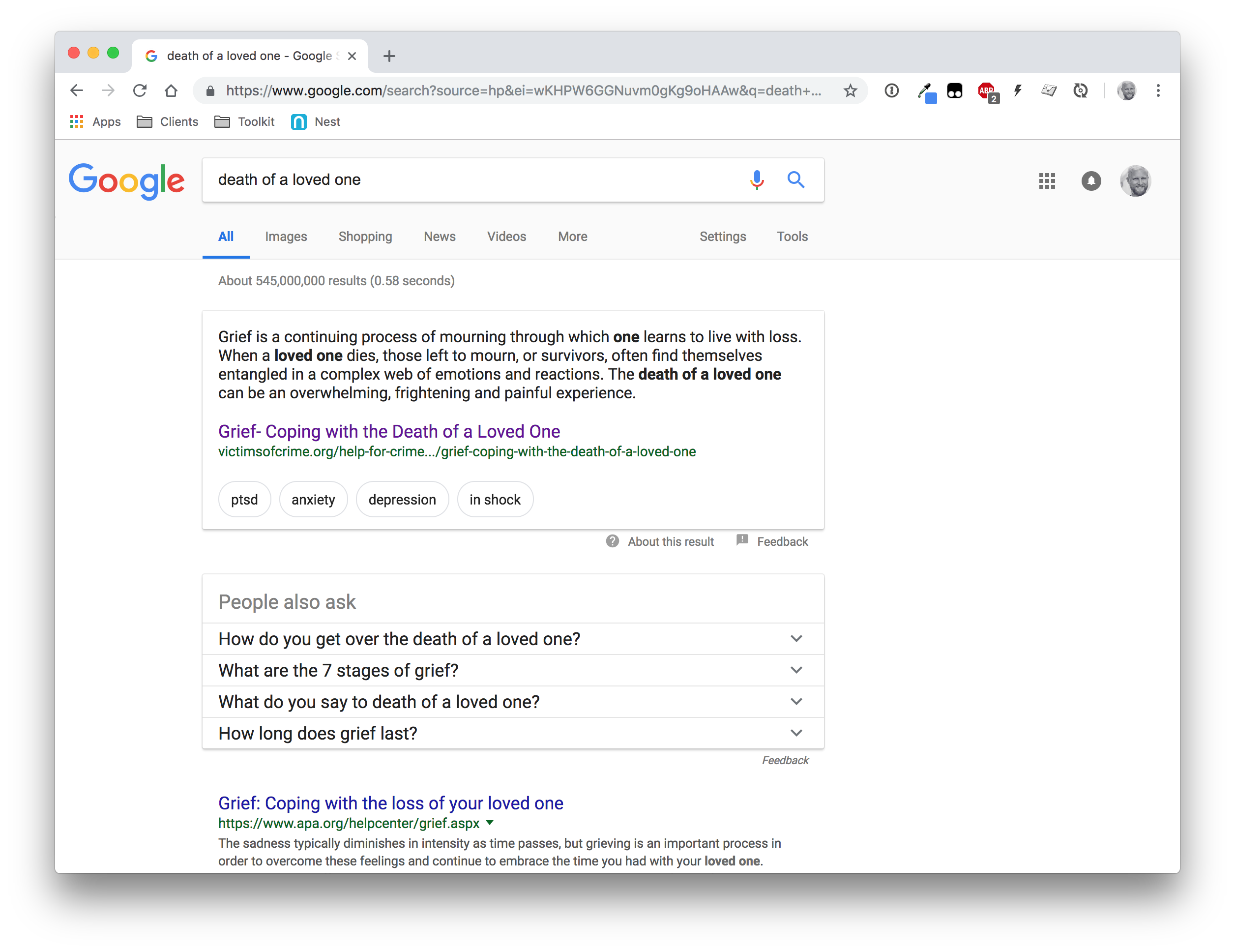
Seriously, say what you want about the lack of design flare, but having a featured result up top that the user can personally relate to, additional search suggestions, and the organic results at the end makes for a pretty compelling experience. A much better place to send the user!
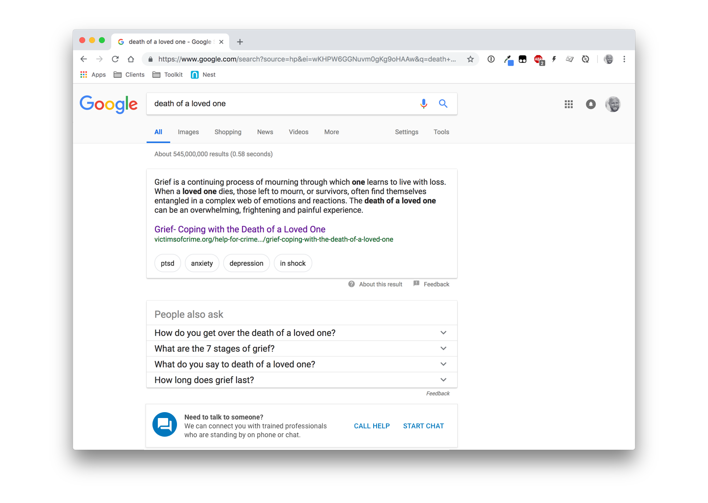
The only change I would suggest is to maintain the ability to make a call to or initiate a chat with a trained professional. It’s doesn’t need to scream for attention in the UI, but be available. Material Design’s banner component seems pretty relevant here, though I can see push back on that as far as the literal use case.
Are we making progress?
I give the greatest hat tip of all hat tips to Lucas Chae for broaching such a hard topic. Not only does he do a bang-up job to solve a real-world problem, but brings awareness to it. Obviously, it’s something I’m able to relate to on a deep personal level and it’s encouraging to see others both empathizing with it and pushing forward ideas to deal with it.
Thank you for that, Lucas.
I hope that by putting my own ideas on the table that we can keep this conversation moving. And that means getting even more ideas on the table and seeing where we can take this bad boy as a community.
So, do you have feedback on anything you’ve seen so far? Maybe ideas of your own you’d like to mock up and share? Please do! The web community is a great one and we can accomplish amazing things together. 💪
Note: My sincere thanks to Chris, Andy Bell and Eric Bailey for providing thoughtful, insightful and thorough feedback on earlier drafts of this post.
The post Preventing Suicide with UX: A Case Study on Google Search appeared first on CSS-Tricks.


