There are so many tools out there to help you pick colors. I totally get it! It’s hard! When colors are done well, it’s like magic. It adds a level of polish to a design that can really set it apart.
Let’s look at some, then talk about this idea some more.
Here’s one I just saw called Color Koala:
It spits out five colors at ya and you’re off to the races.
Hue will give you some too.
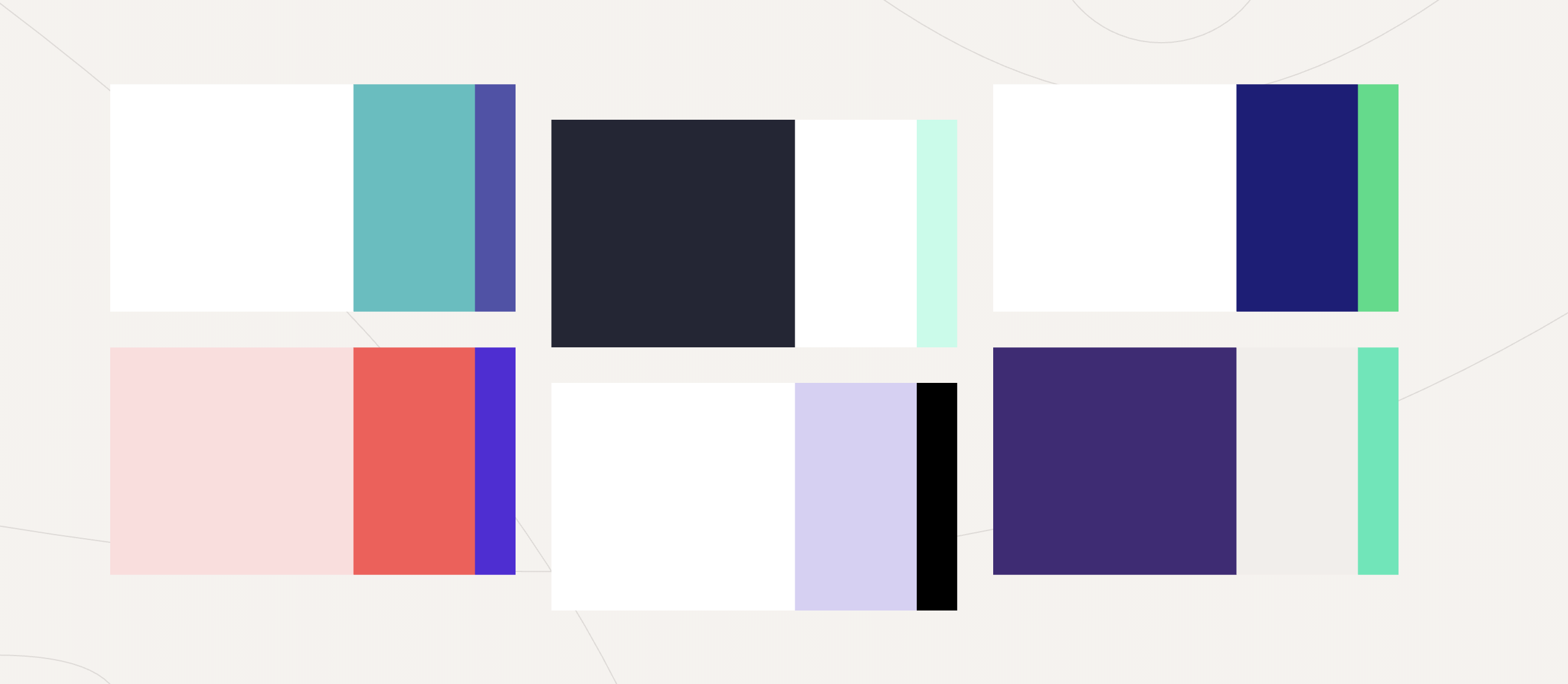
There’s a billion more, and they vary in approach and features, of course. Here’s a handful:
- http://color.farm/
- https://coolors.co/
- https://color.adobe.com/
- http://clrs.cc/
- https://www.colourlovers.com/
- https://flatuicolors.com/
- https://colordrop.io/
- http://www.0to255.com/
- http://materialcolors.com/
- https://material.io/collections/color/
- https://www.materialpalette.com/
- https://colorhunt.co/
- https://www.palettable.io/
- https://www.webdesignrankings.com/resources/lolcolors/
- https://hihayk.github.io/wheel/
- https://htmlcolorcodes.com/
- https://www.vanschneider.com/colors
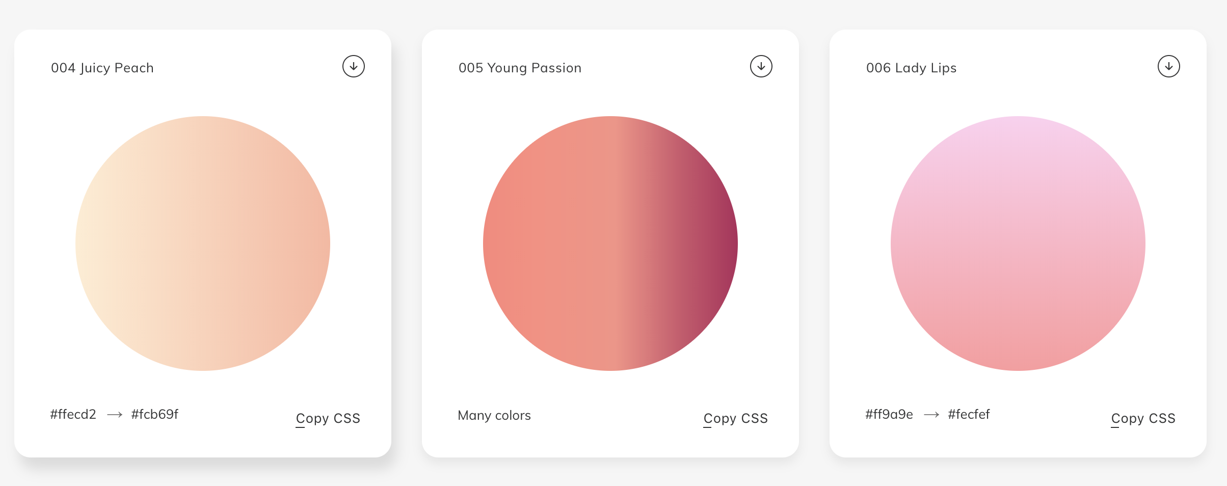
Then there are tools that focus on gradients, like UI Gradients, Web Gradients, and Shapy.
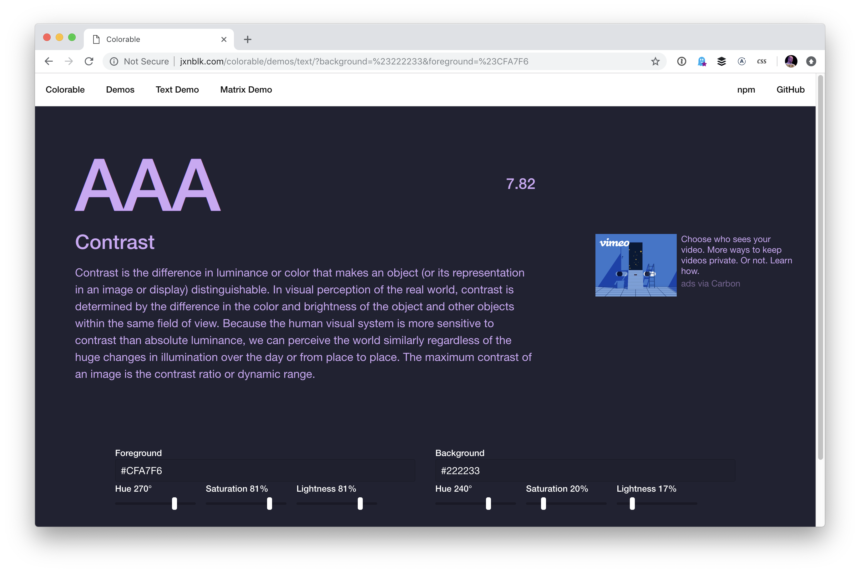
Oh! And a site that helps with text color while keeping accessibility in mind.
There are even native apps like Sip, ColorSnapper, and Frank DeLoupe that help you select colors and sometimes keep your palettes right within them.
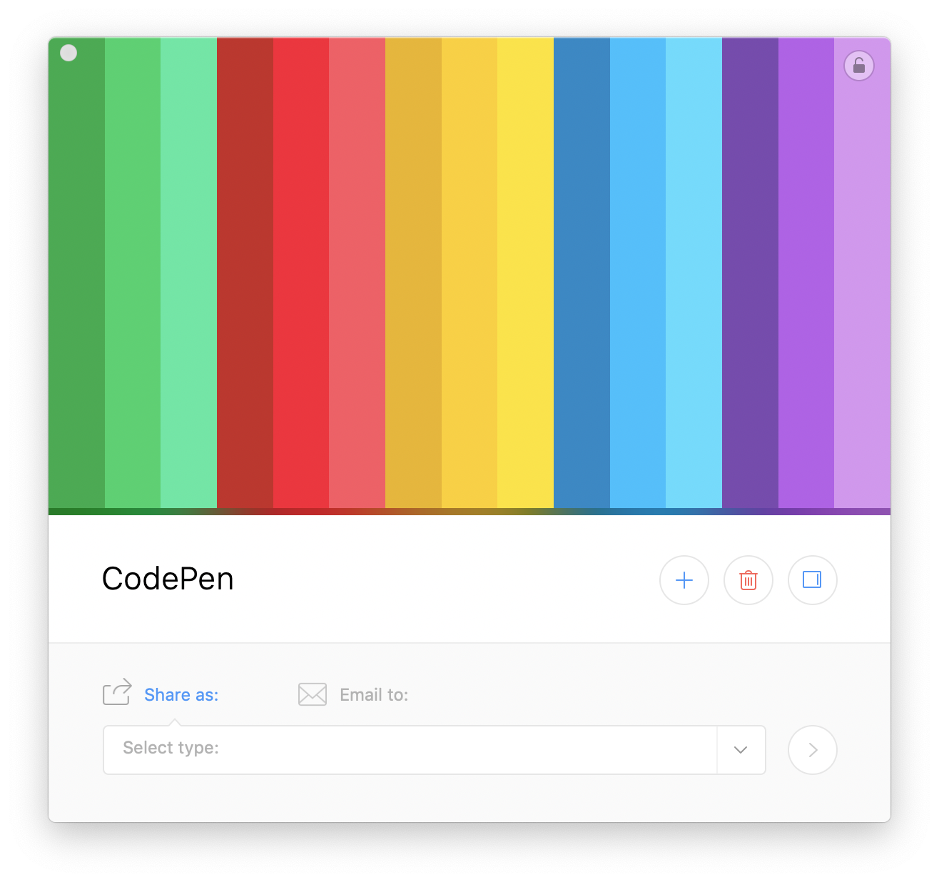
Colors can be programatically generated.
There is no native JavaScript API for it, but it’s still basically a one-liner:
See the Pen Generate New Random Hex Color with JavaScript by Chris Coyier (@chriscoyier) on CodePen.
Pleasing colors can be as well.
Generating random colors won’t guarantee pleasing palettes, especially if a bunch of random colors are paired together. PleaseJS can help build color schemes that work together. You provide it a base color and other options (like what type of color scheme) and it spits out colors for you.
See the Pen Generate Pleasing Colors by Chris Coyier (@chriscoyier) on CodePen.
Similarly, randomColor.js…
generates attractive colors by default. More specifically, randomColor produces bright colors with a reasonably high saturation. This makes randomColor particularly useful for data visualizations and generative art.
It doesn’t claim to make multiple colors part of a cohesive theme aside from passing in a base hue or luminosity.
See the Pen Generate Pleasing Colors by Chris Coyier (@chriscoyier) on CodePen.
But the thing about just being handed colors is…
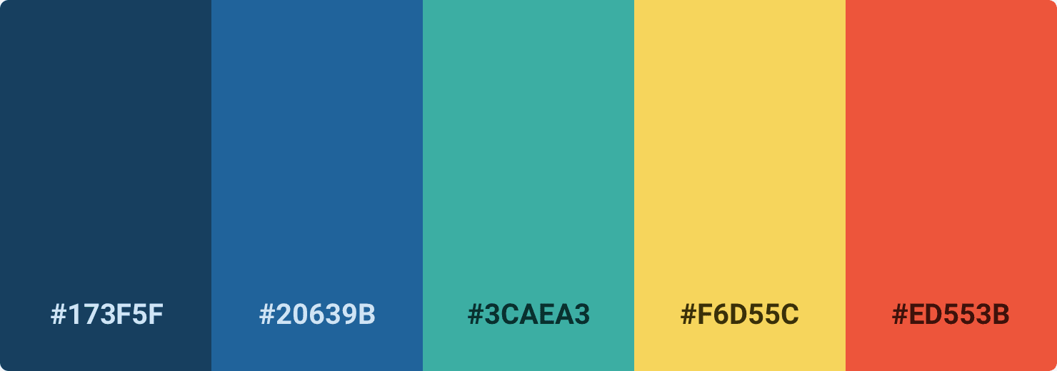
…they don’t exactly tell you how to use them. Steve Schoger makes a point of this, rather hilariously in a blog post. This is a perfectly lovely color palette:
But if you just pick those colors and plop them onto a design, you could end up with something like this:
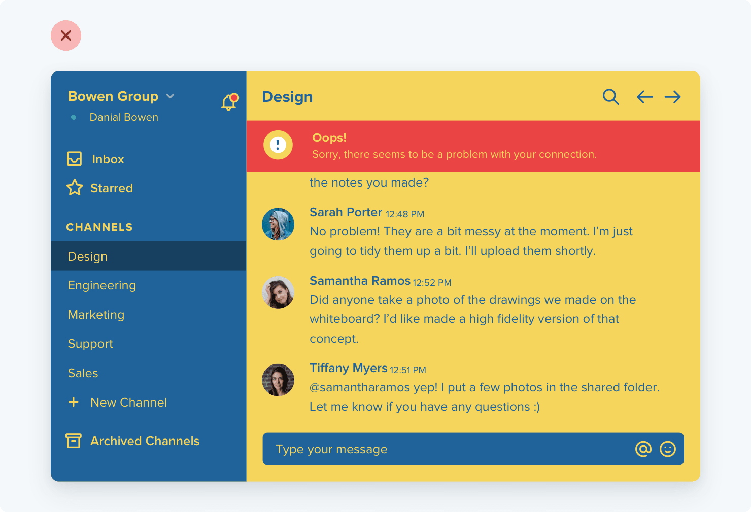
You might like that, but you’d be in the minority. It’s not a refined design that gets out of the way and would be nice to use every day. Color usage is a bit more complicated than plopping five nice colors into a design. It’s variations on those and using them in tasteful ways, like this:
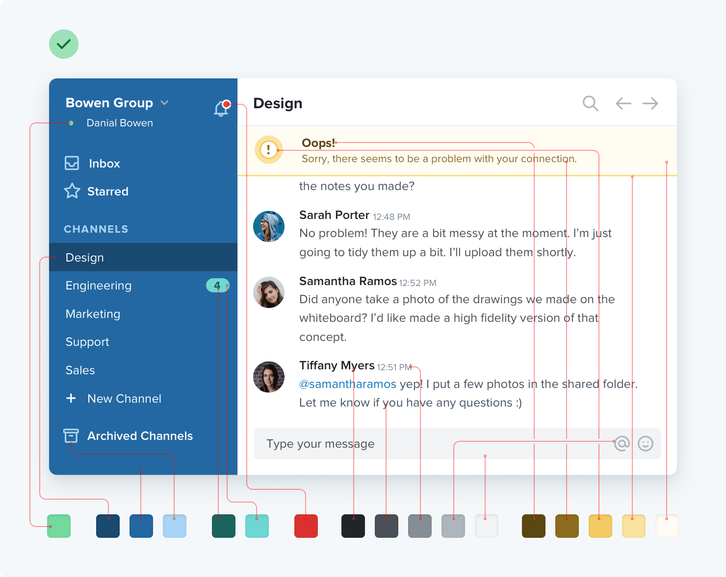
Picking up Steve Schoger and Adam Wathan’s book surely has some advice for you there!
The post Re: Pleasing Color Palettes appeared first on CSS-Tricks.


