Oh hey, so tomorrow (tomorrow!) is Election Day here in the United States. We’re not in the business of making political endorsements or anything like that at CSS-Tricks, though we do endorse that everyone exercise their right to vote.
I did exactly that two years ago and posted a CSS rendition of the “I Voted” sticker that came with my California mail-in ballot.
See the Pen I Voted Sticker by Geoff Graham (@geoffgraham) on CodePen.
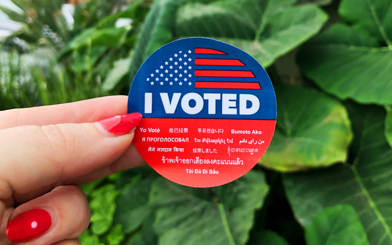
Fast forward to today, and I received a new sticker in the ballot sporting a fresh design:

I have a little time, so I’m going to try to re-create this sticker in CSS and walk through my thought process as I do it. Feel free to follow along if you’d like!
Breaking down the elements
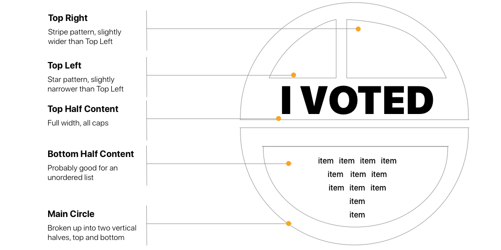
Anytime I’m given a design of any kind, I like to pretend that my eyes have the superpower of X-ray vision and can see through the design as if it were a skeleton. This helps me start to think through how many elements I might use in the HTML.

OK, I think I’m going to start with something like this:
<!-- Main Circle --> I Voted
- Item
- Item
- Item
- Item
- Item
- Item
- Item
- Item
- Item
- Item
- Item
- Item
</div>I’m also going to throw in some base styles on the <body> so I can jump right into the rest of the sticker.
See the Pen “I Voted” Sticker HTML by Geoff Graham (@geoffgraham) on CodePen.
OK, nothing fancy so far. Really just looks like an unordered list with a heading with some terrible contrast between the content and background.
Working on the main sticker container
I think I’ll set up the container, which is the main circle. I’m going to use a fixed width and height, then use border-radius to round it out and into the shape of a circle.
Oh, and I ought to take care of that dark text and also add a border while I’m at it, so I can see what I’m doing.
.sticker { border: 20px solid #fff; border-radius: 100%; color: #fff; height: 400px; width: 400px; }
See the Pen “I Voted” Sticker HTML 2 by Geoff Graham (@geoffgraham) on CodePen.
The alignment is all off. Seems like a good spot to drop in some flexbox. This will allow me to center our elements horizontally. I think going with a single-column layout will take care of the vertical alignment.
.sticker { display: flex; flex-flow: column; align-items: center; border: 20px solid #fff; border-radius: 100%; color: #fff; height: 400px; width: 400px;
}
Yep, that helps.
See the Pen “I Voted” Sticker HTML 3 by Geoff Graham (@geoffgraham) on CodePen.
The last thing I want to do with the sticker for now is split it up into two halves — a top and a bottom. OK, so yeah, I have explicit elements for those in the HTML (.sticker__top and .sticker__bottom). I could use background-color on each element to make the top half blue and bottom half red, but I actually like the idea of using a linear gradient instead with a hard stop at the halfway mark.
.sticker { background-image: linear-gradient( to bottom, #080968, #080968 50%, #080968 50%, #F81616 50% ); border: 20px solid #fff; border-radius: 100%; color: #fff; display: flex; flex-flow: column; align-items: center; height: 400px; width: 400px;
}
Hey now, looking much sharper already!
See the Pen “I Voted” Sticker HTML 4 by Geoff Graham (@geoffgraham) on CodePen.
Time to deal with the top half
The top and bottom halves both occupy 50% of the sticker’s height, so the selectors can be combined to hit them both at once. Plus, I’m using flexbox, so I can simply flex those items.
.sticker__top,
.sticker-bottom { flex: 0 50%;
}
The top half is super weird. The way I see it, there’s two rows: one that contains the stars and stripes and the other that contains the heading. I’m going to turn to flexbox again to draw that layout.
.sticker__top { display: flex; flex-flow: row wrap; position: relative;
}
That’s not really going to change much at the moment because, well, I haven’t done anything to define elements for the stars and stripes in the HTML. I’m thinking of using the ::before and ::after pseudo elements on .sticker__top to make those. Again, they can be combined since they share some common properties and values.
.sticker__top::before,
.sticker__top::after { content: ""; height: 45%; /* Had to play with this a bit */ margin-top: 2em; /* Move away from the top edge of the sticker */
}
I’m going to cheat and use SVG for the stars. I mean, I guess that’s not cheating but it sorta feels like a deviation from a “pure” CSS way of doing things. Oh well.
That said, the stripes can definitely be made in CSS, again, with the same linear gradient background technique that’s used to split the sticker up into blue and red halves.
.sticker__top::before { background-image: url("/path/to/star/image.svg"); background-size: 35px; /* Magic number, depends on the image used. */
}
.sticker__top::after { background-image: linear-gradient( to bottom, #F81616, #F81616 14%, transparent 14%, transparent 28%, #F81616 28%, #F81616 42%, transparent 42%, transparent 56%, #F81616 56%, #F81616 70%, transparent 70%, transparent 84%, #F81616 84%, #F81616 98%, transparent 100% );
}
That’s cool but, crap, things are out of order.
See the Pen “I Voted” Sticker HTML 5 by Geoff Graham (@geoffgraham) on CodePen.
I’m so thankful flexbox has an order property. I’m going to order the stars, stripes and heading at 1, 2 and 3, respectively,
.sticker__top::before { /* Same as before... */ order: 1;
}
.sticker__top::after { /* Same as before... */ order: 2;
}
.sticker__top h1 { order: 3;
}
If I stop here, the shape of the stars and stripes would be all off and the heading font would be sloppy.
border-radius is still a good way to get the stars and stripes to follow the same circular path as the sticker. The rub is that the bottoms of them have to maintain a flat edge. Since border-radius is a shorthand property, I’m going to drop border-top-left-radius on the stars and border-top-right-radius on the stripes.
It’s also worth noting that the stripes are a little wider than the stars. Maybe a 55-45 split? I don’t know. I’ll go with that and also use relative positioning on the stripes so I can push them to the right a bit to add separation between them and the stars.
.sticker__top::before { /* Same as before... */ flex: 45%;
}
.sticker__top::after { /* Same as before... */ flex: 55%; position: relative; left: 10px;
}
The stars and stripes should flex with the size and width of the heading. I had to play with the font family, font size, letter spacing, and text transform to get something that looks pretty nice. In case you’re wondering, I wound up using Raleway for the font. It’s not precise, but close enough… at least to my untrained typographical eye.
.sticker__top h1 { font-family: 'Raleway', sans-serif; font-size: 4em; letter-spacing: 3px; line-height: 0; text-transform: uppercase; order: 3;
}
See the Pen “I Voted” Sticker HTML 6 by Geoff Graham (@geoffgraham) on CodePen.
Alright, so now the bottom half is making my skin crawl. Gotta tackle that.
Style up the bottom half
So much has already been done. The element for bottom half is already there in the HTML and is sized and positioned the way it should be. I think stripping out the bullet points of the list items and removing the left padding from the unordered list will clean things up a lot.
.sticker__bottom ul { list-style: none; padding: 0; width: 100%; /* Gotta take up the all of the bottom half */
}
But, that’s not going to cut it completely. I want that list to run horizontally, wrap lines, and to allow the list items to occupy open space. Yep, that sounds like flexbox again.
.sticker__bottom ul { display: flex; flex-flow: row wrap; align-items: flex-start; justify-content: flex-start; /* same as before... */
}
.sticker__bottom li { flex: auto; /* Flex as much as you need, guys */ margin: .75em; /* A liiiiitle breathing room between items */
}
See the Pen “I Voted” Sticker HTML 7 by Geoff Graham (@geoffgraham) on CodePen.
Now I have to make a few tweaks to .sticker__bottom. Specifically, I’m going to make it a little narrower (80% of the full sticker width) to get it off the edge of the sticker and then round its edges… though it might not actually need rounded corners since content is not going to overflow.
.sticker__bottom { border-bottom-right-radius: 100%; border-bottom-left-radius: 100%; width: 80%;
}
And, now center the text. I guess that can go on the parent .sticker element since nothing on the sticker is technically left-justified.
.sticker { /* same as before... */ text-align: center;
}
Finally, I’m going to do my best to replace the dummy content with the “I Voted” translations. Let me go look those up.
(Heads over to Google Translate.)
Meh, I couldn’t find everything I needed. I’m sure it’s my lack of patience, but I wound up using some alternatives:
<ul> <li>Yo voté</li> <li>我投票</li> <li>나는 투표했다</li> <li>Bumoto ako</li> <li>Я проголосував</li> <li>मैने मतदान किया</li> <li>أنا صوتت</li> <li>Ik stemde</li> <li>Szavaztam</li> <li>ฉันโหวตแล้ว</li> <li>Anigu waxaan codsaday</li> <li>Tôi đã bầu chọn</li>
</ul>
I’m going to have to play around with the font size and to get the same sort of alignment as the IRL sticker, which has rows of: 4 items, 3 items, 3 items, 1 item, 1 item.
Here’s where I landed:
.sticker__bottom ul { display: flex; flex-flow: row wrap; font-size: .75em; align-items: flex-start; justify-content: flex-start; list-style: none; padding: 0; width: 100%;
}
To get the last two items off the same line, I’m going to single out the second-to-last one using :last-child() so that both of them always flex 100%:
.sticker__bottom li:nth-child(11) { flex: 100%;
}
See the Pen “I Voted” Sticker HTML 8 by Geoff Graham (@geoffgraham) on CodePen.
Ding, ready!
I’m going to call this one baked. I know, I know. I should cross-browser test. It would also be wise to find graceful fallbacks for older browsers that do not support flexbox. And, some responsiveness would be nice to have. Maybe someone would like to take those up and share. 😉
Is this the best way to make the sticker? Probably not. For example, I bet there are some interesting things that can be done with clip-path instead of the way I fumbled through background gradients. And, if I had to do it again, I might even consider going with a CSS Grid layout on the parent because there are clearly opportunities to work in two directions instead of one.
But that’s the beauty of CSS. There’s more than one way to accomplish something.
Happy Election Day, friends. 🇺🇸
The post Rocking California’s “I Voted” Sticker in CSS for Election Day 2018 appeared first on CSS-Tricks.


