Does it ever seem like certain website color schemes just get all the attention? As with every other aspect of web design, there are color schemes that tend to trend more than others. Bright colors, stark palettes, and even some mismatching schemes are elements of color that are trending.
Here’s a look at some of the best website color schemes of 2020 (in no particular order). For each, we’re also sharing the color codes that make up the key elements of the design, so it’s easy to play around with these color schemes yourself too!
2 Million+ Digital Assets, With Unlimited Downloads
Get unlimited downloads of 2 million+ design resources, themes, templates, photos, graphics and more. Envato Elements starts at $16 per month, and is the best creative subscription we’ve ever seen.
Whether you’re building a website from scratch yourself, or creating a website design using a site building tool like Wix, you’ll need to think carefully about color choices. For backgrounds, text, animations, and more.
Here are some great examples of colour choices done right, to inspire your next project.
1. Taproot Foundation
#00a9d8#0d9edf#259b9a
Taproot Foundation uses one of the best, most colorful website color schemes out there. The combination of yellow, blue and kelly green work together to explain the different facets of the group that helps nonprofits. It’s not a website color scheme that you see that often but bright color with a white background is a majorly trendy option.
2. Prevent Epidemics
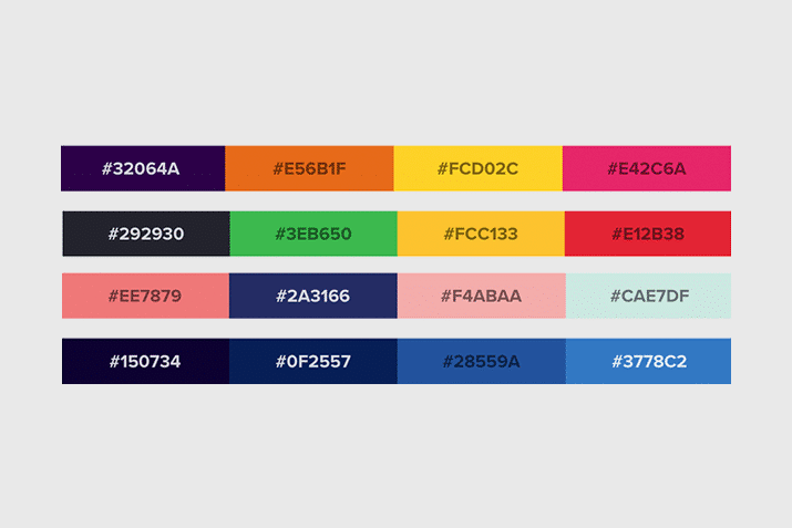
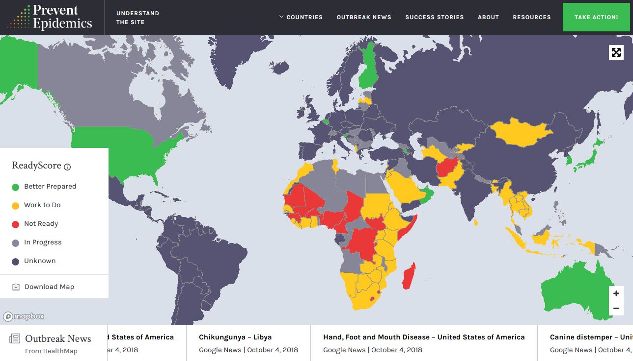
#292930#3eb650#fcc133#e12b38
Prevent Epidemics uses an equally colorful scheme but paired with a dark background and greens that carry throughout user interface elements and the overall design, it all comes together. One of the most trendy color palette options is to develop a set of colors that is more wide ranging than the typical two- or three-color palette that is more common.
3. Snipcart
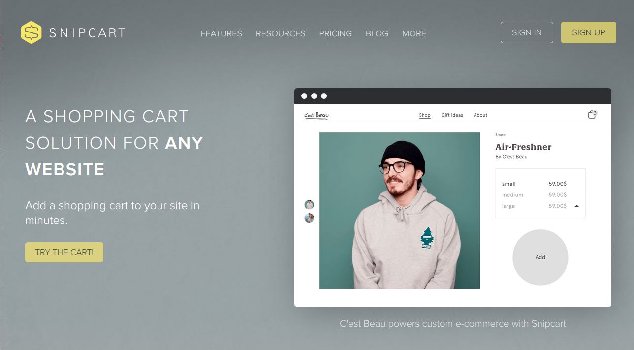
#7f8688#929d9e#f3e367
Snipcart uses a light gray to set the tone as the primary background color in this palette with subtle yellow accents. The solution pairs a more trendy bright color with a subtle and neutral gradient for a color palette that encourages the user to really hone in on the content.
4. Mossio
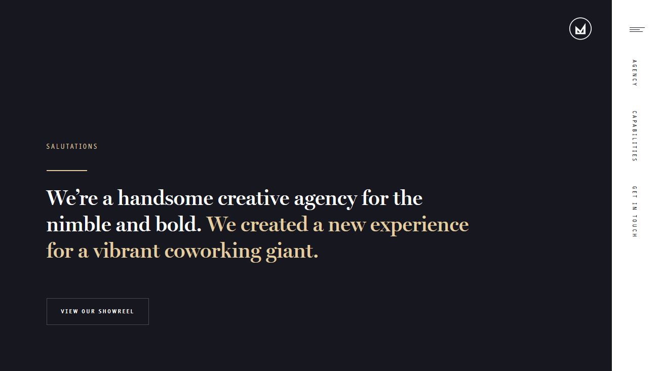
#18181e#dec79b
Mossio uses the same base colors here for this website color scheme – you can see the trend with black/gray and yellow, right? – only with a more saturated background and less saturated accent color. The combination has almost the same effect as the above example with a color palette that focuses on content, making the design a little more invisible.
5. Omega Yeast
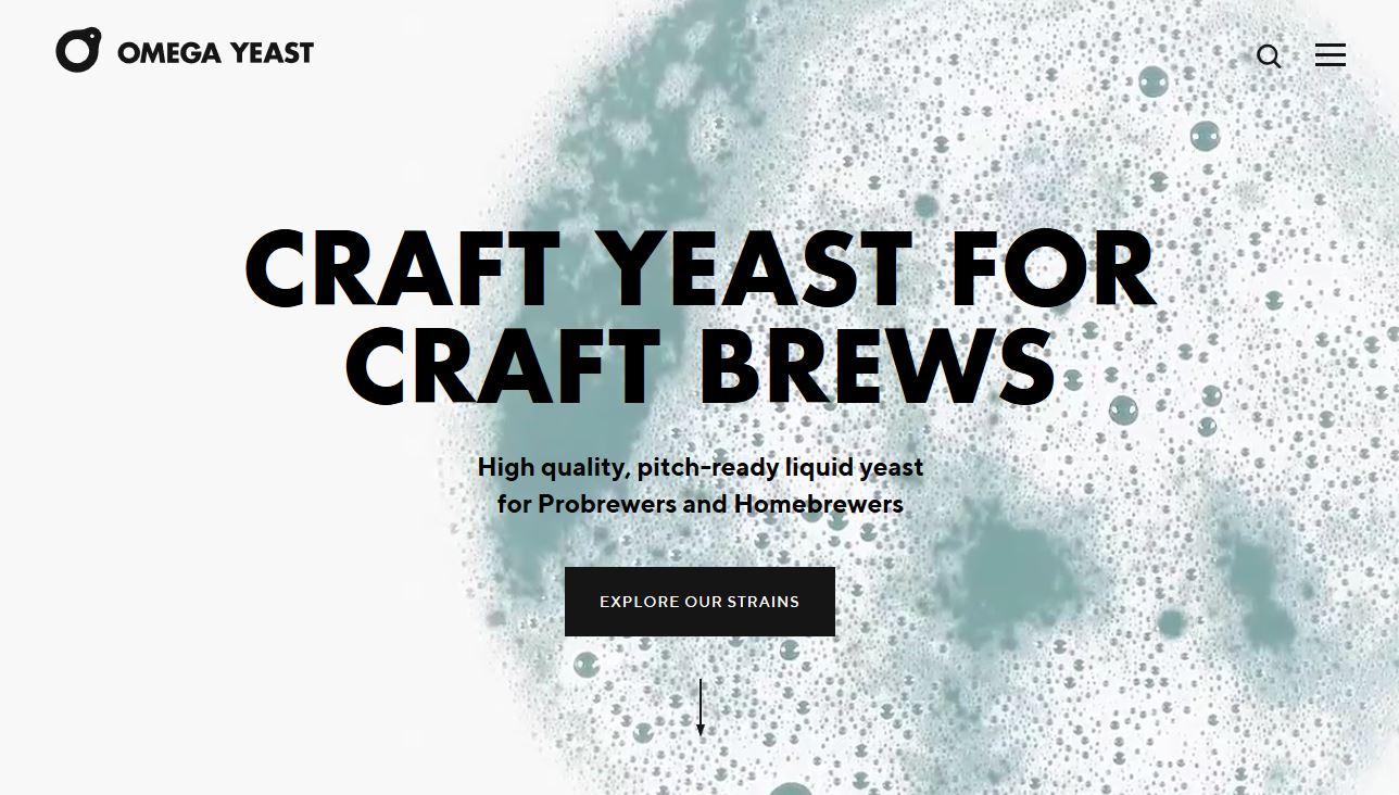
#f7f7f7#7da2a9
Omega Yeast doesn’t look like it has a color palette beyond black and white at first glance, but this website design does something that is a big idea in color trends. The color scheme is rooted in the main image – in this case a video – rather than a background or colorful user interface elements. This trend in color is becoming more common because designers are using full-screen images to tell a brand story.
6. Farm Food
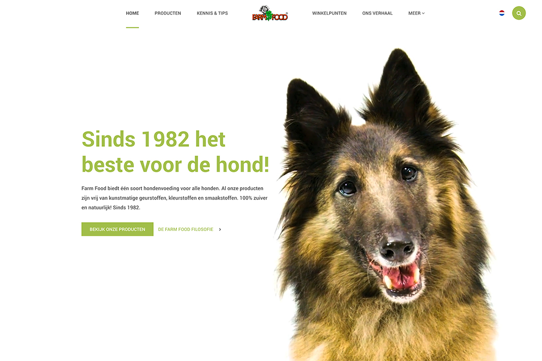
#ffffff#a7bc5b#8da242
Farm Food uses a simple, natural palette with a white minimal style background with bright olive greens to draw attention. Further the palette has a monotone feature with a light and dark olive for elements. (It is easiest to see this color change in the hover state of the button.) This might not be a color pair that you come to first, but it’s really striking.
7. Jebsen Careers
#3fd2c7#99ddff#00458b
Jebsen Careers uses muted blues and greens to create amazing color overlays and design elements with more saturated color. The combination works great on a white background and really shows what you can do by working with variations of the same color. The navy used for text elements and the logo further enhance overall color use.
8. IC Creative
#fb8122#1d2228#e1e2e2
IC Creative uses a dark color overlay – black that isn’t truly black – with a bright accent color and plenty of white to create an inviting scene. Color overlays in almost every hue are a major trend in website color and a rich black option such as the one here is a nice way to give other content plenty of room on the screen. Just note the oversized headline and bright accents and calls to action.
9. Mangrove Hotel
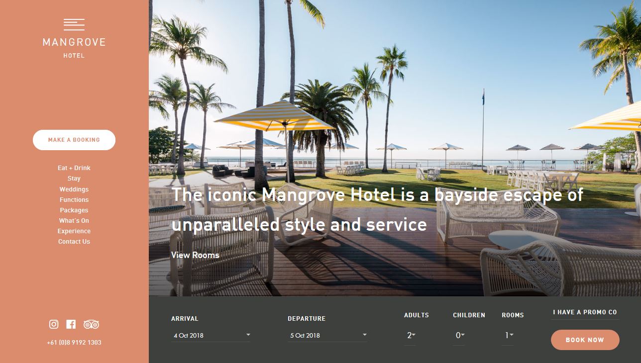
#d48166#373a36##e6e2dd
While bright color palettes have practically ruled website deign for a few years, there’s a shift back to more muted palettes for some projects. The fleshy tone of Mangrove Hotel is warm and compliments the content well. (This same color has also been appearing in some Twitter marketing communications.)
10. Slumber
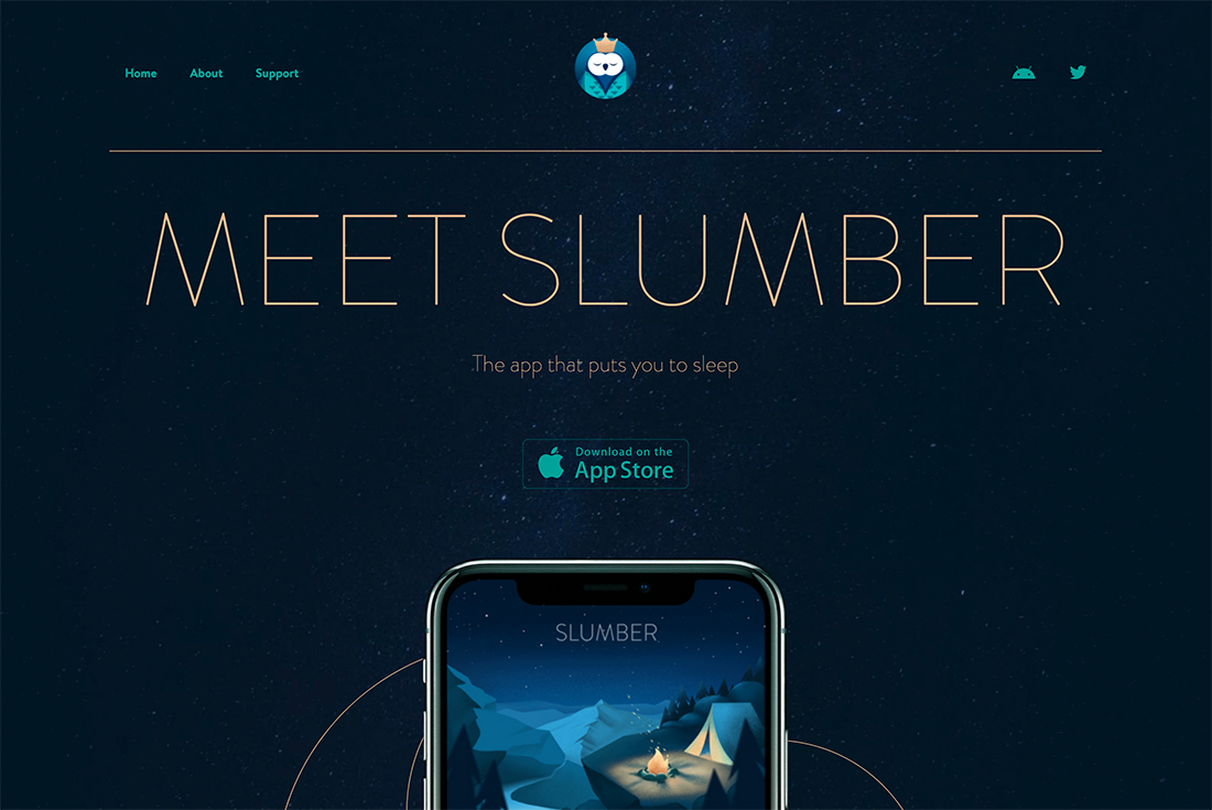
#051622#1ba098#deb992
Slumber makes great use of Pantone’s color of the year – Classic Blue – in app imagery and dark tones in the background and logo. The paring with gold and green is super trendy, elegant, and follows along with the night and sleep theme.
11. Atlanta Brewing
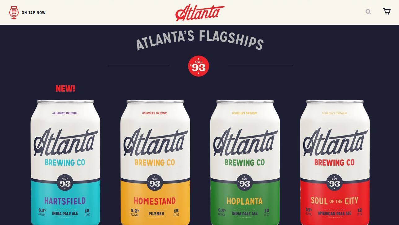
#e40c2b#1d1d2c#f7f4e9#3cbcc3#eba63f#438945
Atlanta Brewing also uses a dominant red with plenty of other accent colors. Note that the palette is not only part of the website design, but also extends to the product packaging as well. They have a pretty wide palette with primary colors as the base and a rich black and white background.
12. Sunny Street Cafe
#5c6e58#8aa899#f2d349
Sunny Street Café is bright with a color palette that perfectly matches the images and language in the design. Greens and yellows together are an unusual combination, but it feels friendly and just right to the design of this breakfast and lunch spot. The color theme also brings out the food imagery nicely.
13. Distinction
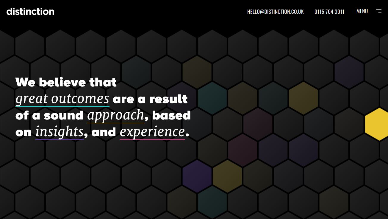
#000000#181818#2cccc3#facd3d#5626c4#e60576
Distinction uses the same all black base for its color palette with a rainbow of accent colors. If you want a wide-ranging color palette, this is the way to use the trend effectively.
14. Lucia Lash
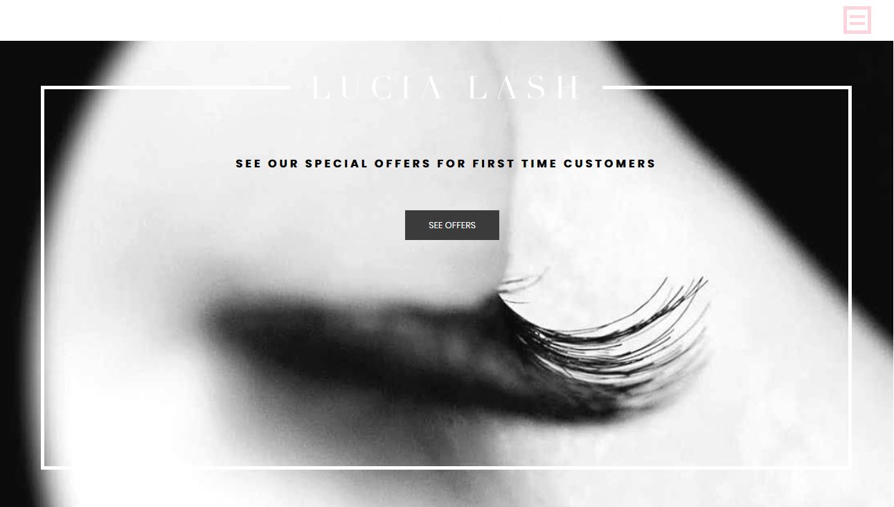
#ffffff#0a0a0a
On the other end of the color spectrum is lack of color altogether. An only black and white website color scheme is the height of mod and minimalism.
15. Pittori di Cinema
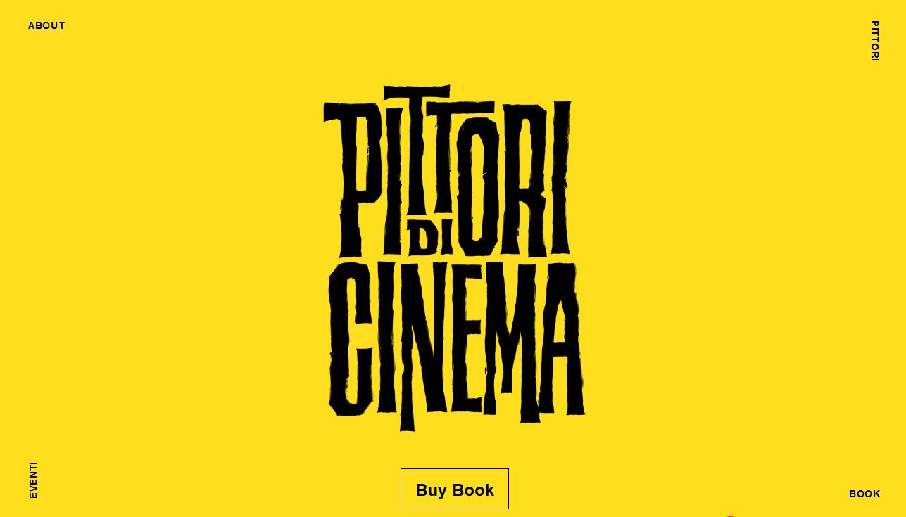
#fdd935#000000
Minimalism can be in full color as well, as evidenced by Pittori di Cinema. The bright yellow scheme with black is a common high-color minimalism option. The brighter the color palette for this style, the more on-trend it seems to be.
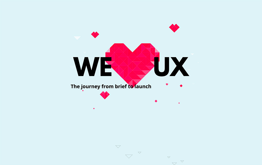
16. We (Heart) UX
#e1f2f7#ef0d50#eb3a70#e5bace
We (Heart) UX uses a simple color palette with a pale blue background – lovely choice – and shades of pinkish red for the main art element. Pulling together these colors with a funky geo style is trendy, modern, and just plain fun to look at.
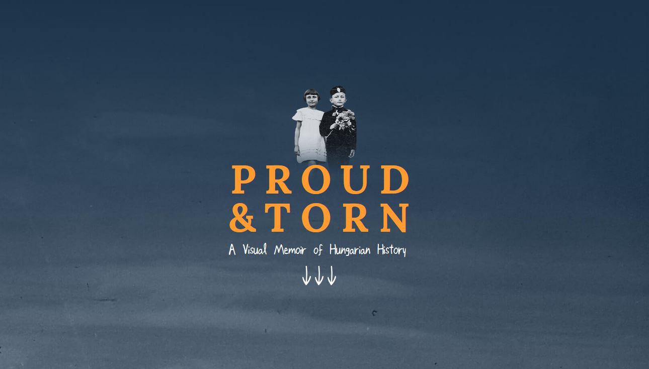
17. Proud & Torn
#1f3044#fb9039#646c79
Proud & Torn uses the same jewel-tone concept with a slightly more muted color combination. The more subtle color palette helps create visual interest for a website that features a lot of colorless images.
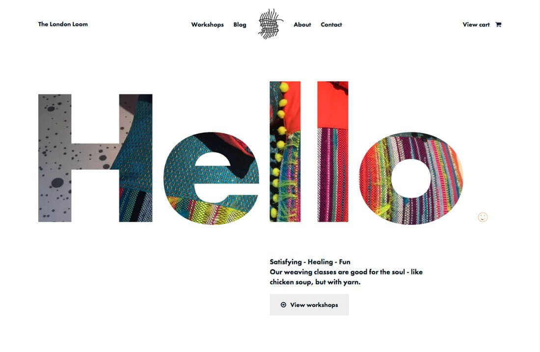
18. Loom
#6effc4#9630d8#ffffff
Loom uses bright color elements to contrast with a more stark black and white background. Purple and green work fantastically together, especially in the tones that were selected here. If you aren’t sure about a color choice, the option to use some transparency with one color is a nice touch.
19. Etiya
#d56c2c#22223a
Etiya features another popular single color as part of its overall website color palette – orange. Bright orange tones – often used with dark backgrounds that are black, navy or purple – are a trending option.
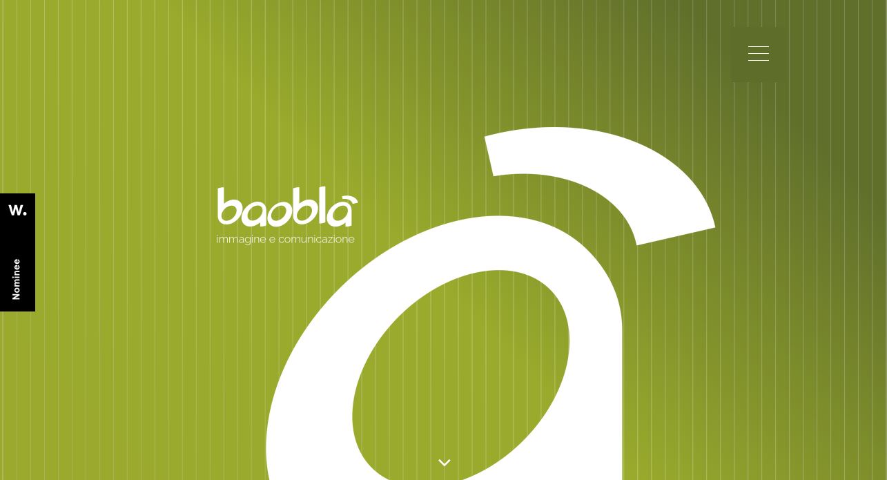
20. Baobla
#56642a#849531#92a332
Baobla features a fun gradient in a monotone color scheme. This style of color palette is ideal for new brands or product identities or if you are looking to make a lot of impact with a bold hue.
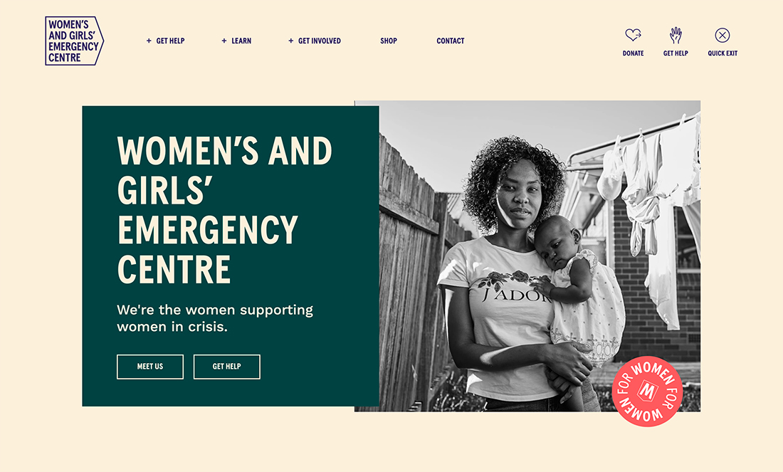
21. Women’s and Girls’ Emergency Centre
#faf0dc#0b4141#ff6864
Women’s and Girls’ Emergency Centre picked a color palette that isn’t overly feminine, helping give more strength to its message with bold color. The color choices are high in contrast and easy on the eyes and in terms of readability. The bright accent choice is trendy and adds emphasis to that element.
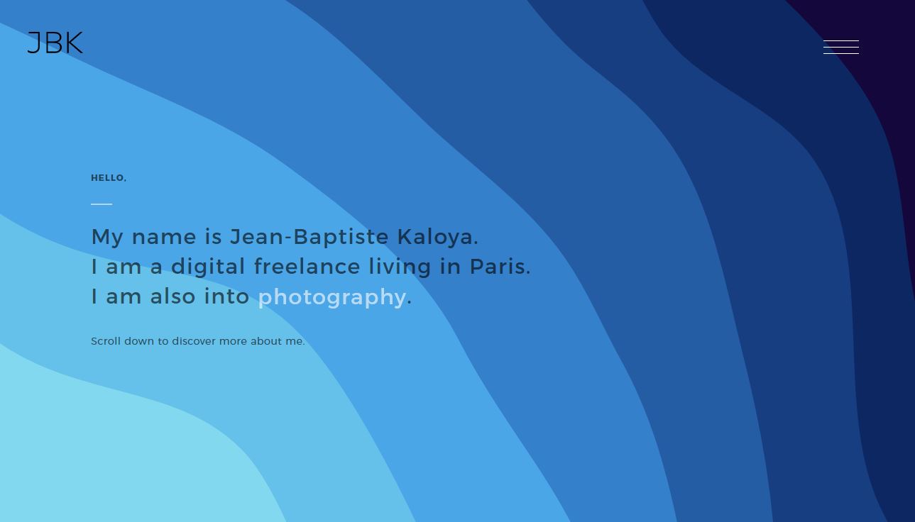
22. Jean-Baptiste Kaloya Portfolio
#150734#0f2557#28559a#3778c2#4b9fe1#63bce5#7ed5ea
Jean-Baptiste Kaloya turns probably the most popular color in website design into a monotone palette of its own with varying degrees of blue. Also note the soft gradients on the lighter blues.
23. Igor
#000000#fefefe#fdee30
Igor showcases what is probably the most popular website color palette of 2019 – black, white and yellow. This color palette, although seen in varying hues, is widely popular. This combination is probably one of the most appealing.
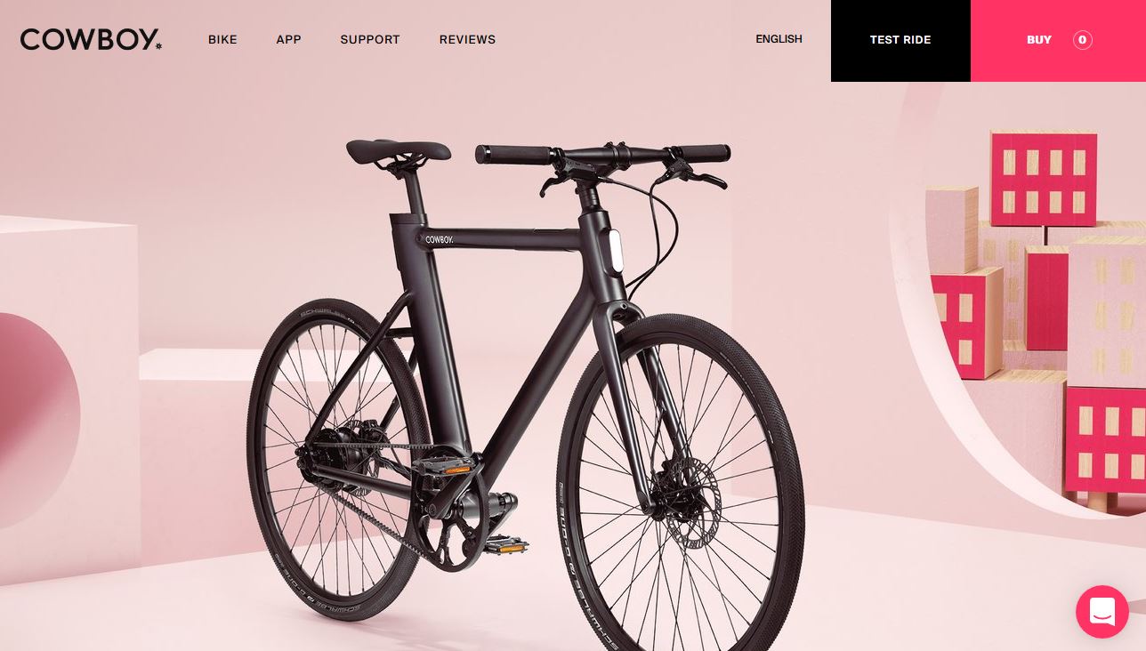
24. Cowboy Bike
#000000#fa255e#c39ea0#f8e5e5
Cowboy Bike uses a black and bright color palette that’s an immediate attention getter. While most sites use black only for text, this design actually incorporates it into the bright, monotone palette.
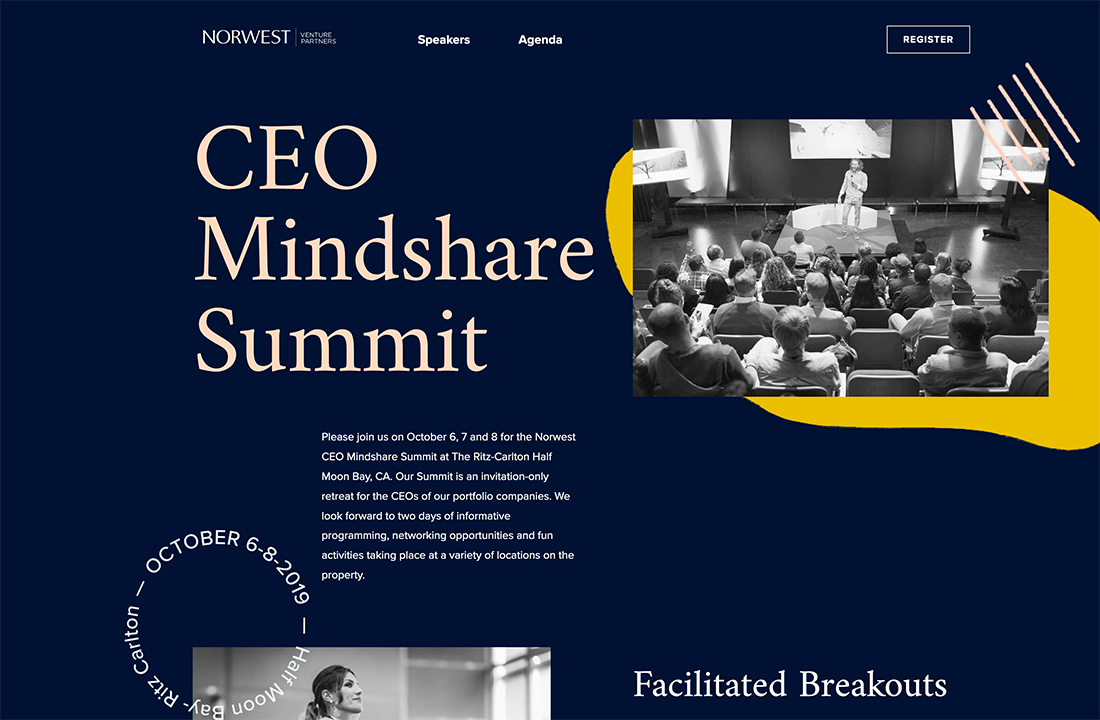
25. CEO Mindshare Summit
#001131#e4bf3f#fedbc4
CEO Mindshare Summit’s combination of blue and yellow is striking. The surprising element in the color palette is the use of a peach accent. It’s so subtle that you might not notice it at first. What this color does is provide an accent that’s not as stark and bright as white, which makes it a little less bold at large sizes, such as in the main headline.
26. Social Economy Month
#ff4653#f6dadf#9b1b3b
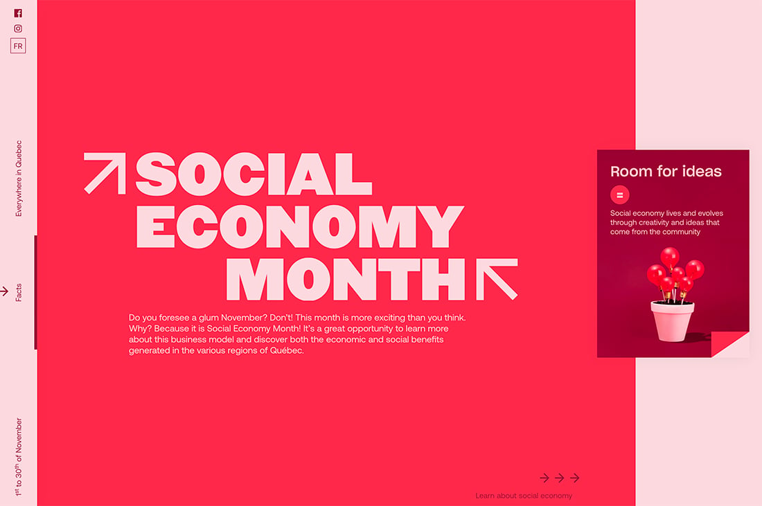
Social Economy Month uses a monotone color palette with one of the year’s most trendy colors un an unexpected way. The bright red that’s the main background color here is typically used as an accent color against black or dark blue. Seldom does it stand alone in this way and the palette really does make you look at the design thanks to bold color choices.
27. Gabrielle Dolan
#e8eae3 #373833 #fa2742
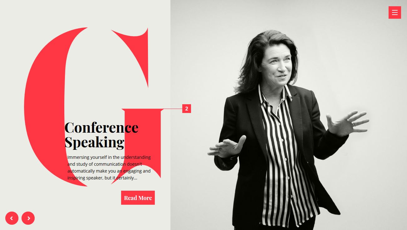
Gabrielle Dolan’s website uses the gray-white-bright color palette trend. With a distinct lack of color for most of the design the bright color seems to jump off the screen. It creates just the right focal area and amount of contrast, which is why this is a trending color scheme option.
28. Pixel Pantry
#9e15bf#4ac6d2
Pixel Pantry uses a distinct color pair to show off this trend – purple and teal. The combination of these two colors to create a palette is nearly unreal. You’ll find variations of this scheme almost everywhere you turn.
29. Eleven Plants
#5daa68#3f6844#faf1cf
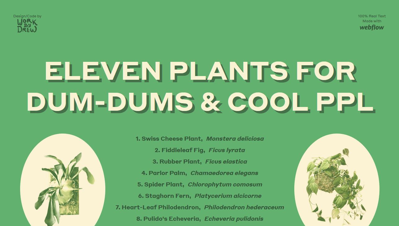
Eleven Plants uses an all neutral color scheme that’s harmonious and easy to look at. The green matches the content well and the color combinations are simple and charming.
30. Qvartz
#ee7879#2a3166#f4abaa#cae7df
Qvartz uses one of the most unexpected trending colors of the year in a way that mimics many other projects. With pink text, pink color blocks and a mashup of bold and softer colors, this palette is somewhat feminine but not too much so.
31. Sheerlink by RTX
#4a2c40#e9bd43#7d3780
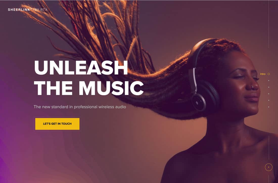
Sheelink By RTX uses a modern gradient and bold coloring to bring attention to its product. The colors are deep and moody and the maroon-purple has a distinct sense of regality and mystery.
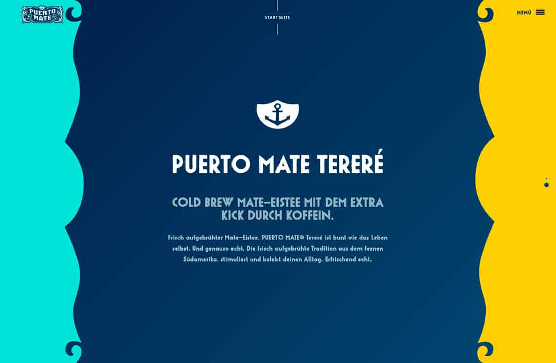
32. Puerto Mate
#5ce0d8#01345b#ffcf43
Puerto Mate uses trending colors that are bold without being overpowering. Because the center panel is navy the outside bright colors feel a little less in your face. (Just imagine flipping these hues into different locations in the design.)
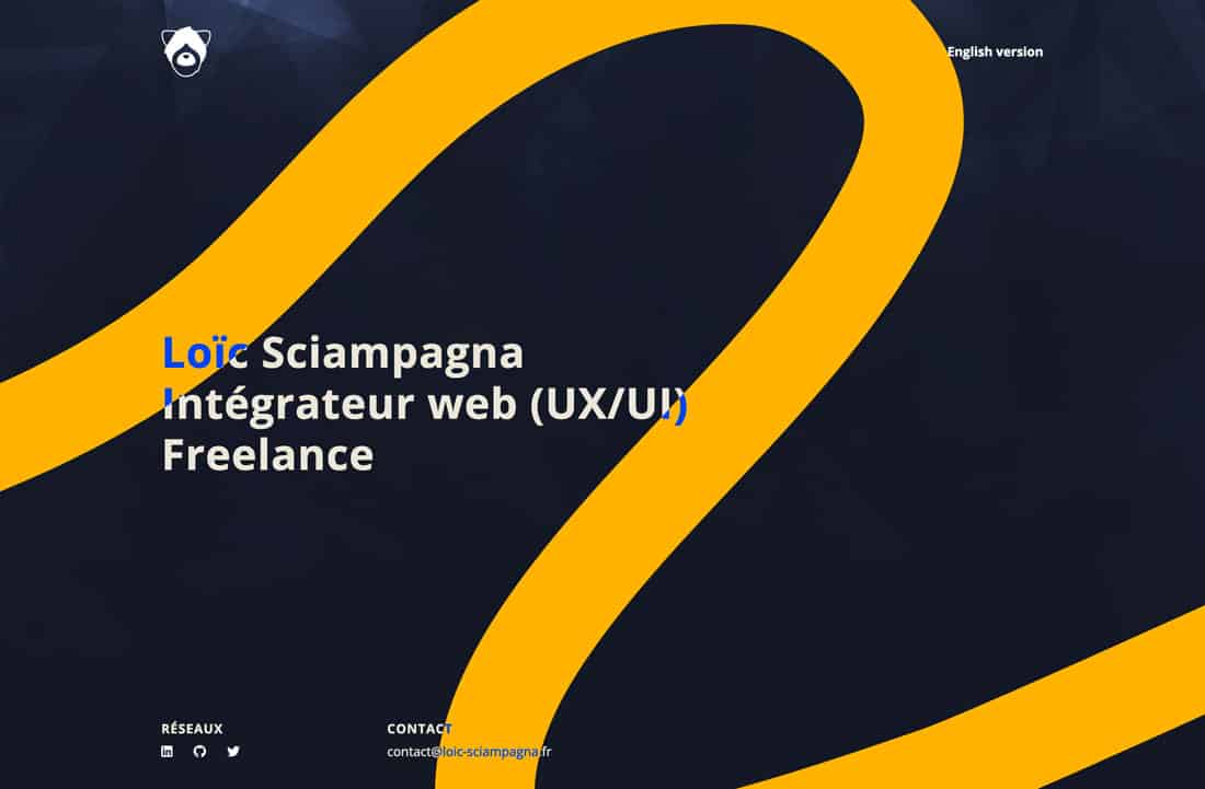
33. Loic Sciampagna Portfolio
#141824 #ffb600#0049ff
Loic Sciampagna’s portfolio uses one of the best combinations of blue and yellow you’ll find. The contrasting hues are simple, elegant and engaging with the simple touch of the light, brighter blue.
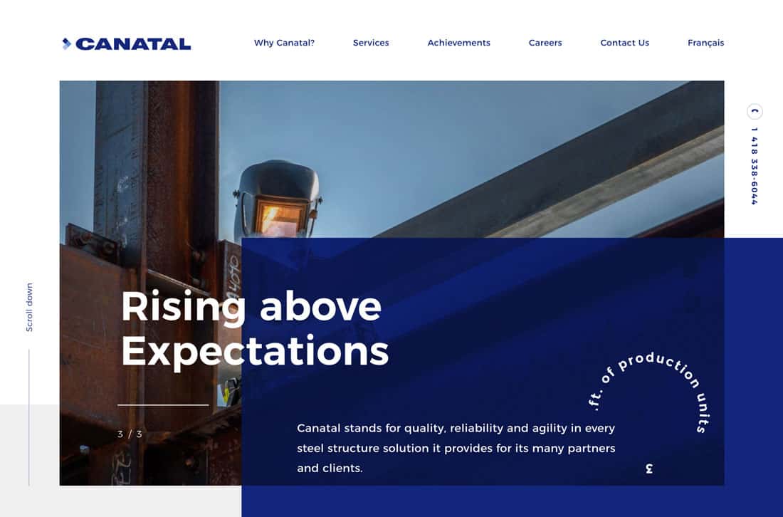
34. Canatal
#182978 #6688cc #acbfe6
Canatal uses its triple blue brand colors well in this design. It’s an example of how to use a monotone color palette without being boring.
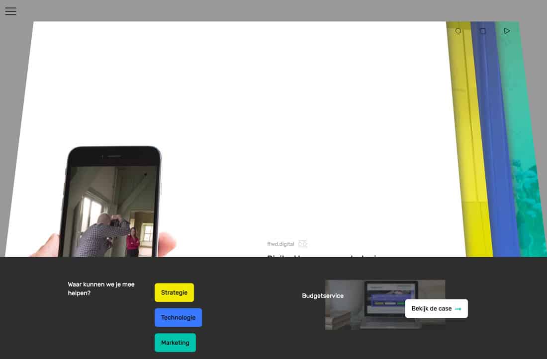
35. FFWD Digital
#f1e821#487afa#23c0ad
FFWD Digital uses brights in a stylish and classic way. On paper, using this trio of colors on a dark and light background might seem awkward, but here, it’s actually seamless and lovely.
36. Tappezzeria Novecento
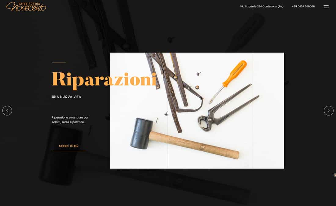
#191919#fab162
Tappezzeria Novecento uses a color scheme that most would shy away from – and it works. The bright combination of orange and black is simple and engaging. The colors contrast just enough so that everything is easy to read. It’s also a nice touch that the brand colors are also in the images.
37. Tev
#252669#4ecb4a
Tev is anything but boring with a lime background and duotone color overlay. It’s bold and the green makes you think money – just what the site is designed to do.
38. Niche & Cult
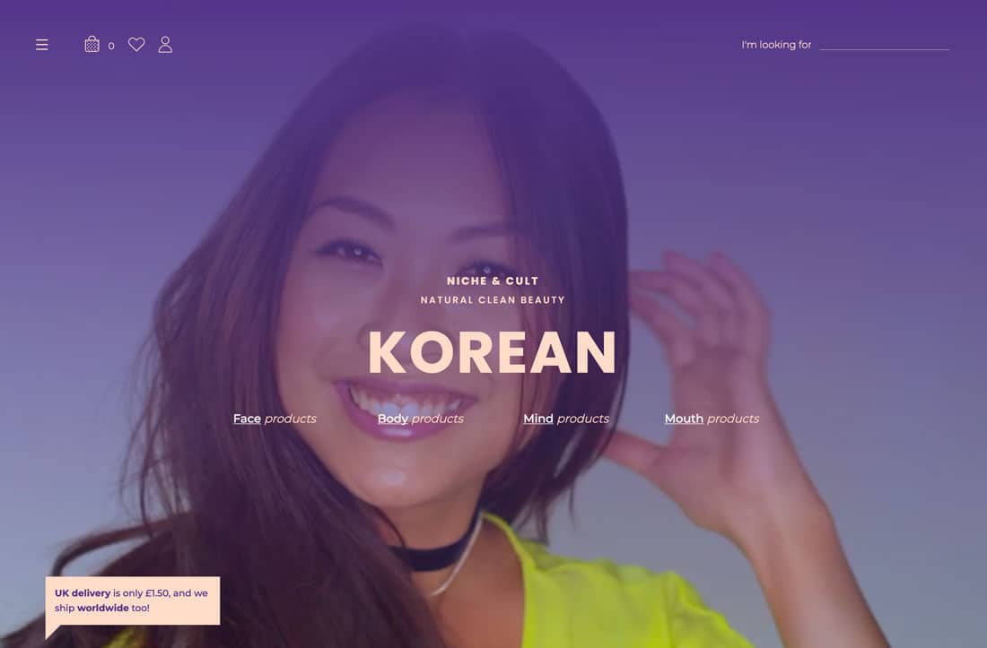
#4e3883#ffddcc
Niche & Cult uses soft hues for a beauty brand with a more feminine feel. The soft pink is reminiscent of some skin tones and a blank canvas for makeup while the bright purple matches the mood of the site.
39. Sysdoc
#001730#4ad7d1#fe4a49
Sysdoc creates a new spin on a basic palette of red, blue and green with brighter, less saturated options for the red and green. The palette is strong and soft and matches almost any other set of elements.
40. Veneziano Coffee Roasters
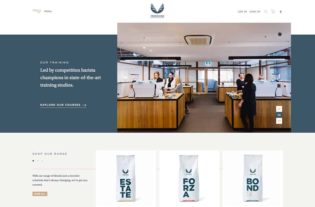
#f6f4f2#425664#c6ad8f
Veneziano Coffee Roasters goes back to a more muted palette with a gray-blue and gold combination that’s subtle and classy. The colors pair well with the website’s imagery and create just the right feel.
41. Better Energy
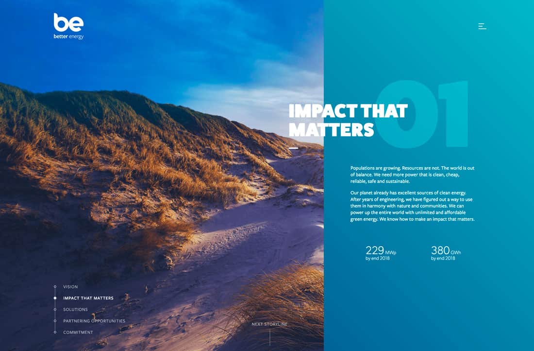
#11abc1#df3062#f5b935#4bac3f
Better Energy uses bright colors associated with nature – taken from corresponding imagery – to create a fun palette to tell the story of something that might not super interesting to talk about.
42. Blast Galaxy
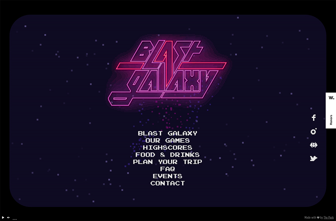
#0f0c24#a350a3#c1436d
We couldn’t get through a roundup of cool color trends without looking at an 80s palette. Everything from the 1980s seems to be trending and that includes the colors used for Blast Galaxy, a commonly observed combination of blue, purple, and pink with a neon glow.
43. Kyle Decker Portfolio
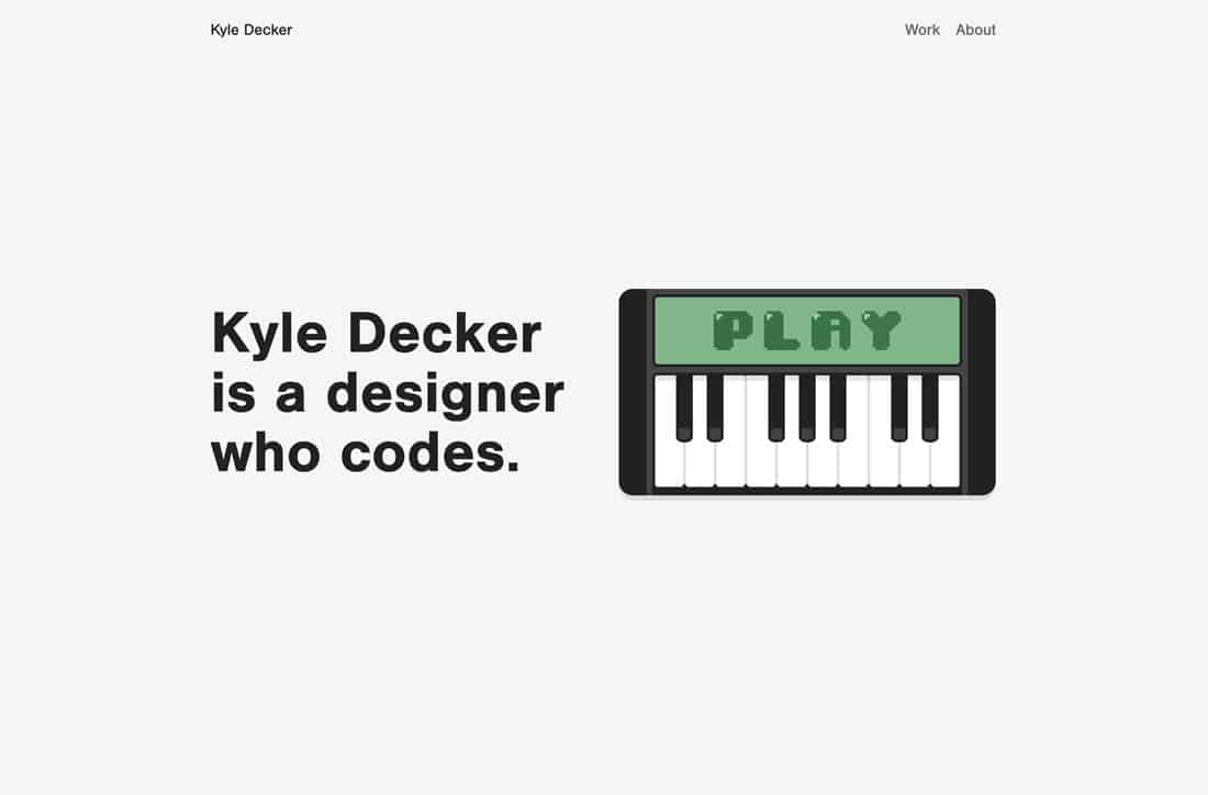
#f5f5f5#8db48e#4d724d
Kyle Decker’s portfolio is another website with a color scheme that shines because it is so simple. It uses a combination of neutrals and only one true color to focus the eyes of the user.
44. Awink
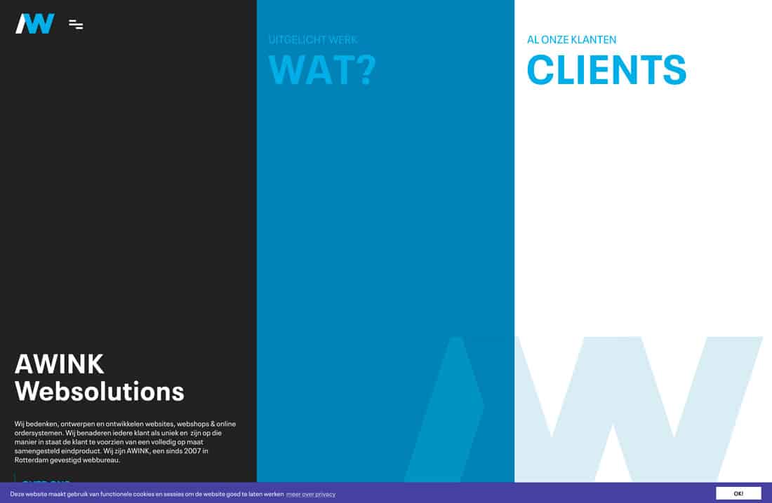
#212221#1181b2#ddedf4#44449b
Awink Websolutions also uses a monotone color schedule with varying hues of blue. (Blues are a popular option when it comes to monotone options.) This one is just a little different thanks to the deeper, darker accents. Plus, dark and light screen areas almost play an optical illusion, making you think there are more colors here than there actually are.
45. Archibald Microbrewery
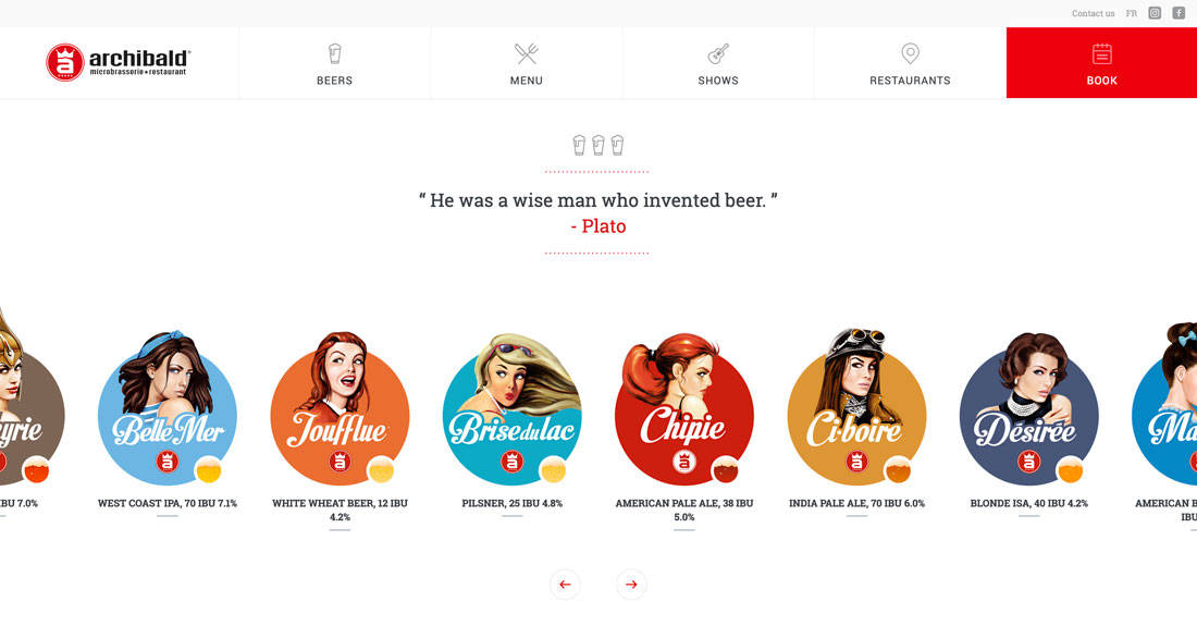
#d81c23#4fa8c2#d97441#d29849
Archibald Microbrewery uses a rainbow of colors, but the palette is surprisingly beautiful. With colors all in similar saturations and following a theme visually, it comes together pretty seamlessly.
46. Australian Government, Building and Construction Commission
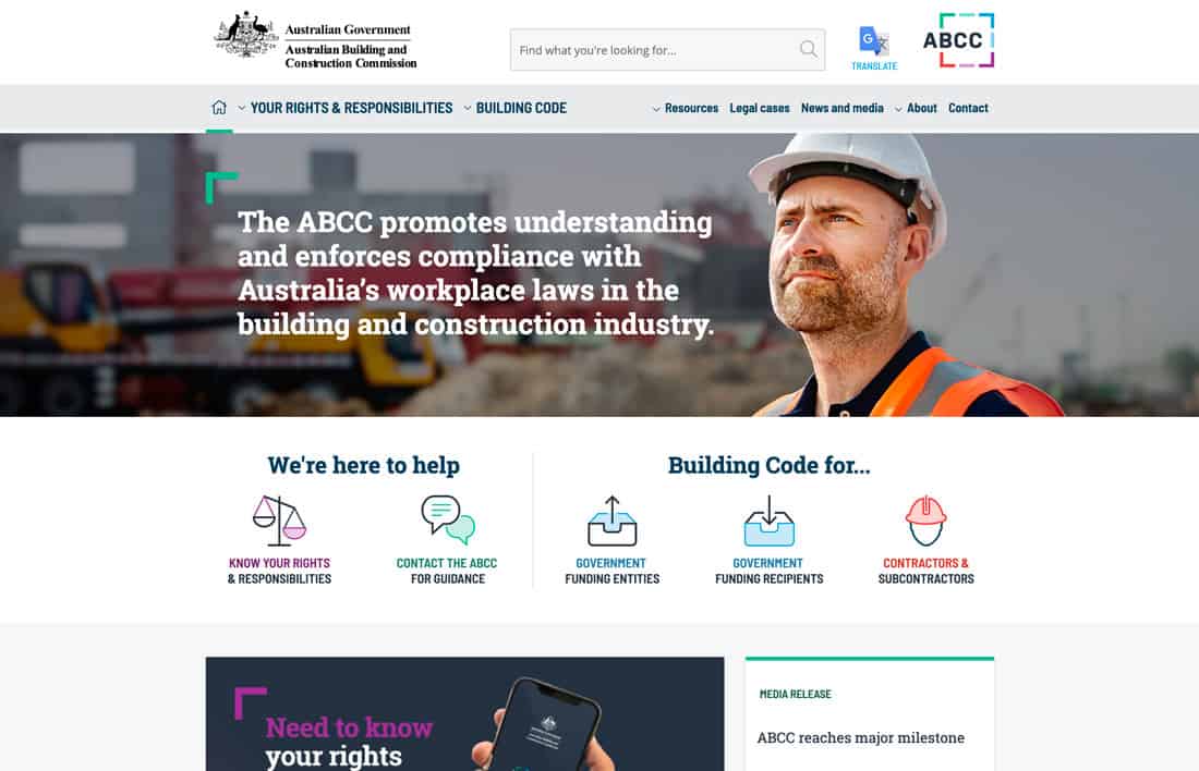
# 9b3a95#3d7da7#f4abaa
The Australian Government, Building and Construction Commission website isn’t one you’d probably expect to be on a list of great color schemes, but the combination of purple, green and blue here is stunning. It also helps guide users through the design with a color-coded system.
47. Indegy
#45af2a#3fddc1#d56c06
Indegy uses a bright green against plenty of photos and high color. The simple color, paired mostly with gray and white, adds a modern tough to the design and helps direct users through the content. (There are also teal and orange accents for subtle pops of bright in other places.)
48. Knapsack
#ad4328#b65741
Knapsack uses a bright red color scheme with gradients to add interest to a color that can be tough to use. This works because there aren’t a lot of high-energy visuals competing with the bright palette.
49. Demisol
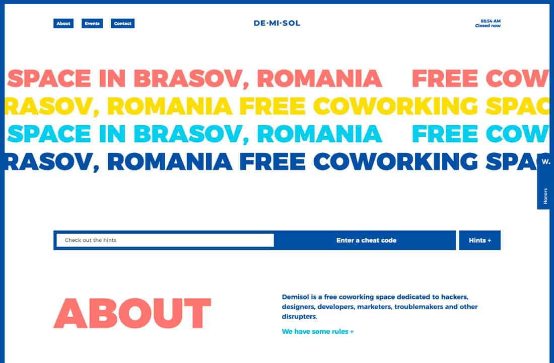
#16519f#f07e74#f8dd2e#4fcbe9
Demisol uses too many colors and too many big elements, and it’s fabulous anyway. Sometimes playing with color is an experiment; test it out and see if it works.
50. Dropbox
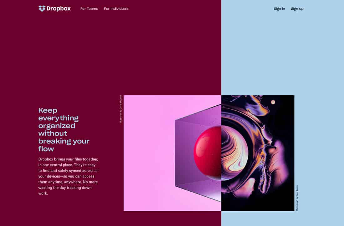
#61082b#b4d0e7
Dropbox has another one of those color schemes that shouldn’t work … but it does. The contrast between the deep maroon and baby blue establishes great eye movement across the split screen. The colors work equally well as text elements on the opposite color. Once more, it proves that sometimes you just have to try color options out and see how they work.


