Color is the main component of every design. Even though it may seem like colors always remain the same, it’s actually something that is everchanging. And as a result, it makes way for new color trends every year.
In fact, Pantone recently introduced a whopping 294 new colors. According to the company, these colors were invented to fit in with modern trends and to appeal to the new generations.
If you’re preparing to start a new design project, staying up-to-date on the latest trends is important. It’s the key to making your designs relevant and appealing to the current audiences.
Today we take a look at the breakout color trends of 2020. Rather than just talking about different trends, we wanted to go deeper. So we found real-life examples to show how each trend is being used by different industries today. As an added bonus, we also feature a design template that uses each color trend. So that you can get a headstart on your project.
What kind of color trends will be popular this year? Will there be new trends in color schemes? Or would any old trends make a come-back? Here are our predictions.
1. Pastel Colors in Website Designs
Most of the new color shades invented by Pantone were shades of pastel colors. Well, it’s not really a surprise at all. Especially with many brands and designers already adopting the new pastel color trend.
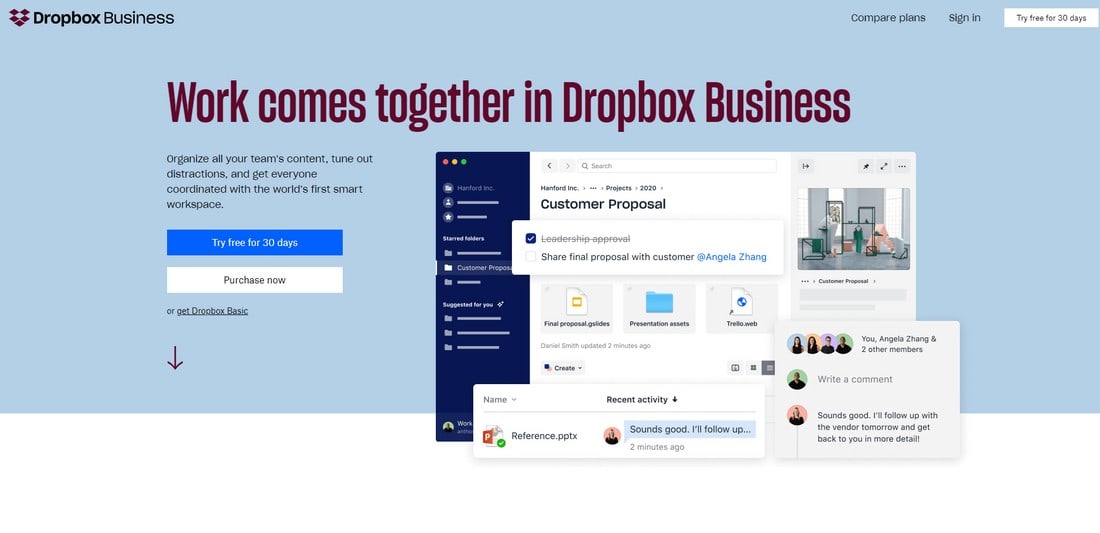
A great example of pastel colors in action is the Dropbox website design.
Fun fact, this is not the main Dropbox website. At the time we were publishing the trends in startup unicorn websites, Dropbox website was different. So we likely stumbled upon an alternate version of the website, presumably a part of an A/B testing campaign.
Nonetheless, both the main site design and this new landing page variants of Dropbox websites use gorgeous pastel colors.
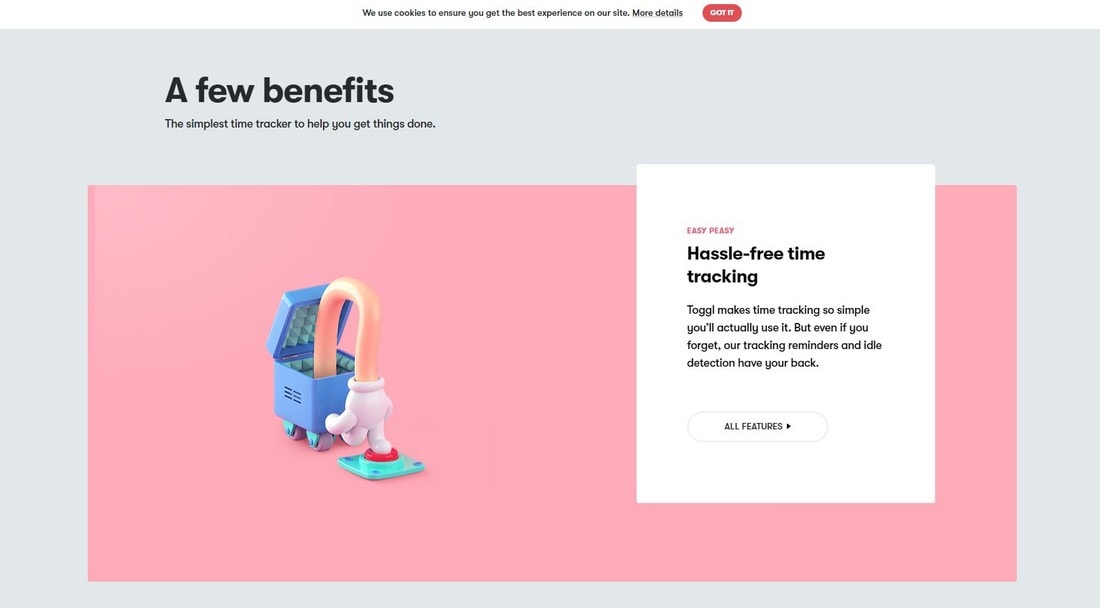
And Dropbox is not the only fan of pastel colors, many other brand websites like Toggl also use beautiful pastel colors on its design.
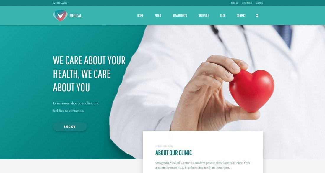
Another example is this Bootstrap website template. It also uses pastel colors in multiple styles of website layouts.
Why are pastel colors so popular? It probably has something to do with the pleasing and calming effect it has on people. It’s a feeling that’s difficult to describe but when you look at a design made with pastel colors it just makes you feel relaxed.
2. Gradient Colors in Icon Design
There used to be a time where designers were shamed for using multi-color color schemes in designs. Today, things are different. Using color palettes with vivid and multiple colors is encouraged. Because now it stands for something meaningful than just random colors.
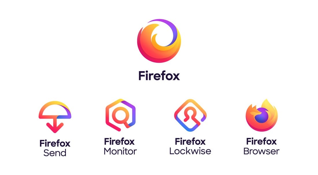
It’s probably why we’re seeing many designers adopting gradient color schemes. Especially when it comes to icon designs, we saw many brands such as Instagram take advantage of this trend. The latest brand to join is Mozilla.
Mozilla introduced its new Firefox rebranded icons design in June 2019. Firefox always had a colorful icon design. But this new approach took things to the next level.
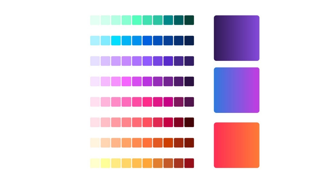
Their new color palette featured a variety of colors and shades. The company says the new icons will help the brand stay relevant “long into the future”.
Are gradient icons only suitable for product icons? Not at all. You can use them on website designs and app interfaces as well. This business icon pack is a good example of that.
3. Retro Neon Colors in Logo Designs
The retro color schemes from the ’80s are making a comeback. Especially the use of neon colors in logo design is something that’s been picking up momentum recently.
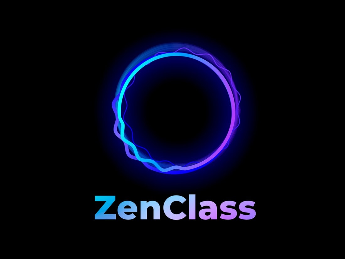
A great example is this brand logo we’ve found on Dribbble. It’s designed for a Russian software company called ZenClass that specializes in online learning systems.
Notice how it uses glowing neon colors with a mix of gradients. It’s actually quite mesmerizing to look at.
While this trend is not applicable to most branding and logo designs, it has its own audience. Especially with the popularity of the futuristic cyberpunk designs, this neon color trend is most relevant for technology and gaming related brands.
4. Duotone Colors in Poster Designs
The duotone color trend is something that dates back many decades. It’s been used for many different types of designs over the years. And it’s quite popular in poster designs.
However, we believe Barack Obama’s Hope campaign deserves credit for making the duotone color trend popular again.
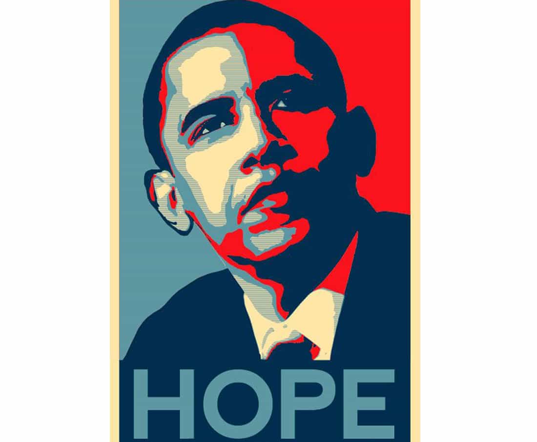
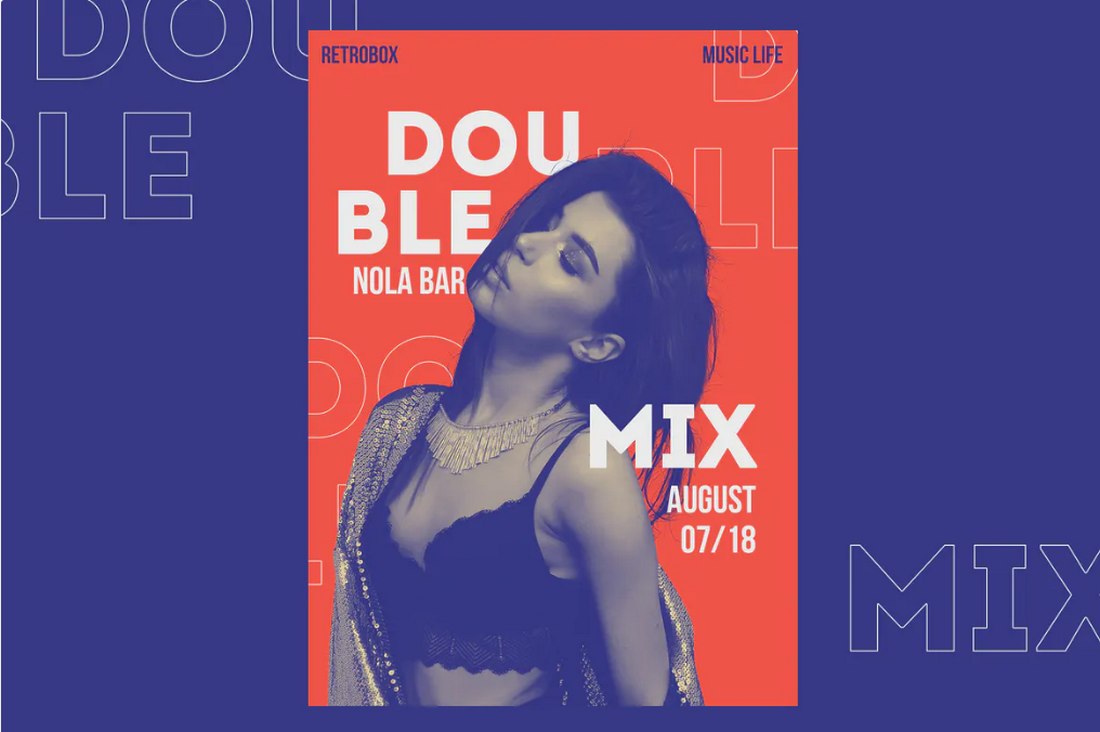
Recently, the duotone trend started taking over the entire print design industry. It was a quite common theme among music and DJ posters and flyers. Then it made its way to movie posters and brand flyer designs as well.
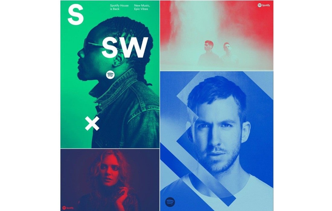
Even Spotify started using the color trend in its promotional campaigns.
There’s something oddly attractive about the duotone color style. It’s the mix of simplicity and the way the colors are used that make it more appealing to the younger generations.
5. Faded Vintage Colors in Label Designs
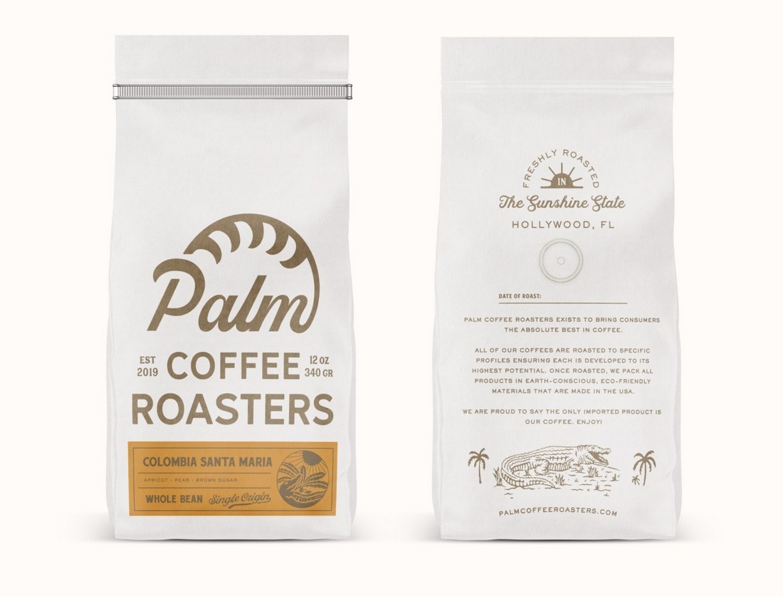
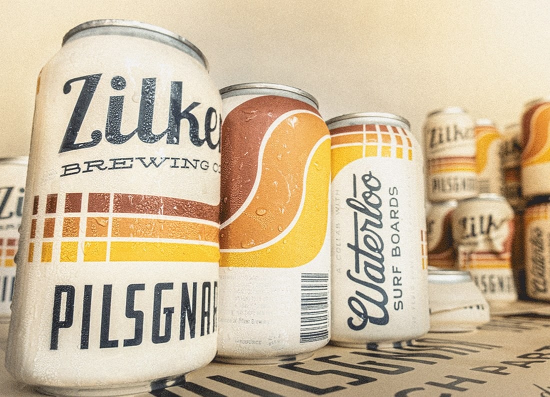
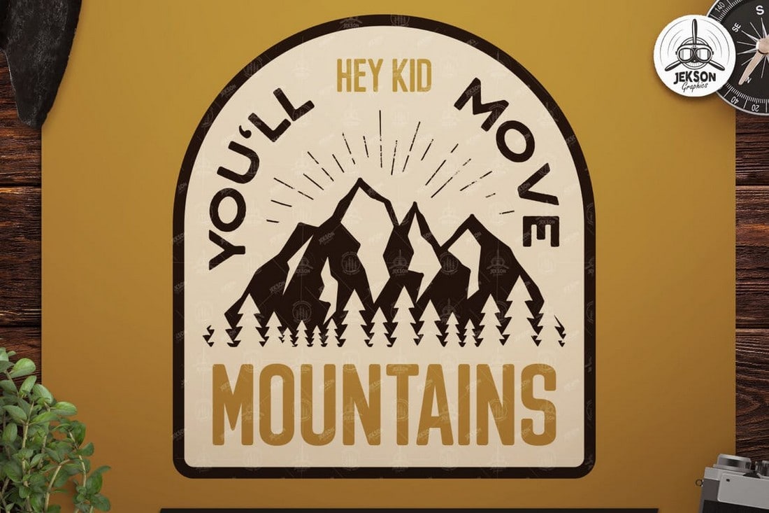
The use of vintage-themed designs in labels is quite popular these days. Especially the label designs that use washed-up and faded vintage colors are the ones that attract the most attention. We’ve seen the color trend in everything from clothing labels to coffee packaging and much more.
Why is it popular in label design? It’s mainly because the vintage colors look amazing when printed on cardboard and paper bags.
But lately, we spotted this new trend taking a step further. And appearing in even beer can labels.
This really makes you wonder, are we going backward in following design trends?
6. Black and Gold Colors in Product Designs
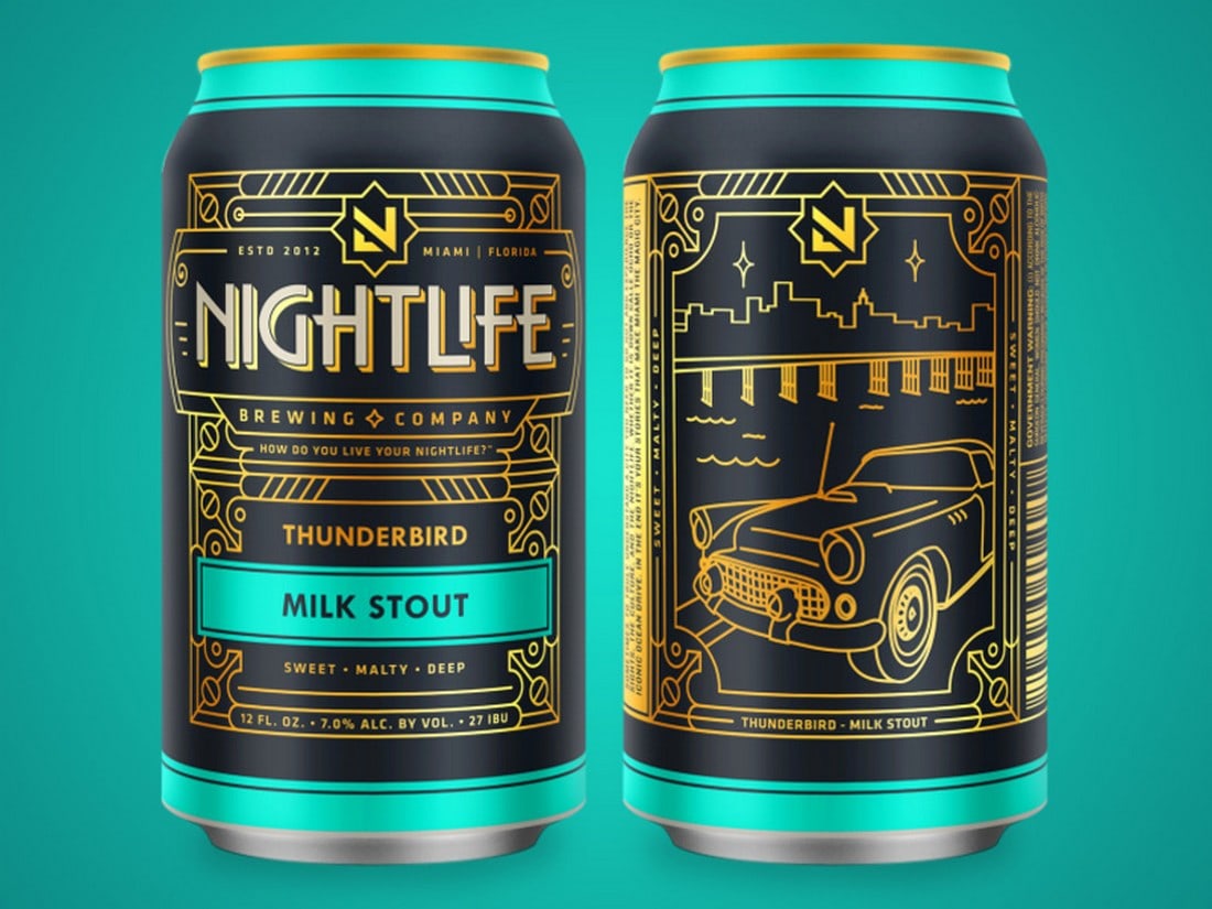
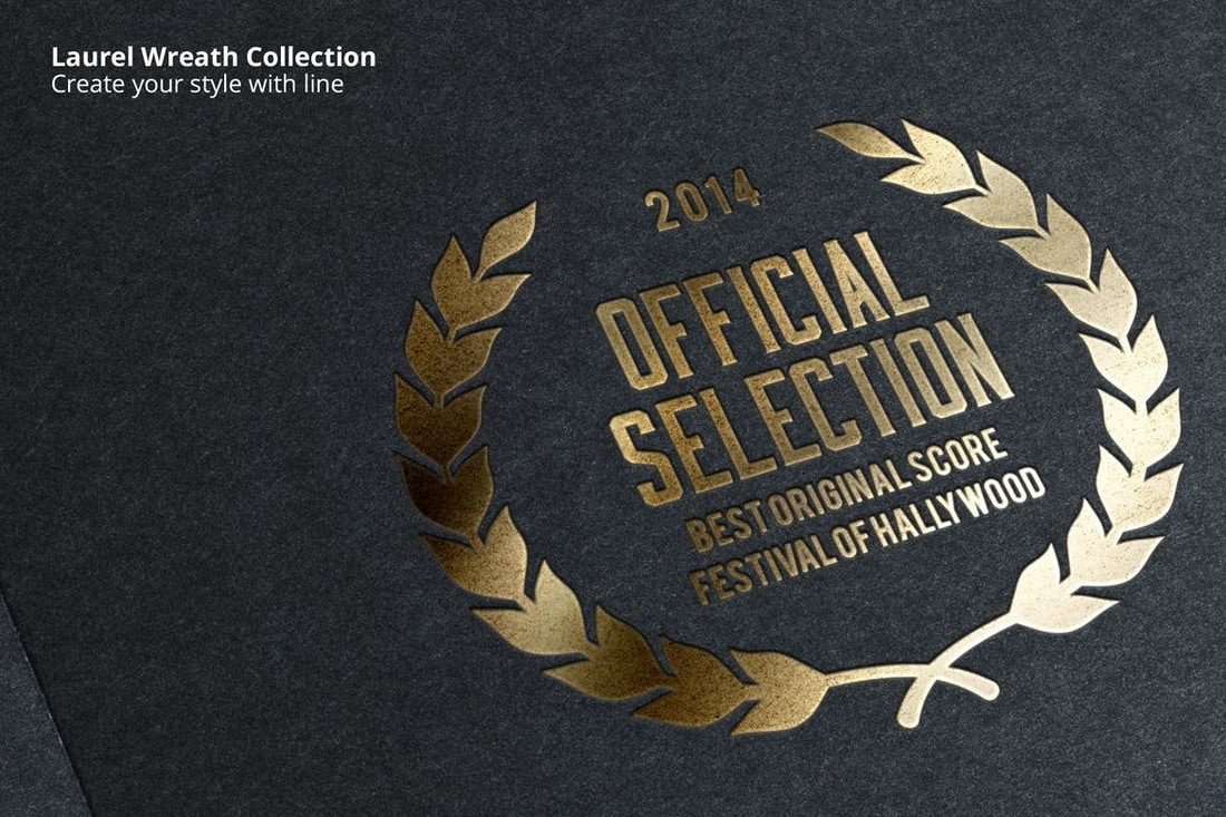
The classic black and gold color mix is a trend that never goes out of style. This color trend has always been something that represents elegance, class, and luxury. Surely, we can expect it to hold up its place this year as well.
The question is, what type of brands and designs will adopt this timeless trend next? Well, how about a beer brand?
Nightlife Brewing is the latest alcohol brand to adopt the classic black and gold color trend for its product designs. As you can see, it looks amazing, especially when used with an art-deco style of design.
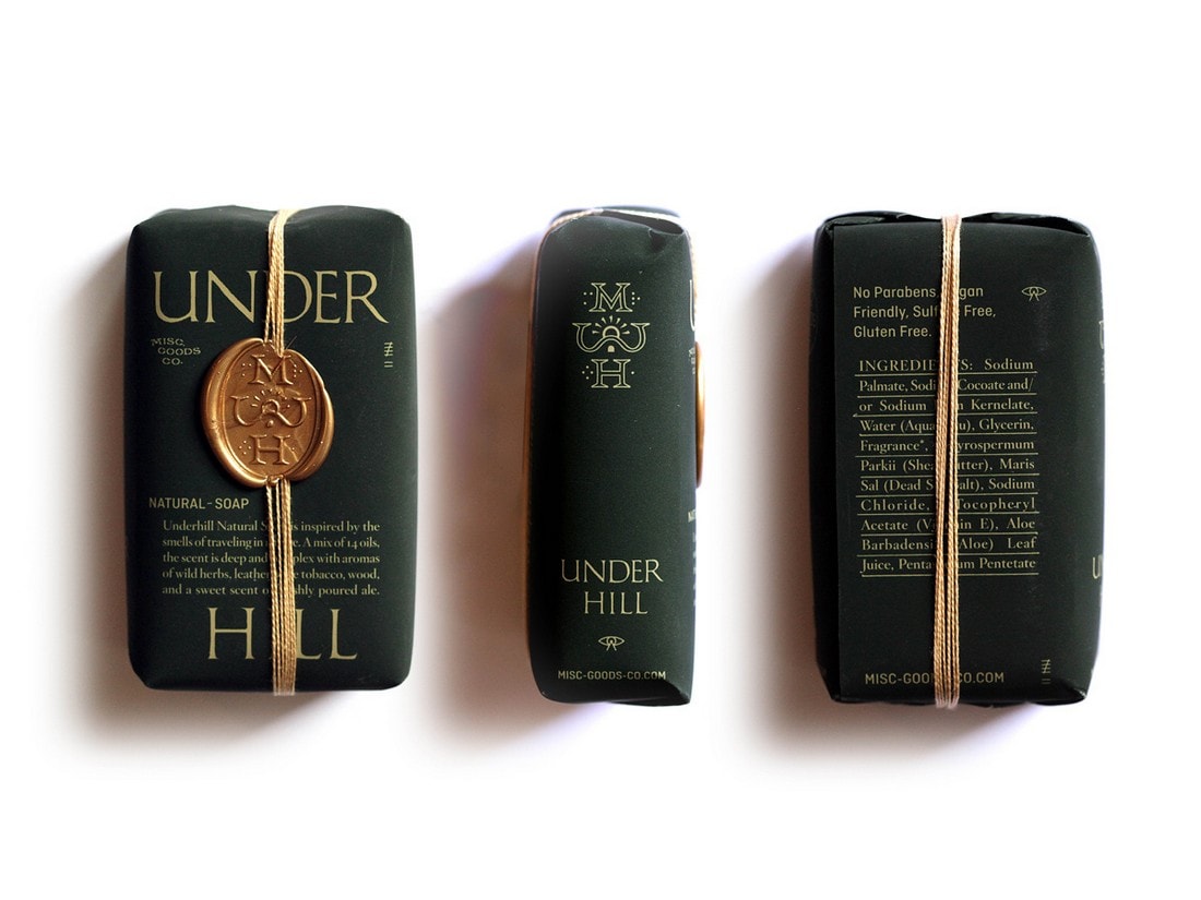
MGCO Soap company managed to put a spin on this new trend by using a dark green and gold color design for its soap packaging design.
7. Dark Colors in App UI Designs
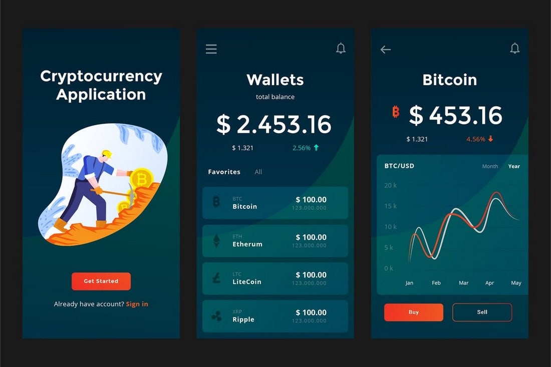
It’s like every app on both mobile and desktop platforms are getting a dark mode these days. With Android, iOS, and even Windows introducing dark user interfaces, it’s now standard practice to include a dark color mode in every app.
Google first introduced a dark mode for its Gmail mobile app. Followed by Whatsapp. Even Facebook now has a dark mode for its web app.
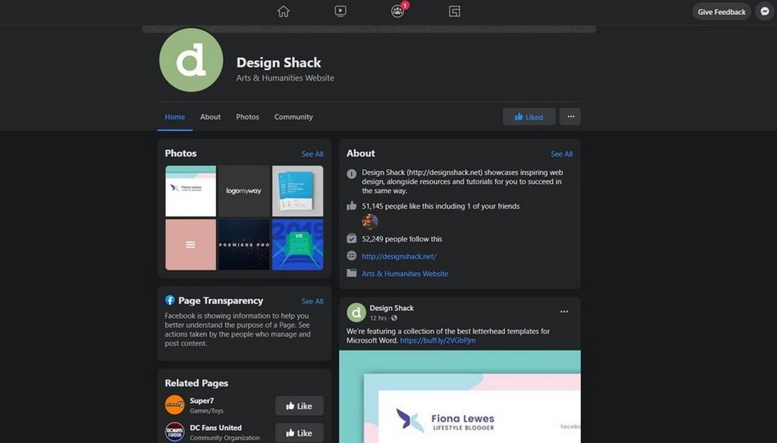
Needless to say, we’ll be seeing more apps using dark color UIs in the coming months. Of course, we hope designers will get creative with this trend.
It doesn’t always have to be black and white to create a dark mode for a user interface. There are many dark shades of colors that will help create an amazing dark color mode for apps.
What’s Next?
Among the seas of color and design trends, we’re certain that these specific trends will float through to the next year. And hopefully for many years ahead. Especially since they’re validated by some of the biggest brands in the world, you can safely use these trends in your design projects.
What kind of new color trends will come out next year? Tune in next year to find out.


