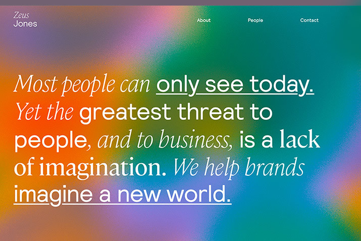
There are a few ideas about website design that seem to never fade away, even though they are not so true anymore. Some concepts haven’t stood the test of time, and it’s time to revisit whether we should be adopting them anymore.
Do people love sliders? Does simplicity = minimal design? Do you really need to include every page of your site in the navigation? There’s quite a bit to unpack!
Here, we’re going to look at a few web design myths and share modern best practices so you don’t fall into any of these old-school traps.
2 Million+ Digital Assets, With Unlimited Downloads
Get unlimited downloads of 2 million+ design resources, themes, templates, photos, graphics and more. Envato Elements starts at $16 per month, and is the best creative subscription we’ve ever seen.
1. Users Love Sliders
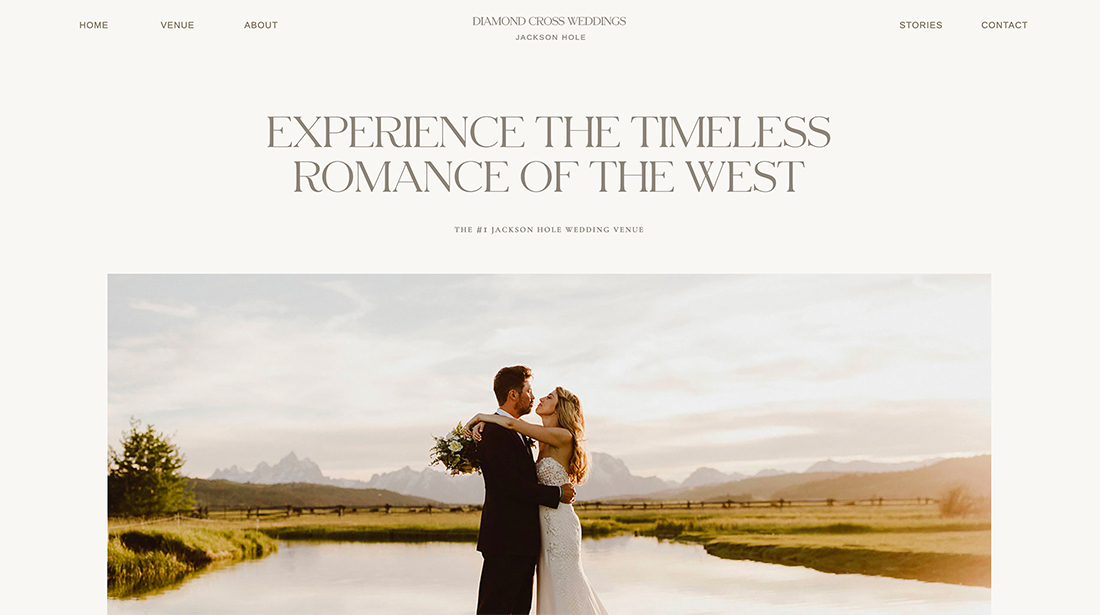
When is the last time you advanced a slider or even clicked on one?
While sliders are still a popular technique, they aren’t really that useful. Visitor engagement for sliders or rotating carousels is exceptionally low.
Yoast makes a pretty compelling case for eliminating them all together:
- Only 1% of people actually click on a slider
- Sliders present too much information and can result in confusion
- They can slow down your website
- Visitors can skip important website messaging
All of these challenges with sliders lead us to a solid conclusion: There’s a better way.
It’s up to you to come up with a more creative design solution. Take the information you were going to put in a slider and create screens using parallax scrolling or create multiple landing pages to create different funnels for what would have been slider content.
Just don’t get caught in the slider trap. It screams indecision – on the part of the designer and for the user.
2. Design Just Makes Things Pretty
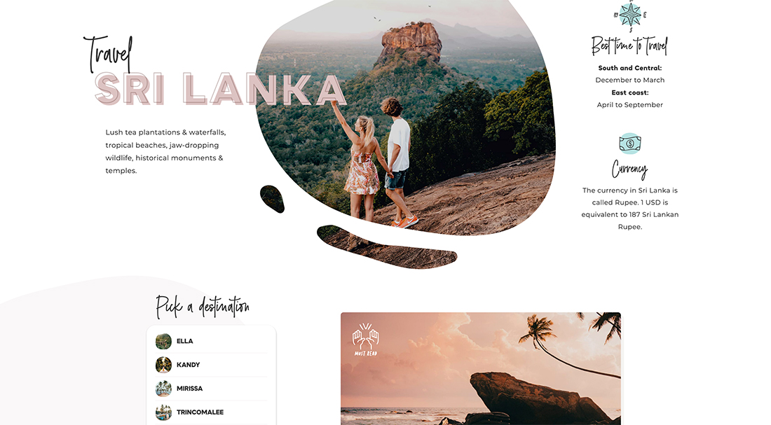
Good design isn’t just painted on a canvas. While it should be aesthetically pleasing, a truly good design is functional and beautiful.
As you create something that looks good, are you thinking about the full user experience? How will visitors interact with the design? Will they be able to do what they expect thanks to visual cues?
Challenge yourself to think about the design process from more than a visual standpoint. As you start mapping the project consider function with visuals. It will create a better design every time.
Use good visuals to help solve user pain points or find key information. This includes everything from images to color to typography choices.
3. Simple Equals Minimal Design
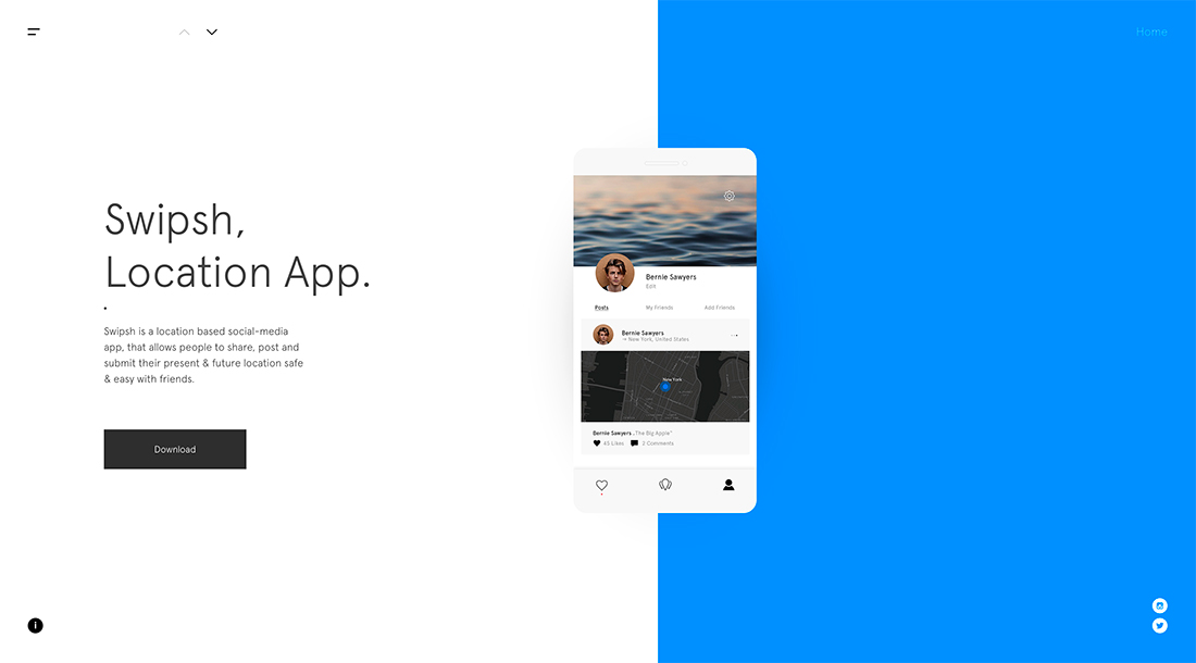
A simple design isn’t necessarily a minimal one.
Both are great design concepts. (We regularly emphasize here how simple design techniques can contribute to a well-designed project.) But just because something is simple doesn’t mean it is minimal.
A simple design is easy to understand without a lot of complexity in the visuals or interface. It’s just what you need to communicate efficiently and help website visitors engage.
A minimal design is an aesthetic that strips away all unnecessary visuals for a sleek, streamlined look.
Minimalism is all about visual representation, while simplicity can be visual and functional. For most designers, there are opportunities to use both design philosophies.
4. Users Don’t Scroll
There was a good chunk of time where all practical advice said website design had to put all pertinent information above the scroll. Otherwise, users would never see it.
The rules of scrolling have changed.
- The depth of the scroll is different on desktop screens (primarily horizontal) versus phone or table screens (often vertical).
- Users are fairly adept at scrolling and skimming content quickly before they make a decision to stick with the design or abandon. (You can almost think of it like fast-forwarding through commercials on TV, a few quick flicks to see if there is anything worth stopping for.)
What that means is that you need highly interesting content in multiple locations on each page. At the top for the users that glance and go and somewhere else on the page for those that will do a quick scan of the page.
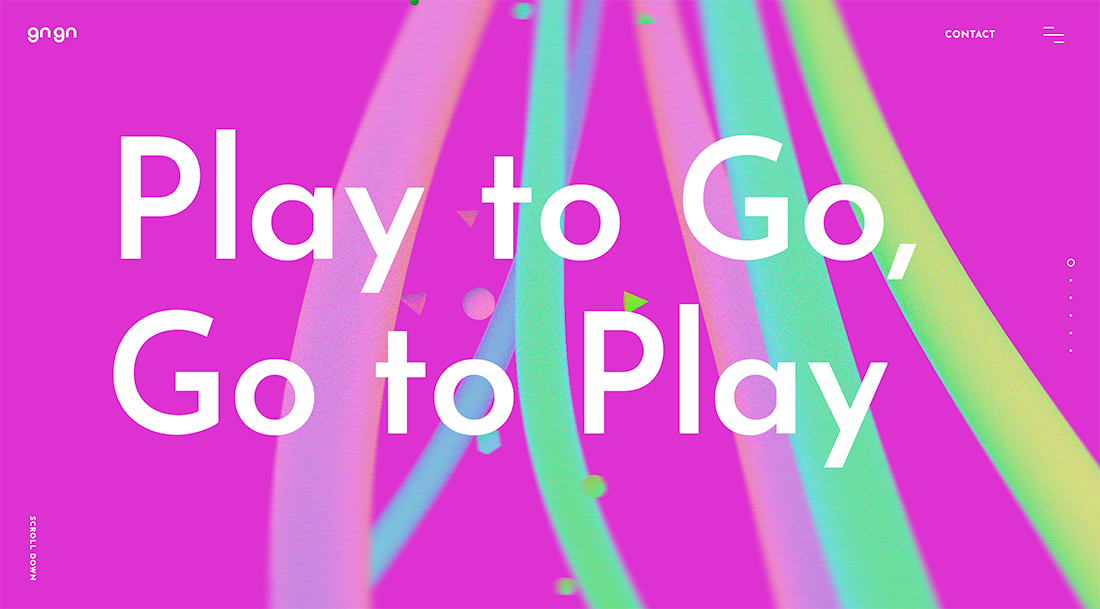
If you are really worried about users not scrolling, provide instructions or visual cues that encourage it. Gngn, above, does this with a scroll instruction in the bottom left corner as well as timeline dots.
Even more important might be creating these informational pieces in such a visually interesting way that they almost force users to stop and look. This gives you a second chance to turn a visitor into someone who completes a conversion.
5. Everything Needs to Be In the Navigation
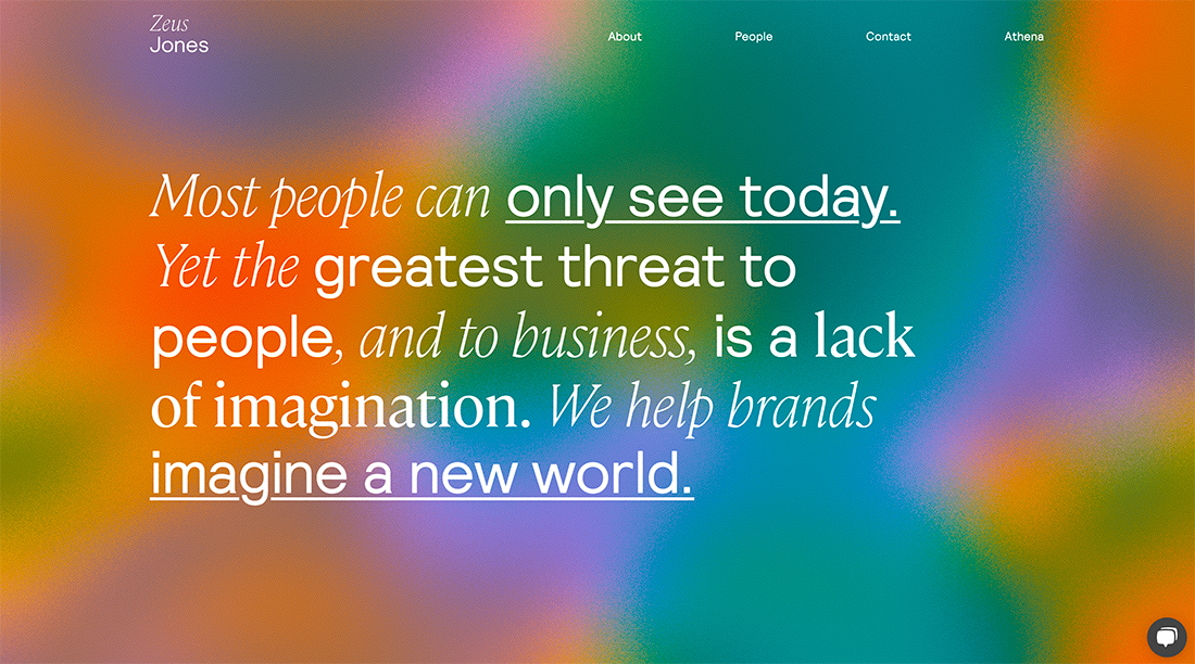
Amazon.com might be the only website that can get away with levels of navigation that just seems to keep going and going. (And even the retail monster has begun to streamline its mega menus.)
Presenting too many choices in the navigation can prove to be overwhelming
Presenting too many choices in the navigation can prove to be overwhelming and actually have the opposite impact on website visitors, meaning they will leave the website rather than complete an action.
A better option is to put a handful of the most popular links in the main navigation and include a prominent search option for users who don’t see what they are looking for. Include search in, or close to, the main menu so it becomes an obvious solution if they aren’t finding something.
An added bonus, this makes navigation menus a lot cleaner and easier to deal with on mobile devices as well without offering a drastically different list of options.
6. Web Typography Needs to Use Sans Serifs
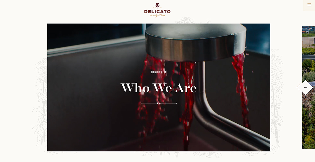
How many times have you heard that you have to use sans serif fonts on websites? (Way too many, right?)
While this was once true, it is a myth today. Thanks to high-resolution screens you can easily see and read almost any font (provided color and contrast are correct) on a website. The reason for using sans serifs was rooted primarily in low-resolution screens that could make some other typefaces difficult to read.
So, go for it! Use a serif, script, or novelty typeface if it works for your project.
7. All That Matters is the Homepage
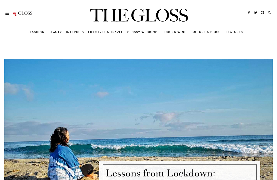
Another fading trend in website design is the use of one-page websites that get all of the information on the homepage. This is only a good idea if you have a limited amount of content.
A one-page design can also get limiting if you begin to grow your business
Most websites are better served with multiple pages and entry points for users. While there are some who will come to the website directly by typing in a URL or from a link, many others will find your website thanks to search.
More pages with more directed content can help the right website visitors find your website and content that they want to see. This includes everything from blog posts to your contact or about page.
A one-page design can also get limiting if you begin to grow your business or want more content on the website. A multipage structure will be easier to grow with and evolve over time.
8. You Need a Social Media Feed on Your Website
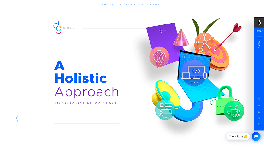
This website design element is almost as popular as the slider – social media feeds on webpages.
Think about it: What benefit do you get from having a version of your Facebook feed on your website homepage?
It can be beneficial to provide website visitors with a button to easily share content on social media or to follow accounts, but they don’t need to see the feed on your website. These are two different platforms for different reasons.
Conclusion
To ensure that you have a modern website design, it’s important to stay on top of user research and patterns, your own website analytics, and trends. None of these elements alone is enough to push how and what you should do with the design, but together they are powerful tools.
One of the surest signs of a dated website is not evolving as user habits and behaviors change. Technology and device usage tend to push a lot of this, so make a point to pay attention to what you are seeing as you visit other websites to help determine if your website needs a few tweaks.


