Colorado State has unveiled a new logo. Here’s a look behind-the-scenes.


“Through a unique collaboration, two of Colorado’s most notable brand strategy firms — Egg Strategy and Sterling Rice Group — worked together to build the foundation that ultimately supports the new brand identity. An extensive exploratory of themes was developed and refined through additional interviews among people within Colorado, out of state and internationally.”
Quoted from the Brand Colorado website.
I’ve lifted a few of the preliminary design options (below) from this video.
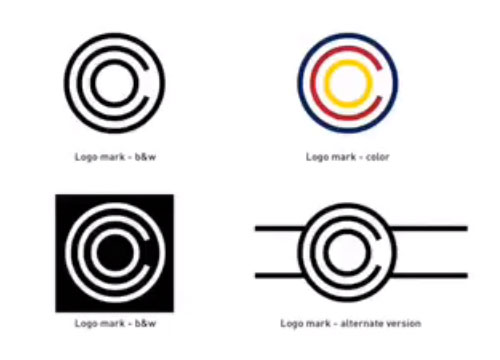












Ideas were narrowed down to two options.
This.


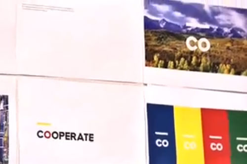


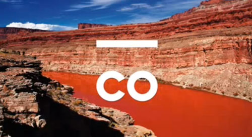




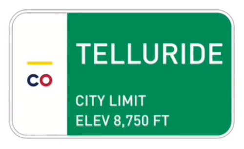
And this.




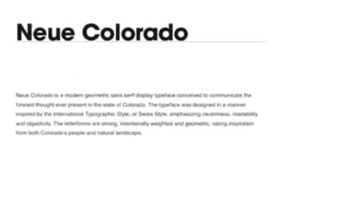
A custom typeface was designed, too.

And here’s the official brand launch video (the chosen logo appears at 1:15).
“Like Colorado itself, our new logo combines the familiar with the unexpected. It draws clear influence from our world-famous mountains and beloved license plate. But its shape, an upward facing arrow with rounded corners, also serves as a symbol of Colorado’s momentum and a reminder of its friendly and approachable attitude.”
The design’s coming in for some stick, and that’s unsurprising — not because of the design, but because it’s the launch of a “logo” (just one small part of the identity). People see this single symbol, then they see the money involved (inevitably commented on), and they think, “It cost how much? I could’ve done better for a fraction of that.”
Brand Colorado. Via The Branding Source.


