On its face, Grigora Blocks by Latracal Solutions seems almost pedestrian. It feels like a theme you would use as a starting point to build your own thing. It will not have enough personality for everyone to give it a shot. However, for others, a base layout to customize is what they might be looking for. I genuinely love starter-type themes because they are often ideal for client work or DIY users who want to take control.
Plus, Grigora has a feature that only a handful of existing block themes in the WordPress directory can boast. It includes a sidebar in its default output:
 Single post view with sidebar.
There is one quirk with the sidebar. For whatever reason, the theme author specifically targets the last Group block in it, adding 30px of left padding. Any blocks added above it do not share the same offset from the content area as shown in the screenshot.
Sidebar-less designs are increasingly becoming the norm, especially in an age where most people browse the web through mobile devices. However, several Tavern readers have asked if I would share some block themes with sidebars. Grigora’s implementation matches with how I would go about building a similar layout (aside from the weird padding issue, of course).
For once, someone built a theme that did not automatically load all 90+ of my pages in the default nav menu. Almost every time I activate a new block theme that does this, it is broken on the front end. For this break from the insanity, I can only thank the developer.
The most disappointing thing about Grigora was that its default design did not match its screenshot from WordPress.org. Anyone who has ever installed a theme from the directory knows that this is not unusual. Theme authors have asked for better tools to address this issue for years, and block templates and global styles are the answer.
There are no longer any limits on offering the experience that users expect when they see that pretty screenshot that caught their eye in the first place. Instead of the nicely laid-out design, users are presented with the typical list of blog posts. And, there are no instructions on how to recreate the screenshot’s look.
I managed to piece something together with the theme’s “Blank” page template and a couple of patterns. The testimonial pattern was easy to locate, but I could not find one that matched the header. The closest was “Parallax Centered Transparent Header.” However, I had to customize it to get something more closely aligned with the screenshot.
 Recreating the theme’s screenshot.
Such fiddling should not be a prerequisite to getting the same design as the screenshot.
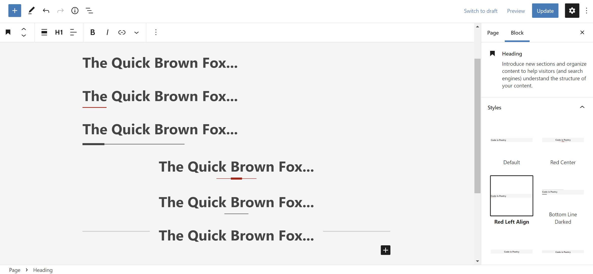
Grigora has over a dozen patterns, but where it really shines is its custom block styles. I had a lot of fun tinkering with Heading options:
 Testing Heading block styles.
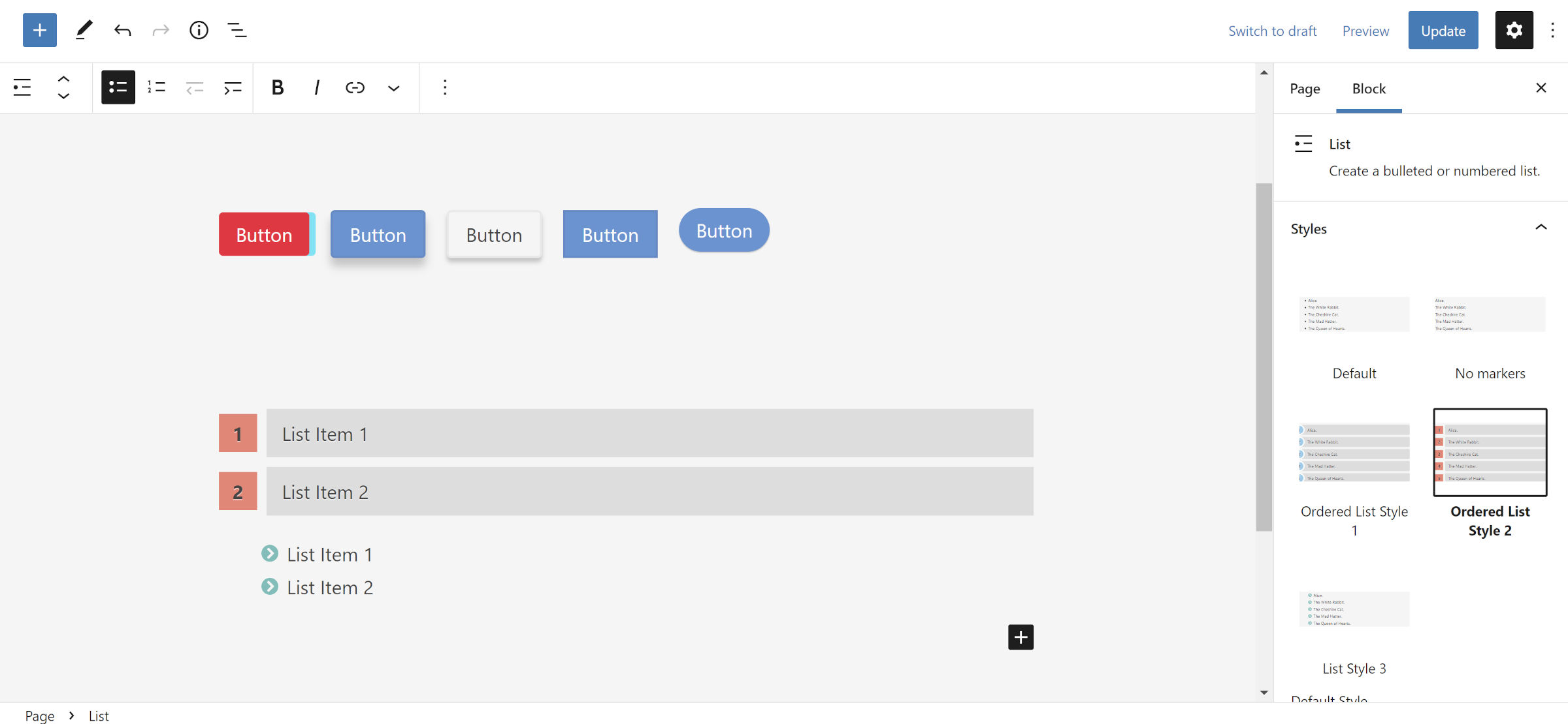
In total, the theme registers 98 styles for users to choose from. Some of these are duplicates used on similar block types. However, it is still an impressive range of style options.
The following screenshot shows some of its Button and List block styles:
 Inserting Button and List blocks with custom styles.
I have a bit of a love/hate relationship with Grigora. I see a ton of potential for it to be a rock-solid base theme. All the elements are in place, but several quirks are scattered throughout. Every time I think I have encountered them all, another pops up. A few are because WordPress 5.9 lacks some necessary block controls. However, others are easy to address with the existing toolset.
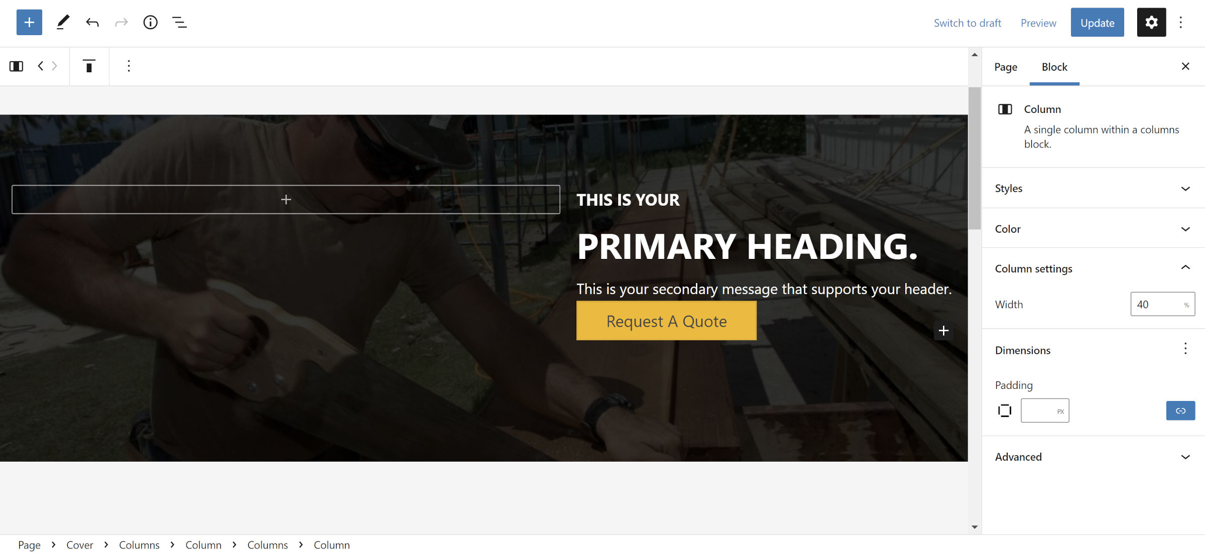
For example, the spacing between blocks in the right column of the following pattern is all over the place:
 Pattern with inconsistent spacing.
Users can adjust it with the margin design option for each block or by wrapping it in a Group and modifying its spacing. However, that should be handled by the theme out of the box.
Most of the issues I encountered with Grigora Blocks revolved around fixable spacing hiccups. Outside of that, the content width was a tad wide for the 18px font size deployed by the theme. Bumping that up to 19px, even 20px, or reducing the width would be ideal for users who will be writing long-form content.
I expect this theme to only get better as user feedback rolls in and the author experiments more with WordPress’s design controls. A bit more quality control and testing will make it a nicer base for building all sorts of websites.
Side note: I tested Grigora against WordPress 5.9 because some of its pattern designs were slightly off with the latest Gutenberg plugin active. Even a mere few months after the last major WordPress release, the editor already feels dated. For those who have not tested the most recent Gutenberg updates, I recommend doing so. The experience is much improved across the board, and I expect you to be pleasantly surprised when 6.0 launches.


