For Gutenberg junkies, the three-week wait between major releases has been rough, especially during this time when many are looking for new things to fill the gaps in our social calendars. Not to fret, the team dropped version 7.9 of the plugin earlier today. This release includes several goodies such as new typography-related controls for blocks, extra patterns for testing, and even more work toward a lighter DOM for theme authors.
With the added time, version 7.9 is a larger release than usual. It includes over two dozen bug fixes and almost as many minor enhancements. The team continued work on full-site editing, which has moved along at a steady pace and is currently slated to land in WordPress 5.6 later this year.
The development team has made several tweaks to the user interface. This is a continuation of the work that has landed in the previous couple of major releases. WordPress users who are not running the Gutenberg plugin can expect to see the refreshed UI in August this year when WordPress 5.5 drops.
One nice change is to the link inserter. Instead of outputting the URL from an existing post, it will output the post title instead. This should make it far quicker for users to insert links to their posts or pages in the editor.
Fullscreen mode can now be toggled on and off via the Ctrl + Shift + Alt + F keyboard shortcut. That is assuming you consider remembering which four keys to press a shortcut. At least the option exists for those who need it. I suppose I will acquire the muscle memory to toggle it over time.
On the whole, this a major release in every sense. Everything from documentation to code quality has seen improvements. Developers can enjoy new APIs. Theme authors should also have an easier time styling buttons — the editor HTML should now be consistent with front-end output.
Gradient All the Things

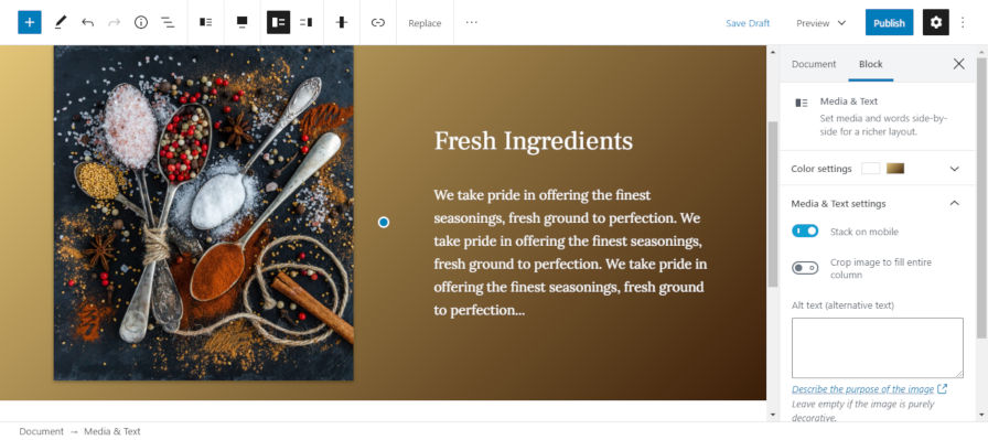
Until now, users could add gradient backgrounds to the cover and button blocks. Gutenberg 7.9 extends this option to the group, columns, and media & text blocks.
I have yet to see many theme authors take advantage of gradients. Granted, gradient backgrounds only landed in WordPress 5.4. I am hoping some of the top designers in the theme space can tackle this, if for no other reason than providing me some new eye candy when writing posts such as this that discuss gradients in Gutenberg.
On the whole, the addition of the gradients option to new blocks is a good thing. The next step is to continue expanding it to other blocks.
Typography for Headings and Paragraphs

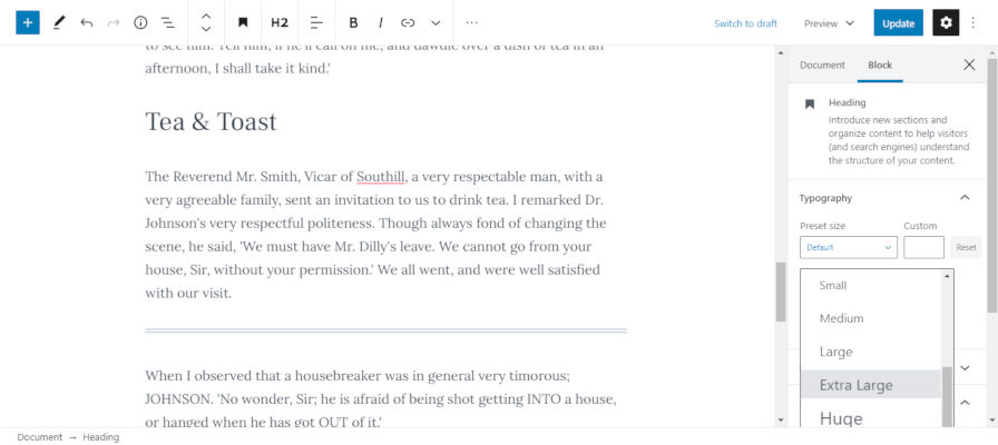
The Gutenberg team has finally checked off one of my longstanding pet peeves. The heading block now has a font-size option. Instead of users using an H1-level heading to make their text larger, they can stick with an appropriate-level heading for the document structure while using the font-size option to adjust how large it appears.
I am concerned about the addition of a new setting to allow users to adjust the line-height for paragraphs and headings. Currently, the setting does not allow theme authors to add choices based on their design system or disable the feature altogether.
We also get some new inline styles instead of classes. At this point, that ship has already sailed and sunk with Gutenberg.
The usefulness of a line-height setting is clear when designing a full-page layout, such as a single-page brochure. However, changing the line-height for most text on a site could have dire consequences in the long term, especially when an end-user switches themes and finds that their chosen line-height is completely out of sync with their new theme. I would not wish the pain of updating dozens or more old blog posts to adjust paragraph design on anyone. Of course, the same could be said of font sizes and similar settings. This is the one setting that I want to see with more theme author feedback as part of the decision.
Three New Block Patterns

Gutenberg 7.9 removed the block patterns icon from the top right and tucked it behind the editor options menu. Users can pin the patterns sidebar, which will move the patterns icon back to the top for quick access.
The update also introduces three additional block patterns, bringing the total to six.
- Hero Two Columns: Displays a group that encloses an italic paragraph, a heading, and two columns of text.
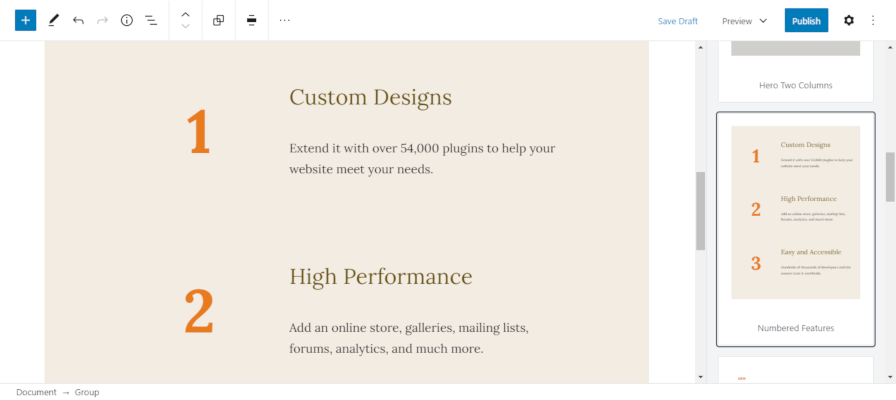
- Numbered Features: Displays several groups of columns with a number on the left and text on the right.
- It’s Time: Outputs a paragraph, two columns, and a large paragraph that reads “it’s time.”
The Numbered Features pattern is by far the most intricate pattern the Gutenberg team has put together while building the block patterns system. It is nice to see them exploring some designs that users will find useful.
At this point, most of the patterns are relatively boring and not representative of how feature-rich this system will become in the future. It is important to remember that patterns are still at an early stage of development. By the time the feature lands in core WordPress, we should see more advanced and beautiful patterns for use on websites.


