If you hadn’t seen it, Heydon posted a rather clever flexbox layout pattern that, in a sense, mimics what you could do with a container query by forcing an element to stack at a certain container width. I was particularly interested, as I was fighting a little layout situation at the time I saw this and thought it could be a solution. Let’s take a peak.
“Ad Double” Units
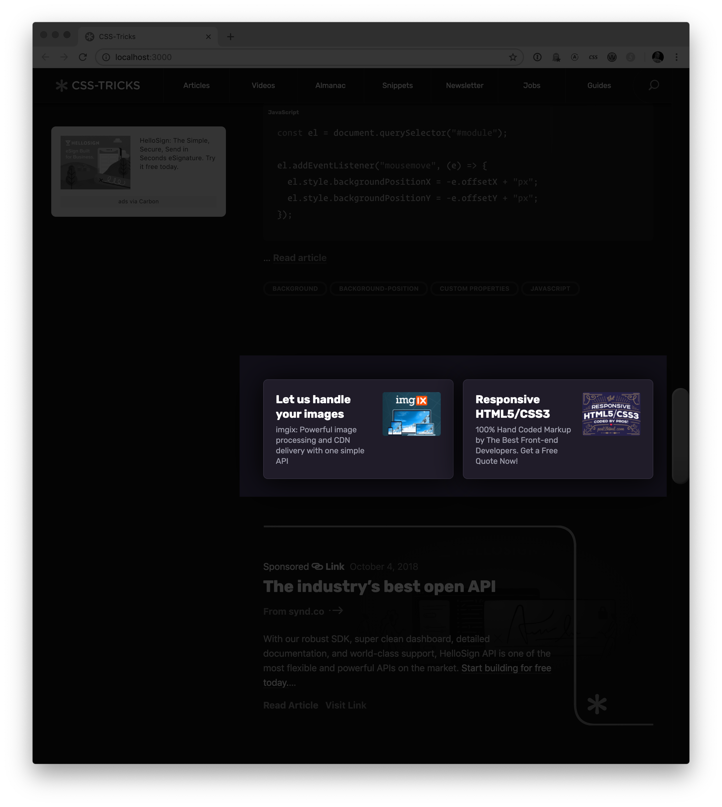
I have these little advertising units on the design of this site. I can and do insert them into a variety of places on the site. Sometimes they are in a column like this:
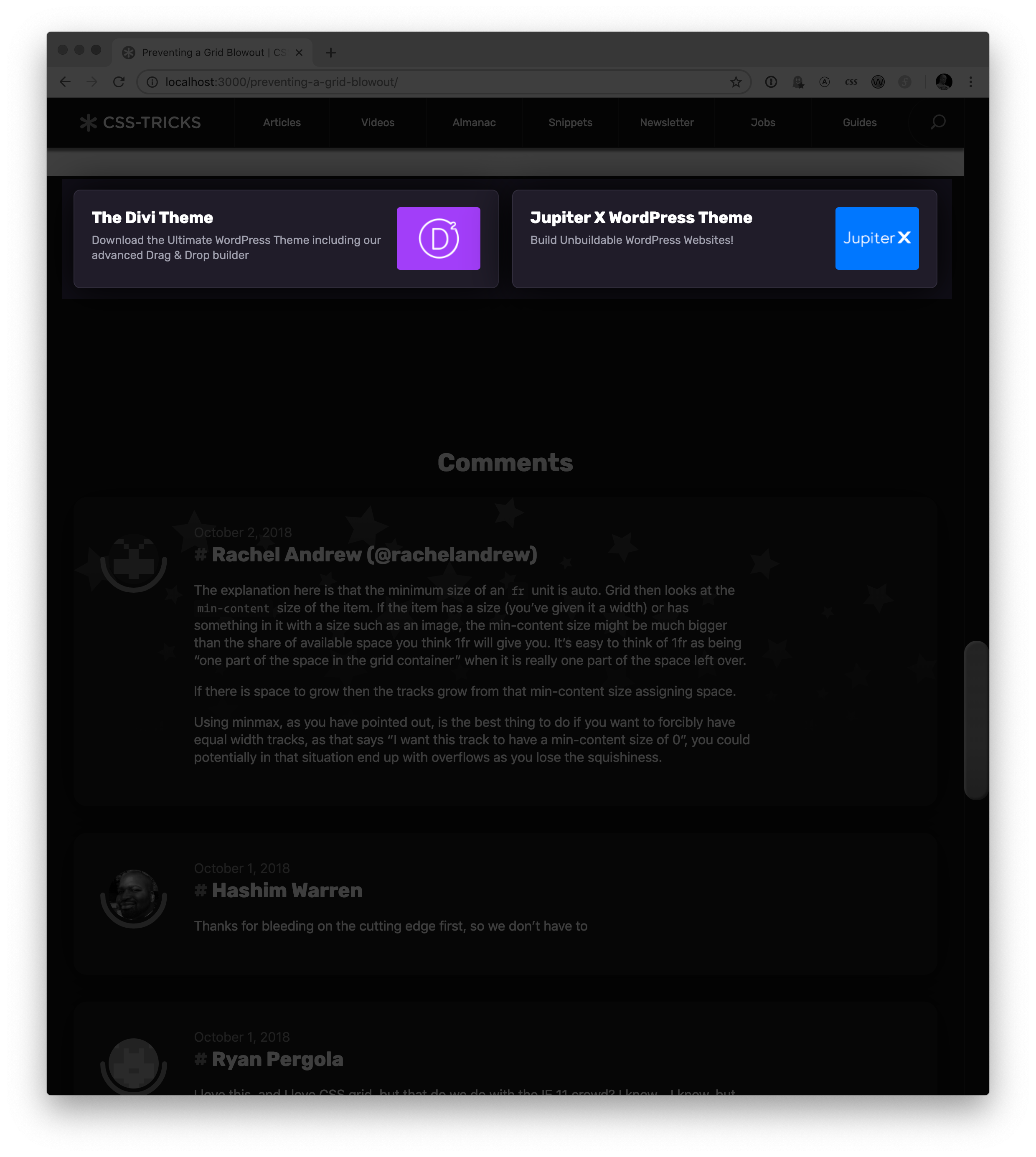
Sometimes I put them in a place that is more like a full-width environment:
And sometimes they go in a multi-column layout that is created by a flexible CSS grid.
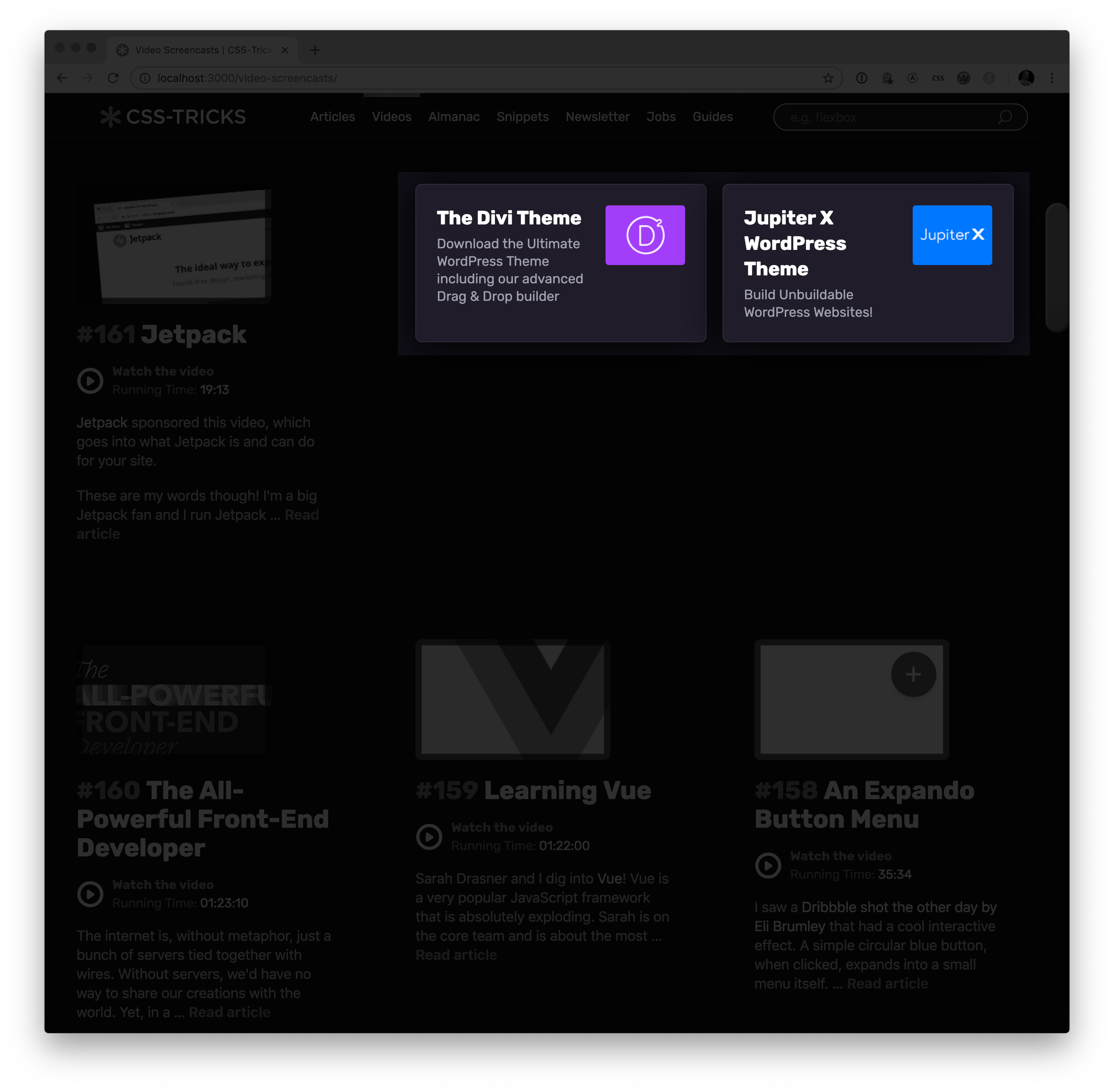
So, really, they could be just about any width.
But there is a point at which I’d like the ads to stack. They don’t work side by side anymore when they get squished in a narrow column, so I’d like to have them go over/under instead of left/right.
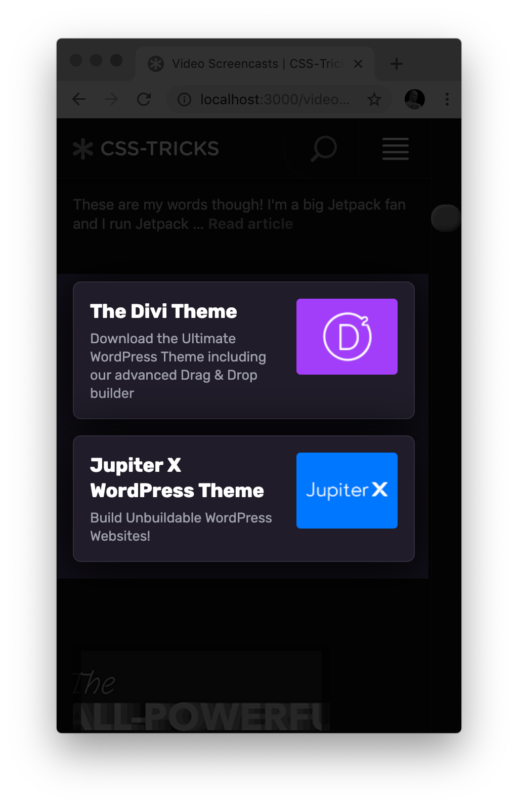
I don’t care how wide the screen is, I care about the space these go in
I caught myself writing media queries to make these ads flop from side by side to stacked. I’d “fix” it in one place only to break it in another because that same media query doesn’t work in another context. I needed a damn container query!
This is the beauty of Heydon’s albatross technique. The point at which I want them to break is about 560px, so that’s what I set out to use.
The transition
I was already using flexbox to lay out these Ad Doubles, so the only changes were to make it wrap them, put in the fancy 4-property albatross magic, and adjust the margin handling so that it doesn’t need a media query to reset itself.
This is the entire dif:
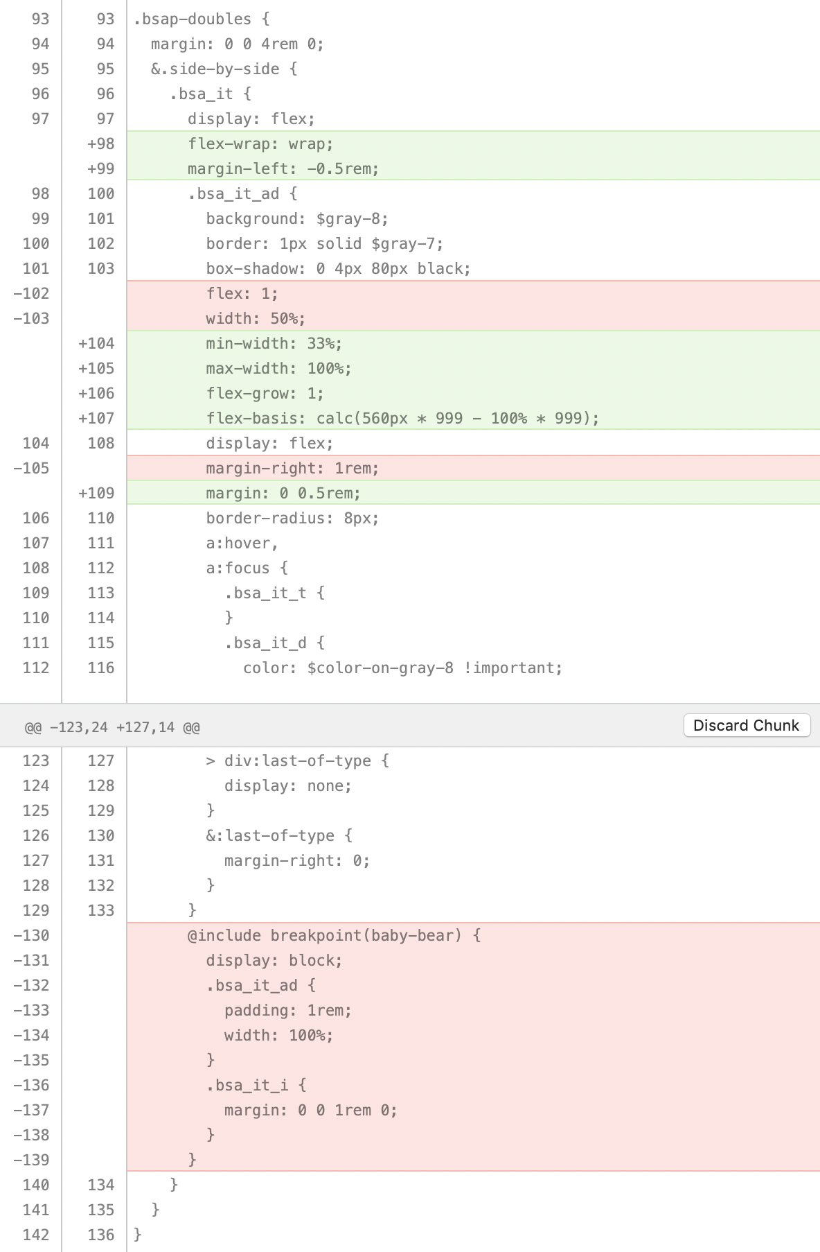
And it works great!
Peeking at it in Firefox DevTools
Victoria Wang recently wrote about designing the Firefox DevTools Flexbox Inspector. I had to pop open Firefox Developer Edition to check it out! It’s pretty cool!
The coolest part, to me, is how it shows you the way an individual flex item arrives at the size it’s being rendered. As we well know, this can get a bit wacky, as lots of things can affect it like flex-basis, flex-grow, flex-shrink, max-width, min-width, etc.
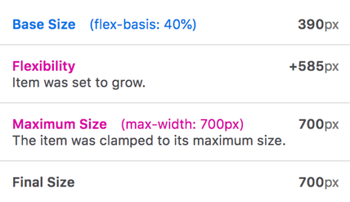
Here’s what the albatross technique shows:
The post Putting the Flexbox Albatross to Real Use appeared first on CSS-Tricks.


