Website design with a split-screen aesthetic is a trend that keeps evolving and growing. A split-screen design can be good for a number of reasons, including mobile compatibility and user-friendliness. Plus, many of these designs just look great!
Shifts in the trend show that there are so many different ways to create an effective split screen design that users will love. Consider this your introduction to split-screen design in the new and improved era!
Benefits of Split Screen Design
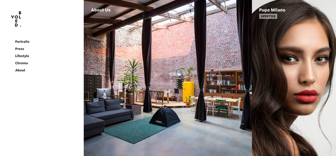
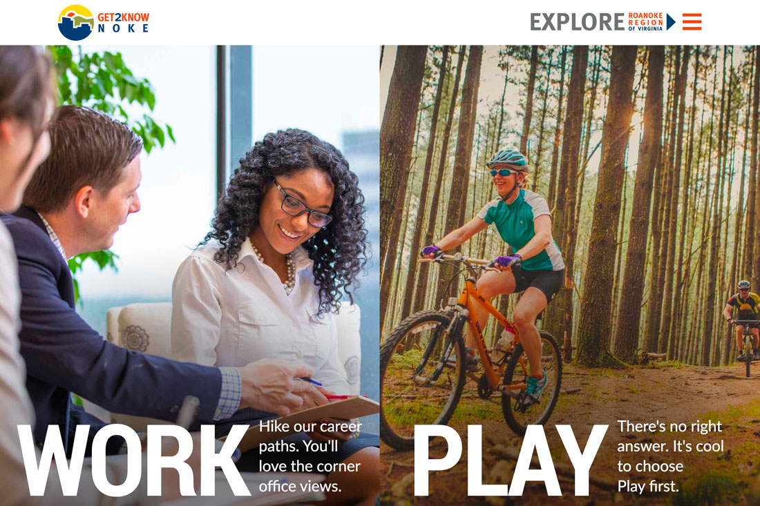
Split screen designs keep growing in popularity because they can be highly effective. They work well when there are two bits of content the user needs to see right away. This same idea applies to content that requires the user to make a choice to proceed, such as picking a content path.
Designers are using split-screen design because they are effective. Top reasons to use a split screen design are to:
- Encourage the user to make a choice – pick this or that
- Highlight a vertical image
- Create a common experience on desktop and mobile devices
- Establish a distinct visual flow (to a call to action)
- Establish a design pattern that works with other design techniques and trends
- Create a visual that stands out from so many full-screen hero homepages or differentiate between types of content on a website
The great thing about split screen designs is that they work with the responsive format beautifully. You get double content on desktop and stacked content on mobile screens. Regardless of the device, the user doesn’t feel like he or she missed out on anything by changing device type.
“Classic” Split Screen Design
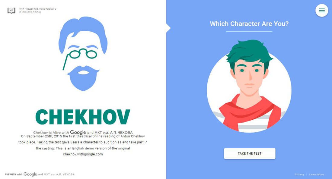
It might be a little soon to call the split-screen design aesthetic “classic”, but considering the rate at which web design trends move, that’s not beyond reason.
We’ve been writing about split-screen design here since 2015. It was featured as a top design trend of 2017 and a trend you need to try in 2018. So what are you waiting for?
Here’s why we liked it then (and now):
- Split-screen design can be a good choice for responsive frameworks. On bigger screens, the design is split but when it comes to smaller screens, the panels can be stacked.
- It’s easy to work in animation and effects that encourage clicks based on the content provided.
- Two symmetrical panels make it easy to create a modular outline for the full site design and organize content within the blocks.
Evolving Split Screens
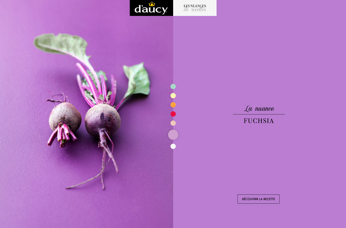
While the first split screen designs were fairly simple – and symmetrical – that’s not the full story anymore. Designers are still using some of the equal-weight splits, but also working in splits that aren’t down-the-middle of the screen.
Some feature more zig-zag patterns, grid-based splits (think three-quarters and one-quarter screens) and splits screens with unequal content weights. There’s also a shift to more minimally-designed split screens.
Originally split screens tended to be a little weighty because they were designed to take the user on a journey through an appropriate content channel and the content need to help them get there. Now that choice is being streamlined even more. (There are even some split screen designs that use the visual pattern without a this or that choice, such as the example above).
Split-Screens With Multiple Click Areas

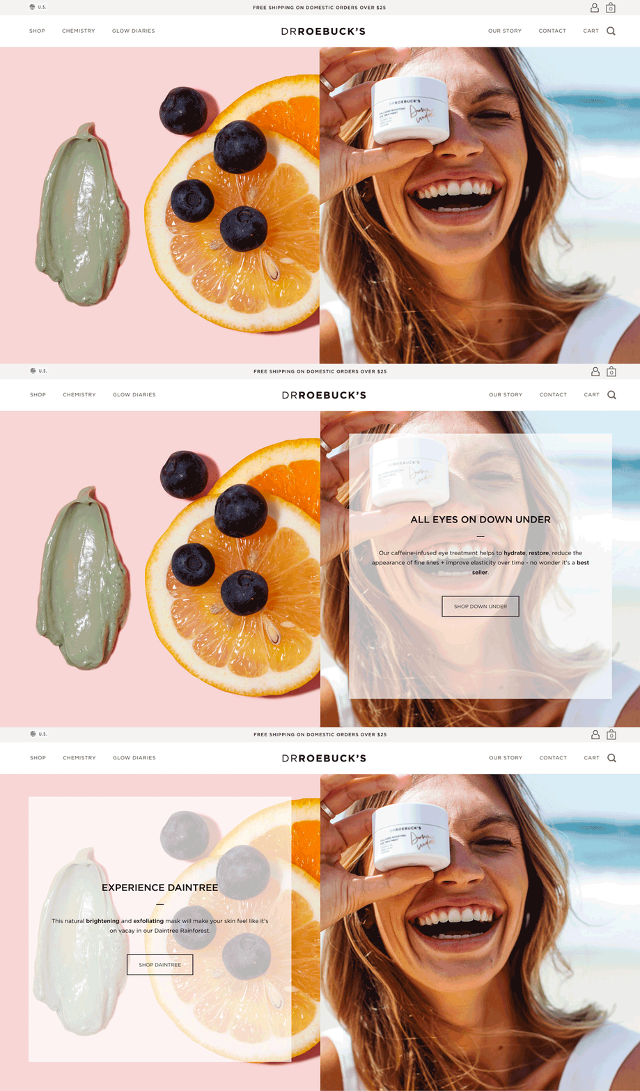
One of the biggest shifts in the split-screen design trend is that there are multiple click areas in some of the newer designs. Where originally split-screens had two CTAs per screen, these splits often contain other information – and clickable areas.
The example above shows a split screen with a strong image and messaging paired with e-commerce links. It looks great on desktops – with the big image to draw you in and stacks just a nice on mobile, making a more pleasant shopping experience.
Not-So-Obvious Split Screens
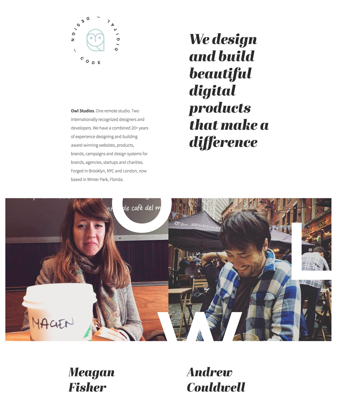
Not all split screen designs are super obvious. (Consider that this is as much of a user experience trend as a visual one.)
In minimal design outlines a split screen can be established with the use of a grid, but without color or images, the “screens” look like one. Owl Studios, above, does this well. Above the scroll, it looks like a single-screen design, below the scroll and on mobile, the split becomes more obvious.
This split-screen design is beautiful and highly usable on all devices. That’s exactly what you should be trying to accomplish with this website design trend.
A Word of Caution

While working with vertical split screens can create some amazing user experiences, you should beware of horizontal splits. These can get awkward and go a little haywire quickly!
The example above is actually a nice website and uses split-screen principles well below the scroll, but the first two “screens” fall short. There’s almost too much white space and not enough messaging to encourage scrolling and the mobile UX is lacking. The design would work better with a vertical split screen here, maintaining the white space and CTAs with the video beside it.
A horizontal split screen often leaves you with images with a wide image area that isn’t tall. This is a difficult aspect ratio to make work on mobile screens. While you can make it work with a solid plan and different set of crops, it can lead to two different user experiences.
Most users expect the same website on all devices. If you plan to create different experiences – even just in imagery or text – have a good conversation about it with your team and make sure this is the best design choice for the project.
6 Split-Screen Designs We Love
Reach Digital

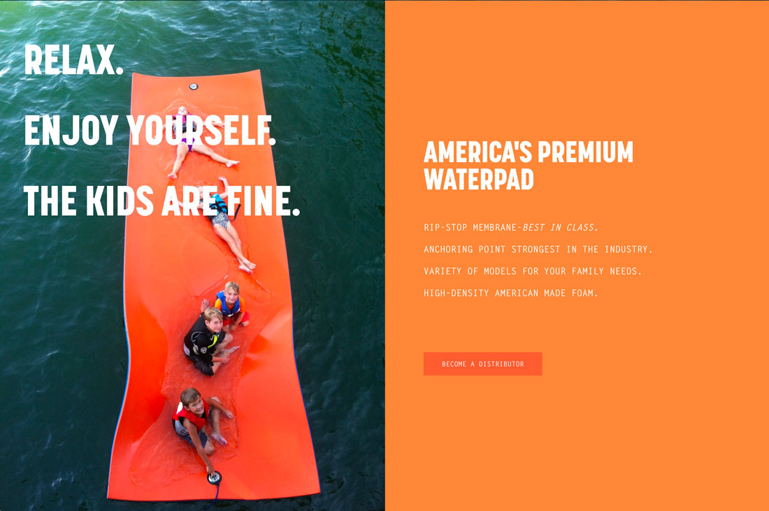
Paradise Pad
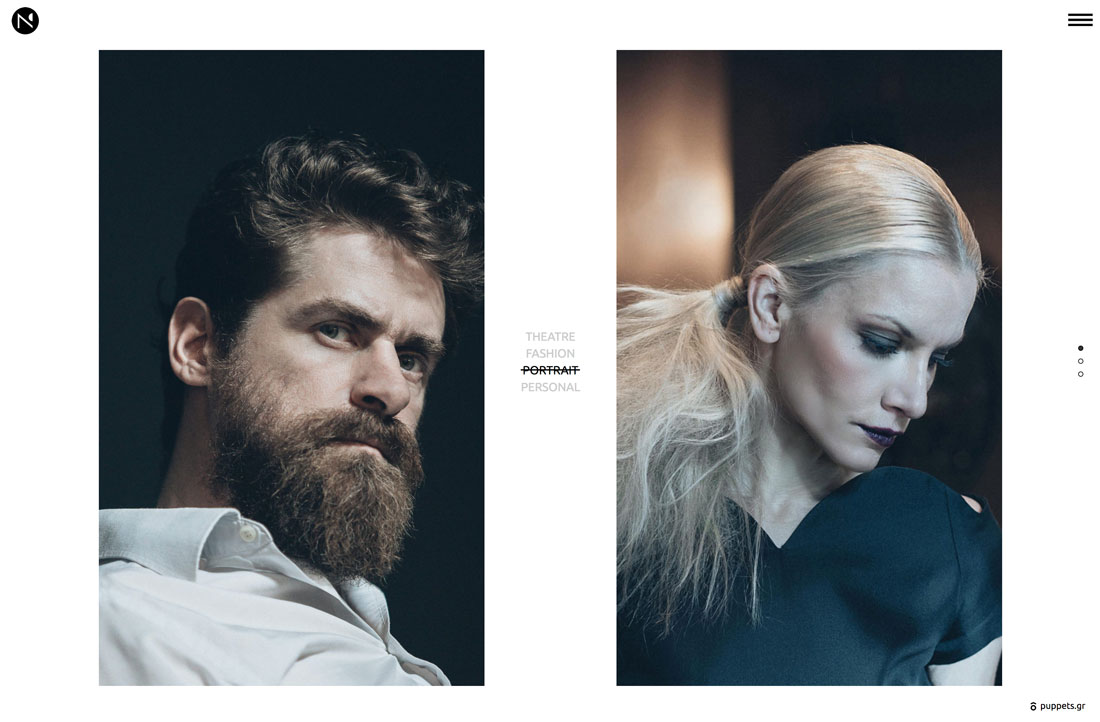
Nikos Pandazaras
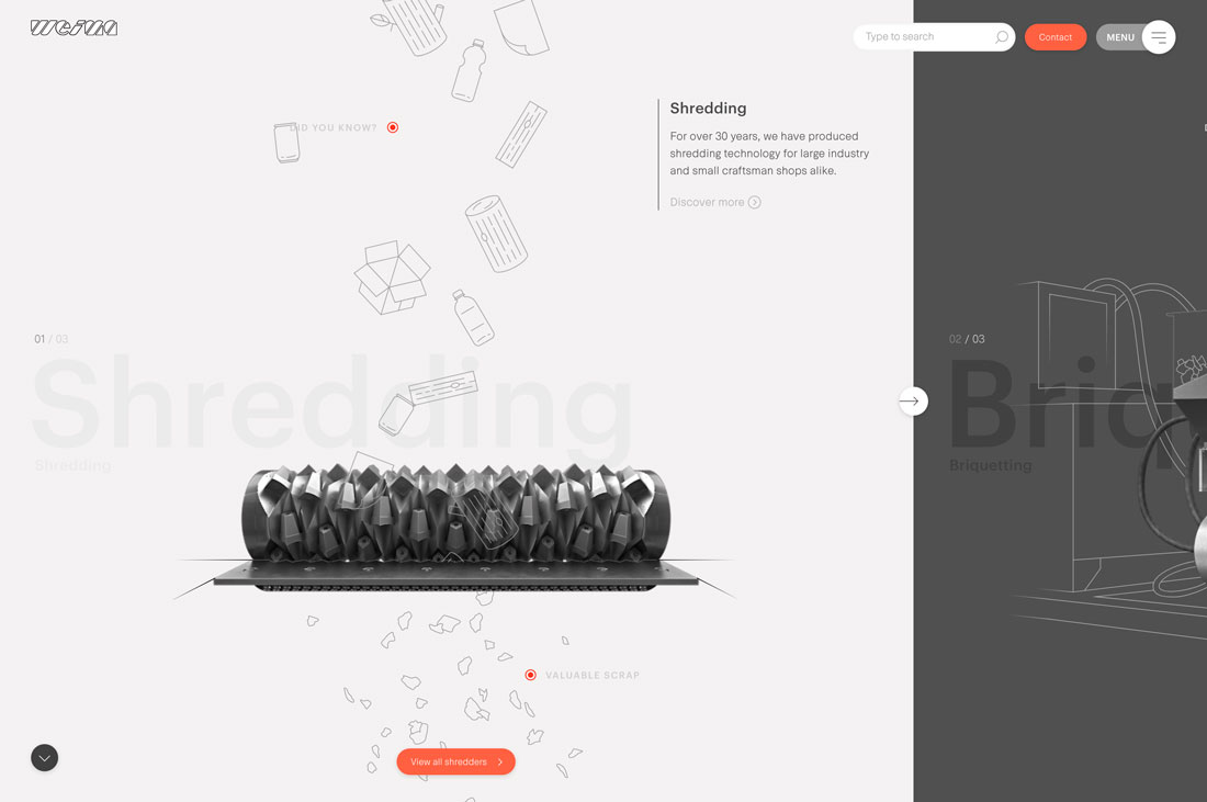
Weima
Dr. Roebuck’s
Conclusion
Can you see using a split-screen design in your projects? If the content type is right, this can be a highly effective design technique. And there are so many different ways to make it work. Good luck!


