The following has been excerpted from Tim Lapetino’s Art of Atari, a beautifully produced book showcasing more than four decades of packaging and advertising illustrations from the pioneering video game company.

Affectionately nicknamed “the Fuji,” the Atari logo still persists as a lasting part of popular culture.
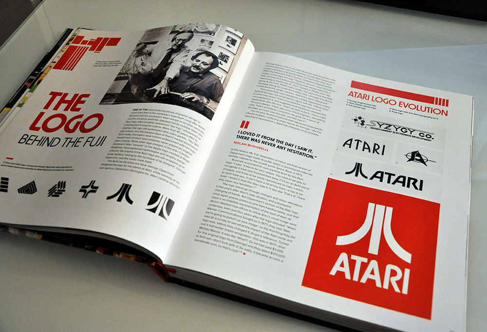
While other logo designs of the era — Carolyn Davidson’s Nike “swoosh” or the Apple logo created at Regis McKenna — have spawned mythologies and lengthy design criticism, the origins of the Atari logo are still wrapped up in some mystery, adding to the mystique of its designer, George Opperman, and the iconic mark itself.
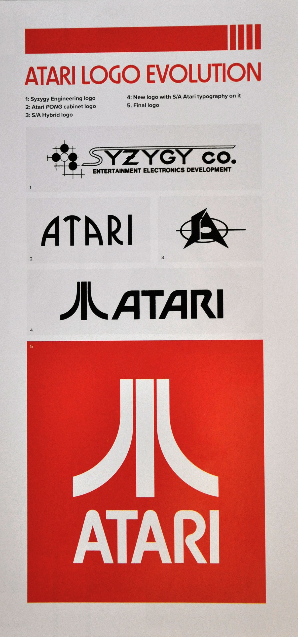
The facts we do know are here: George Opperman designed the logo for his clients at Atari, while working at his own agency, Opperman-Harrington Inc. Atari creative director George Faraco and co-founder Nolan Bushnell were involved in the creative direction and final selection as well. But Opperman’s creative process and actual intent are much less clear.

In a 1983 interview with Video Games, Opperman explained the origins of the logo this way: “Symbols are just visual nicknames that combine first letters and interpretive design elements. I kept trying to stylize the ‘A,’ then I looked at PONG, their big game at the time. PONG had a center line and a force (the ball) that kept hitting its center from either side. I thought that (force) would bend the center outward. And that’s what I designed.”
This explanation was intended to solidify Opperman’s intent behind the logo, but not all parties agree with the “official story.” In other interviews, Faraco insisted the logo had no such concept behind it, and suggested that Opperman imputed this explanation after the fact. “That’s all utter bullshit,” Faraco said. “It’s just a design. There was none of that linguistic, storytelling crap. That’s somebody’s invention. He gave me a bunch of doodles, so I said, ‘Use this one,’ and that was it.”
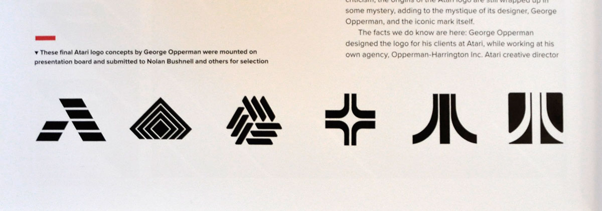
 These Atari logo concepts were mounted on presentation board and submitted for selection.
For his part, Bushnell believes that Opperman purposefully offered multiple, conflicting origin stories for the logo — like the idea that it represented a Japanese character, or its similarity to the famous Mount Fuji. Regardless of intent, the final version of Opperman’s logo made its public debut in promotional materials and the cabinet for the arcade game Space Race in 1973.
Bushnell recounted his own creative brief for the Atari logo: “I said, ‘It has to be very simple. You have to be able to recognize it from one hundred feet away if it’s on an 8×10 piece of paper, and it has to be easily reproduced on hats, t-shirts, or what have you. It can’t have a lot of tiny lines — it has to be bold.’ I loved it from the day I saw it. It was like ‘That’s it!’ There was never any hesitation.”
—
If you fancy some childhood nostalgia (the 2600 was the first console I played), Art of Atari is available from Amazon.com and Amazon.co.uk.
 Visit Polygon for more of a look inside.


