Thomas Cook, Britain’s oldest tour operator, has revealed a new logo, the sunny heart, and changed it’s tagline from “Don’t just book it. Thomas Cook it.” to “Let’s go.”
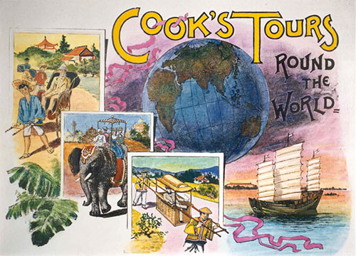
Derbyshire-born Cook (1808-1892) began his travel company in 1841, 50 years before this brochure cover (below) was in use.

Cooks Tours brochure cover, 1891, via The Guardian
The business passed to his only son John who had been his partner since 1864.
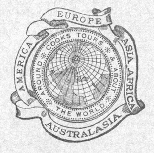
Here’s the “Cooks Tours” logo from late in the 19th century.

In 1914, a fifth continent was added to the surrounding ribbons (below).

And in 1928 a fifth ribbon was added, and the brand name changed from Cooks Tours to Cook’s Travel Service.

The globe was replaced in 1930 with TC&S for Thomas Cook and Son.

These two designs were used between the mid-1930s until after the second world war.

Cooks was seen between the 50s and 70s.

The “flame red” Thomas Cook logo was introduced in 1974.

It changed again in 1989.

The “sea and sun” yellow and blue was launched in 2001.


Thomas Cook signage, 2011, photo by Chris Ratcliffe/Bloomberg
And here’s the new look.

The sunny heart logo, launched worldwide in October 2013
“After a successful year in the Nordic countries, the sunny heart is now the unifying symbol for the whole Thomas Cook Group, in more than 70 countries.”
Quoted from the Happy F&B website — the Swedish agency behind the design.

Ving signage in Sweden and Norway as part of the trial
Thomas Cook marketing and ecommerce director Mike Hoban said, “The gold sunny heart logo had been created to evoke warmth and emotion and worked for all types of holiday, even skiing. […] Then, the type in metallic grey reflects a high tech, digital Thomas Cook.”


The Independent reports that this is the first time in Thomas Cook’s 172-year history that all its companies will have a unifying identity.
Logos and dates courtesy of Loulla-Mae of Marketing Magazine.


