Last week, version 7.7 of the Gutenberg plugin shipped to users. In what is one of the more visually-striking updates in a while, the design team presented a refreshed UI. Users will also get their first chance to test the upcoming block patterns feature.
Some users may get a surprise. Gutenberg 7.7 is the first version of the plugin to ship the editor in fullscreen mode out of the box. This change will land in WordPress 5.4. Now is a good opportunity to see how it works before upgrading later this month.
Block developers can rejoice for the ability to create their own block wrappers. This is part of a change for creating a faster DOM. Inner blocks also produce a lighter DOM output, so the element tree in the editor now matches the front end. These changes make it easier for theme designers to style blocks without a convoluted mess of nested <div> elements.
Version 7.7 includes over two dozen bug fixes. It also includes a fix for the “View Posts” back button at the top of the editor while in fullscreen mode. Instead of an arrow button, which was confusing for users who thought it might return them to the regular editing mode, the team replaced it with the WordPress “W” icon.
A Fresh and Clean Editor UI

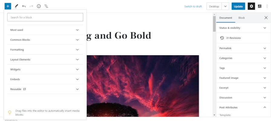
It took a few days to grow on me after more than a year getting accustomed to the old UI. The basics are the same. The layout has not changed. However, the buttons and related elements have received a nice refresh.
The editor feels more professional. The block toolbar is simpler and cleaner. The Gutenberg team redesigned the icons. The color contrast makes everything crisper.
The block inserter now uses the full height of the editor. This is a large improvement over earlier iterations. It means less scrolling to find the right block, which has been one of my pet-peeves (I have fewer and fewer of these with each release).
This is a first pass over the new interface, and there is still more work for the Gutenberg design team to tackle. Work on the sidebar, dropdowns, and other elements is currently in progress and should land in upcoming plugin updates.
Overall, the UI is much more polished. The average WordPress user will not experience it until WordPress 5.5, but it is well worth installing and activating the Gutenberg plugin to give it a spin.
Early Work Toward Block Patterns

Perhaps one of the most-anticipated Gutenberg features is the inclusion of a pattern library. A pattern is a collection of blocks in a predefined arrangement. For example, a common pattern is a large hero image with text and a couple of buttons laid over the top. Another common pattern is a set of three or four boxes aligned next to each other, each with a title, image, and text.
The more complex a particular layout, the harder it is to create from the editor without the know-how. That’s where patterns come in. They are a sort of “template” that allows end-users to quickly build out sections of content without the requirement of inserting the individual blocks.
Patterns will be a game-changer.
Some projects have already made solid attempts at something akin to patterns. ShareABlock’s community-based shared blocks and Gutenberg Hub’s copy-and-paste templates are good options for people who know about those projects. Users are even turning the reusable block system into faux patterns. However, few solutions will be able to compete with having a true Block Patterns API and exposing those patterns in the UI to end-users.
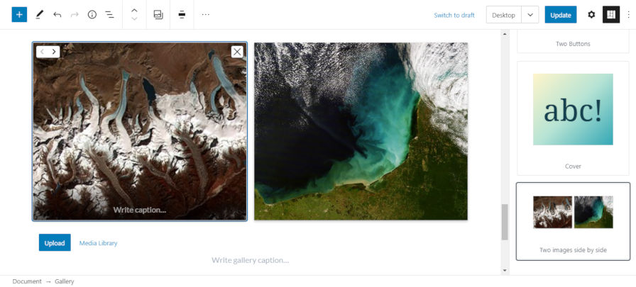
The new patterns feature in Gutenberg 7.7 is meant as a minimum viable product and not representative of what the feature will look like by the time it ships in core WordPress. At the moment, the UI is a new sidebar with a small sampling of patterns to choose from. However, patterns will likely be a part of the block inserter or exposed differently down the road. The goal is to ship something that works and iterate.
Currently, the team has bundled only four patterns:
- Two Columns of Text
- Two Buttons
- Cover
- Two Images Side by Side
While these particular patterns are not exciting, they are simple examples to begin testing the feature. The big question: what patterns should Gutenberg include by default? There is currently an open GitHub ticket to discuss and implement the possibilities. There are several proposals for commonly-seen patterns around the web. The ideal people to be involved with this discussion would be theme authors because they have been working closely and directly with users for years. With enough solid patterns in core, it would mean less code work in themes. Instead of building dozens of patterns to achieve modern layouts, theme authors could focus more on the design aspect of theme development.
In testing, the feature worked without issue. After selecting the patterns sidebar, you simply select the pattern you want, which is inserted directly in the content area of the editor. From that point, you can edit like any other block.
Patterns will certainly make the block editor far more competitive with page building plugins. More than anything, they will allow users to more quickly build layouts that often make for an overly complex and frustrating experience.
Right now, the pattern library is not included in the most recent roadmap update for 2020. However, I could see it making an official appearance in WordPress this year if work continues at its current pace. That is merely speculation, and perhaps a little hope, but this is one of the most exciting Gutenberg features in the works.


